| Image |
Comment |
| 07/05/2006 06:57:34 AM |
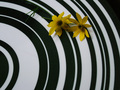
Flowers on a plateby ladpupmoeComment: This is very well thought out, only thing is, that white and black is bold and big, the flowers just dont show up well, the placement might help if it was in a different spot in the frame, and a bit closer up, as it is, the focus is on the white and black, the flowers apear to happen to just be there.
nice job though, you really have creativity ! |
 Photographer found comment helpful. Photographer found comment helpful. |
| 07/04/2006 08:45:19 PM |
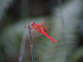
Red Dragonby HornOUBetComment: oh wow! you are so fortunate! the dragons just came out by us, but this is a gorgous color! |
| Photographer found comment helpful. |
| 07/04/2006 08:44:34 PM |
The wild childby ergatesComment: i think a different angle would improve this tremendously and, the lighting could be a bit better, the washed out to bright lighting to the far right is taking the eye away from the child.
still you did well. |
| Photographer found comment helpful. |
| 07/04/2006 08:22:43 PM |
Docksideby bclementsComment: This is a bit to compact or squeezed in giving a very crowded feeling, i think had there been more left at the bottom this would be a fabulous picture. nice job just the same! |
| Photographer found comment helpful. |
| 07/04/2006 08:21:49 PM |
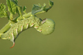
Tomato Invaderby bryantbusComment: Very nicely done, a bit different angle would be advantagous but that is just my opinion, we all see things thru different eyes! |
| Photographer found comment helpful. |
| 07/04/2006 08:19:57 PM |
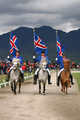
Prideby djonsonComment: Oh gosh this is gorgous, a bit to much foreground for my taste but still very nice job! love the brilliant colors and the gorgous horses! |
| Photographer found comment helpful. |
| 07/04/2006 08:19:14 PM |
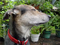
Turn your head and coughby CamComment: AWWW how sweet! i think this really would have been much nicer without the distraction of the background items and the big bulky collar, otherwise beautiful capture and framing of this cute dog. |
| Photographer found comment helpful. |
| 07/04/2006 08:16:33 PM |
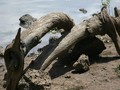
Twistedby PDavisComment: Your lighting was a bit hot, and, possibly washed away details that would otherwise have shown up more in the aged wood.
very nice composition though and very well focused and well framed in. |
| Photographer found comment helpful. |
| 07/04/2006 08:15:45 PM |
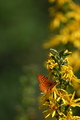
Smorgasbordby cpanaiotiComment: There is to much empty space at the top, i would have aimed so that there was not so much vastness, and, a bit closer up to butterfly, the eye does not go right to the butterfly and flower, but still very nicely done. |
| Photographer found comment helpful. |
| 07/04/2006 08:14:50 PM |
count the rings...by BeeGeeComment: i think this is fabulous, i just think the lighting is a tad hot washing out some of the color, just barely, but still very nicely composed and well executed. |
| Photographer found comment helpful. |
Home -
Challenges -
Community -
League -
Photos -
Cameras -
Lenses -
Learn -
Help -
Terms of Use -
Privacy -
Top ^
DPChallenge, and website content and design, Copyright © 2001-2025 Challenging Technologies, LLC.
All digital photo copyrights belong to the photographers and may not be used without permission.
Current Server Time: 08/04/2025 02:55:05 PM EDT.