| Image |
Comment |
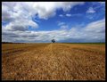
| 07/17/2011 10:13:36 PM |
Lonelyby Kevin_FlynnComment: I really like the leading lines in both the sky and field. The single tree dead center works very well! ETA: back to bump to 9. |
 Photographer found comment helpful. Photographer found comment helpful. |
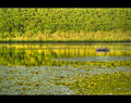
| 07/17/2011 10:13:21 PM |
lessons of life by vikasComment: I love the reflections, deep DOF, and composition. And the colors are wonderful. Back to bump up to a 9. |
| Photographer found comment helpful. |
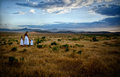
| 07/17/2011 10:12:26 PM |
|
| Photographer found comment helpful. |
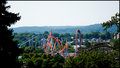
| 07/17/2011 10:10:44 PM |
Rollercoastersby NikonJebComment: I think I'd like this better cropped down to eliminate most of the washed out sky. |
| Photographer found comment helpful. |
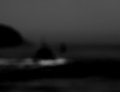
| 07/17/2011 10:07:54 PM |
out to seaby jmritzComment: This one grabbed my attention for a while. I'm left feeling like I want to know more and see more. Is that a ship with a wake, and something else in front of it? Or is that a rock with waves swirling around it, and a ship beyond it? So it leaves me feeling dissatisfied. I'd also like it to be a little brighter. But if that feeling of wanting more was your goal, you succeeded with this very unsharp, dark, moody image. |
| Photographer found comment helpful. |
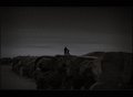
| 07/17/2011 10:04:48 PM |
Look theres a bird !by NeatComment: So ... good for you to enter this at DPC. I don't mind the grain, the low contrast, or the composition. But it's just a little too dark for my taste. I don't mean I'd make it bright, and I can see all the way to the edges, but overall it strikes me as too dark. Maybe a little more contrast would've brightened at least the center, making it easier to see the subject, while keeping the overall somber feel? |
| Photographer found comment helpful. |
| 07/17/2011 10:02:24 PM |
Peaceful Pastels by amsterdammanComment: I like the composition, but it seems tilted. I'd like it better with more contrast, too. Everything seems a little muted. |
| Photographer found comment helpful. |
| 07/17/2011 10:01:31 PM |
|
| Photographer found comment helpful. |
| 07/17/2011 09:57:08 PM |
|
| Photographer found comment helpful. |
| 07/17/2011 09:56:32 PM |
counter-sniperby sinistral_leoComment: Interesting idea. I think I would've liked it more if less of the image were black and the frame, and more were her. |
| Photographer found comment helpful. |
Home -
Challenges -
Community -
League -
Photos -
Cameras -
Lenses -
Learn -
Help -
Terms of Use -
Privacy -
Top ^
DPChallenge, and website content and design, Copyright © 2001-2025 Challenging Technologies, LLC.
All digital photo copyrights belong to the photographers and may not be used without permission.
Current Server Time: 08/27/2025 09:39:45 PM EDT.