| Image |
Comment |
| 03/07/2003 09:06:50 PM |
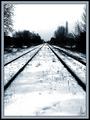
The Tracksby zadoreComment: Nive picture, but the sharpening done here is far from subtle, and although you have great leading lines, the lines lead to nowhere (3) |
 Photographer found comment helpful. Photographer found comment helpful. |
| 03/03/2003 06:30:07 AM |
Good eggby clues56Comment: Nice picture, but the background is very disturbing. (6) |
| Photographer found comment helpful. |
| 02/24/2003 03:25:17 PM |
Goodbye world.by GeocideComment: Writing a suicide note with a sharpie? God, man, at least have the decency to use a fountain pen or something else classy. :P Sorry, couldn't help myself. Good image, but it doesn't really show a sense of urgency and despair. The writing is calm and the grip of the pen is firm and calm.. Not a bad shot, though. (6) |
| Photographer found comment helpful. |
| 02/24/2003 07:46:44 AM |
Think Globallyby alanfreedComment: A good image, but the reflection on the middle of the globe makes it look as if you used a flash. Flashes are bad. Use a diffused light source, preferrably from one or more of the sides, to give it a rounder feel. Nice shot and subtle sepiatoning though. (8) |
| Photographer found comment helpful. |
| 02/24/2003 07:45:27 AM |
Reflected Roseby kandyjComment: Try to be a little bit more creative with your lighting, and make sure you get a wider tonal range than this. Also, using a longer shutter time and smaller aperture might have helped you to get it all sharp. Also try to use a good level of USM. (4) |
| Photographer found comment helpful. |
| 02/21/2003 08:17:36 AM |
Time After Timeby autoolComment: Dunno what the hell is going on here, but technically and rhythmically, this is a great shot. (9) |
| Photographer found comment helpful. |
| 02/21/2003 08:16:25 AM |
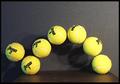
Bouncing Balls Stopped in Timeby GolferDDSComment: Except I think these balls are laying still, this is a very nice picture. One of the few depicting rhythm in any kind of way. As a detail, I would have turned over the second ball - and only let balls marked "2" show.. FOr consistency. (9) |
| Photographer found comment helpful. |
| 02/21/2003 08:10:56 AM |
|
| Photographer found comment helpful. |
| 02/03/2003 07:43:23 AM |
Craftsmanshipby AzrifelComment: Critique Club
The first thing that I noticed about this picture was the borders. They made me cringe violently for about 60 seconds. I must honestly say that I don't particularly like border to begin with, but well. if you HAVE to use borders, I would suggest using a very thin black or white border (1 pixel, perhaps?) around the picture before adding coloured borders.
When that whining is over width, I have to say I like your image. The crop on the left side leaves something to be desired, I feel, but overall the image is very good. Nice contrast, good sharpness and interesting composition. The thingies on the window overhangs are very dtailed, and they make me kind of lose focus: I would think that the intention would be to pull the attention to the "wimpeltje" (whatever that is called in English) on the spire.
I think, with the photo subject chosen, you could not have done a lot better. When that is said, I think I should probably say that I think you could have found more interesting subjects in that village.
Personally, I gave you a 5, because I couldn't quite make up my mind if I liked the image or not. strangely enough, I didn't know why then, and I don't really know why now. I'm sorry
Haje |
| Photographer found comment helpful. |
| 02/03/2003 07:28:46 AM |
Mis-matchby Fibre OptixComment: Incredble bacro, but it seems as if your lens has a few shortcomings, or that you have attempted to enlarge it a little too much, or that you have saved it with too hig compression. Especially around the edge of the unused match-head, there seems to be a lot of banding and JPG artifacts. Also, the side of the match is a bit over exposed. Despite of this, I am giving this picture a 9. |
| Photographer found comment helpful. |
Home -
Challenges -
Community -
League -
Photos -
Cameras -
Lenses -
Learn -
Help -
Terms of Use -
Privacy -
Top ^
DPChallenge, and website content and design, Copyright © 2001-2025 Challenging Technologies, LLC.
All digital photo copyrights belong to the photographers and may not be used without permission.
Current Server Time: 08/20/2025 04:32:30 AM EDT.