| Image |
Comment |
| 05/21/2003 11:01:53 AM |
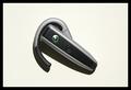
The Matrix - A Wireless Worldby ChezComment: I dont seem to know what that is, but that could be a good thing. It looks futuristic, and the colors/curves are appealing. It's simple and clean. The shadows add something too. Only negatives are the two 'spots' - one in the top right and the other just below the curve. And the background white seems a little dull. |
 Photographer found comment helpful. Photographer found comment helpful. |
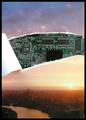
| 05/21/2003 10:58:08 AM |
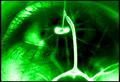
The Hungerby TarbiniComment: This is a great futuristic-style image. If the 'lightning' is real then I'm suitably impressed as it really gives the image a spark (no pun intended!). I'm curious to know what and how it was done, though. |
| Photographer found comment helpful. |
| 05/21/2003 10:46:26 AM |
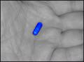
Why, Oh Why...by rickhd13Comment: The concept is a little predictable, but out of all the 'pill' images this one is by far the best. It's simple, the choice of a b&w hand with the very vibrant blue pill has impact. The central composition of the pill makes it demand your attention. |
| Photographer found comment helpful. |
| 05/21/2003 10:42:42 AM |
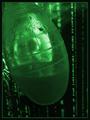
Human Podby CLarson557Comment: Original and creative. I'm not sure what it is, but I certainly see the connection to the matrix. There seems to have been time and thought put into the image. The placement of the 'pod' is good, and of course the background works. The pod does seem a little blurry, but I think it works within this image. The visualization is what sticks out. The message and the impact comes across just great. |
| Photographer found comment helpful. |
| 05/21/2003 10:36:58 AM |
You think that's air you're breathing now? by e301Comment: It's original and creative - I like it. The choice of image you used makes the concept work really well. It's very thought-provoking and deep. It certainly meets the challenge. |
| Photographer found comment helpful. |
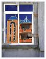
| 05/19/2003 06:04:08 PM |
New house on the blockby JeanComment: The blue/orange building appears interesting just from the shape of it, but presented and framed in this window with the gray walls/shutters it really makes it stand out. The image is very sharp and I love the color of the sky. The only downside is the reflection(s) at the top of the window, and the other 'ghost' reflection by the staircase. |
| Photographer found comment helpful. |
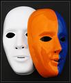
| 05/19/2003 05:53:42 PM |
Mask paradeby AnastasiaComment: I like how the base white mask is there as well as the painted one instead of just having the painted one. I'm not too crazy about the reflections on the painted mask, I probably would have preferred shadows instead. That said, the colors are vibrant and the image very sharp and clean, and stands out well with the black background. |
| Photographer found comment helpful. |
| 05/19/2003 05:50:35 PM |
Spooning Candiesby BigSmilesComment: Interesting idea, although if I recall correctly there was an entry similar to this in the candy challenge. The two candies here look quite snug, but I think the blue one is slightly of focus, especially near the top. |
| Photographer found comment helpful. |
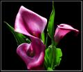
| 05/19/2003 05:43:27 PM |
Morning Lightby falveyComment: Wow, vibrant colors, although a little tinged on the pink/purple side than red to me. The lighting really brings out the depth of the image, and the shadows add just enough mood to make it appealing to me. If I were to be very picky and want to change anything it would be the top of the leaf peeking up from the bottom and a little bit more light on the tip of the right flower. |
| Photographer found comment helpful. |
| 05/19/2003 05:36:55 PM |
Simple Beautyby GolferDDSComment: The title is very true. I dont normally like large borders, but with this image I think it works well. The composition is clean and simple, the lighting looks good. The only real problems I have is the strange 'outline' effect toward the bottom of the vase, and the possibly creases of the background cloth, most noticeably on the right hand side. It's likely a monitor calibration thing, but it's a little distracting on this monitor. |
| Photographer found comment helpful. |
Home -
Challenges -
Community -
League -
Photos -
Cameras -
Lenses -
Learn -
Help -
Terms of Use -
Privacy -
Top ^
DPChallenge, and website content and design, Copyright © 2001-2025 Challenging Technologies, LLC.
All digital photo copyrights belong to the photographers and may not be used without permission.
Current Server Time: 07/31/2025 06:21:24 PM EDT.