| Image |
Comment |
| 08/27/2003 10:45:39 AM |
Rough Cutby crabappl3Comment: The warm tones really make this image. It's an abstract so I'm not sure what it is, but the jagged lines along with the title at least hints at some sort of cutting tool. The lighting is really good, adding to the warm tones to make a very appealing image. The textures and level of DOF is really good too, with the subtle shadow on the blade a nice touch. Not a stereotypical image for this challenge, but a nice refreshing one! |
 Photographer found comment helpful. Photographer found comment helpful. |
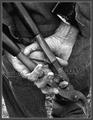
| 08/27/2003 10:40:23 AM |
Used tools by jjbeguinComment: Giving the tool a human element is a nice touch and adds more character to it. The choice of toning is also good and adds to that mood and character. At first glance the hands seem to be the focus, probably because they are more center and lighter, but hands are in themselves a tool and so it blends well. The only thing I'm not too keen on appears to be a DOF(?) issue on his lower right leg. The blur is a little distracting and it also affects the head of the tool. |
| Photographer found comment helpful. |
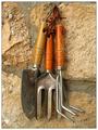
| 08/27/2003 10:35:53 AM |
Family portraitby swaroskjiComment: This is quite a simple idea and yet it is very appealing. i like the contrast between the tools and the brick. The title really adds a 'cute' feel to it, which is complimented with the 'bunching' of the tools too. Not sure I see anything here to improve on. Great shot! |
| Photographer found comment helpful. |
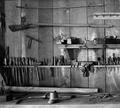
| 08/27/2003 09:36:48 AM |
Gunsmith Toolsby bobgaitherComment: I'm partial to black and white images, but this is also a great shot! There is certainly an age to it, it almost has a gritty feel. It's not supersharp, but I dont think that distracts too much, it's more of a mood thing. I like the fact that you included some of the front of the table to partly frame and actually make it seen that it's a table, so many people would have cropped that out. I find it interesting to look around and single out a few of the tools - the old rifle, what appears to be a tin mug - they all blend together as a collection well, but they also let you explore inside the image too, which to me gives it more value than something that can be admired in two seconds. The contrast, which is so important with B&W is great. |
| Photographer found comment helpful. |
| 08/27/2003 09:28:26 AM |
'Lil prickby zerocusaComment: I dont really care for the title as the tone of it seems contrary to the actual image, that said, I'm sure it was intended to jest. It's a great macro, lots of vibrant color, and the textures are good. Shame you couldnt have gotten them touching all the way instead of the little white area near the top. Your border choice is good and compliments the image well. |
| Photographer found comment helpful. |
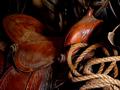
| 08/27/2003 09:23:04 AM |
Cowboy's Toolsby gingerbakerComment: This is great, and I'm glad you decided to keep it in color. The lighting is great, and the contrast between the leather(?) and the rope is nice. The only one negative is the harsh shadow that seems to fall directly down the middle and cut the saddle into half, I think it loses some flow there. Perhaps moving a little to your left may have helped that. Overal it's a great image, and certainly stands out as being different for this challenge. |
| Photographer found comment helpful. |
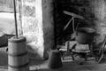
| 08/27/2003 09:19:24 AM |
Toolsby tattoorlgComment: This is a nice set of tools, different from the norm, and ones that tell a story. The choice of black and white is good, it adds to the age that seems to come from the tools. A few things that I'm noticing that could possibly improve the shot - there are several items that are either distracting with the current crop or else cropped out. The basket on the left, the shovel on the right, and the two prongs on the upper left all could have helped by not being there. The bottom of the urn is cropped too tight, and although it is likely straight, the bands around it is giving off the illusion of being slightly tilted. I'm not sure what your setup was like, but I think had you taken the shot with more ground before the urn and cut off the top just past the 'hook thing with the cauldron' or even going portrait it would have had a more dramatic feel. Overall, I do like the mood conveyed. |
| Photographer found comment helpful. |
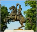
| 08/25/2003 01:20:19 AM |
"Old Hickory", Andrew Jacksonby DougPazComment: Wow, the detail on this is quite amazing. It's very clear, sharp, and intricate! It's a center placement, but it looks good, nicely framed on either side by the trees. The colors are very vibrant, and the slight glow on the statue itself is good, although had it been a little more widespread and really shone it may have been even better. I like the fact that you used a part of the base too instead of just cropping the statue. Wonderful image. |
| Photographer found comment helpful. |
| 08/25/2003 01:17:24 AM |
monument to freedom by magnetic9999Comment: Compositionally this is great, the image is very appealing, and I love the warm tones. Architecture and nature combined in a wonderful harmony. The only negative is something you likely couldnt control and is more of an observance than a noted flaw, but it's a shame you couldnt have obscured the lights behind the trees. |
| Photographer found comment helpful. |
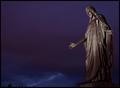
| 08/25/2003 01:09:03 AM |
Come To Meby heidaComment: The deep color in the sky really makes this image, I think. The drama of the sky added to the statue's pose and having him seemingly look at the tops of the trees all nicely tie together well. |
| Photographer found comment helpful. |
Home -
Challenges -
Community -
League -
Photos -
Cameras -
Lenses -
Learn -
Help -
Terms of Use -
Privacy -
Top ^
DPChallenge, and website content and design, Copyright © 2001-2025 Challenging Technologies, LLC.
All digital photo copyrights belong to the photographers and may not be used without permission.
Current Server Time: 08/04/2025 11:11:34 AM EDT.