| Image |
Comment |
| 04/19/2005 12:43:50 AM |
Spring Is Here!!by rexComment: I'm partly wondering if you boosted the green color as the flower seems to have a slight green cast. The details are good, not too soft, but could do with a little more breathing room on the left hand side. |
 Photographer found comment helpful. Photographer found comment helpful. |
| 04/19/2005 12:39:25 AM |
Mourning in St. Peter's Square - The Night John Paul II Passed Awayby sammy_stecchinoComment: The focus seems to be a little off, more than likely due to the low light conditions. There is also a section on the right side that is a different color (gray) to the rest of the image and so stands out as a slight distraction. A crop on the right to remove the area could possibly help. Additionally cropping out a lot of the negative space at the top would put more emphasis back on the pope's image. |
| Photographer found comment helpful. |
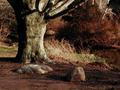
| 04/19/2005 12:20:23 AM |
Aurora Arborealisby OlyuziComment: The colors almost depict an autumn/fall foliage. The contrast is good and adds a more dramatic mood to the shot. I'm not sure if it is the influence of the riverbank but it looks like it could do with a slight rotation. |
| Photographer found comment helpful. |
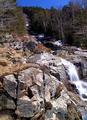
| 04/19/2005 12:18:09 AM |
Spring Snowmeltby mfairbanksComment: The first thing I think of when I look at this is that it was taken in very harsh, probably noontime, lighting. The lighting doesnt really help the mood much for this setting. The assumed focal point seems to be the waterfall but due to the position in the image it is quite a secondary element. The real focal point seems to be the foreground rocks, but they dont really hold too much interest. The color of the sky also seems to not be natural to the lighting in the rest of the image and so it stands out more than it should. It is cliche but putting more emphasis and possibly a closer composition of the waterfall would be more favorable of an image. |
| Photographer found comment helpful. |
| 04/10/2005 11:55:39 PM |
Caught in the Actby bledfordComment: That one ear up in the air is so cute! I've seen this scene quite a number of times myself. This is a good environmental portrait and shows quite a bit of personality. Good lighting, exposure, and colors. Cute shot! |
| Photographer found comment helpful. |
| 04/10/2005 11:54:10 PM |
Inquisitive Aussiesby clarmoreComment: This almost looks like a painting. Wonderful effect with lighting and the blend of foreground/backdrop. Excellent image! |
| Photographer found comment helpful. |
| 04/10/2005 11:36:22 PM |
Minnieby michael_pComment: Awww a yorkie! Contrast is good especially with the green grass. A few blown hotspots and the face is a little dark because of the direction of light. The thing that sticks out the most is what seems to be a bad blurring issue on the rear right leg. It really looks quite odd. |
| Photographer found comment helpful. |
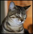
| 04/10/2005 09:32:14 PM |
Jamaica Dreams of Summertimeby gilesletherenComment: Good composition and focus. I like the warm tones in the background but wish it could have stretched the entire length of it. The eyes are usually the big draw with cats and so it's interesting to see this one with the eyes not visible. Seems a little noisy but not distractingly so. |
| Photographer found comment helpful. |
| 04/10/2005 09:29:12 PM |
That Faceby massuloComment: I like the monochromatic tone of the image as well as the depth of field. The stare is very hypnotic and the eyes are nice and large. The green in the left corner isnt so much a distracting as just something I would prefer not to be there. |
| Photographer found comment helpful. |
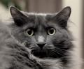
| 04/10/2005 09:17:48 PM |
Surveying His Kingdomby remarshComment: Good full frame but possibly too shallow a depth of field. The eyes seem to be the focal point but because the cat's head isnt straight-on the right eye is a little out of focus and so a little unbalancing to look at. Good lighting and color although I think the catchlight in the right eye is a little distracting due to the position. |
| Photographer found comment helpful. |
Home -
Challenges -
Community -
League -
Photos -
Cameras -
Lenses -
Learn -
Help -
Terms of Use -
Privacy -
Top ^
DPChallenge, and website content and design, Copyright © 2001-2025 Challenging Technologies, LLC.
All digital photo copyrights belong to the photographers and may not be used without permission.
Current Server Time: 07/31/2025 12:05:49 AM EDT.