| Image |
Comment |
| 03/05/2004 12:01:01 PM |
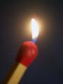
match this!by tolovemoonComment: The match seems out of focus and the flame is a little too bright, although it does have some color at the bottom of it. Good diagonal on the match. |
 Photographer found comment helpful. Photographer found comment helpful. |
| 03/05/2004 11:55:33 AM |
"Zippo - de - do Dah"by tfarrell23Comment: I like the lighting of the shot and the shadow it creates. The texture of the wood table is good also. What I dont like is the flame itself - it's rather large and mostly just a big white blob with no detail or shifts of color. The idea is fine, the set up is fine, the flame isnt fine. |
| Photographer found comment helpful. |
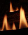
| 03/04/2004 11:01:48 PM |
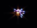
Dying Flamesby JB707Comment: Interesting idea, almost looks like a star. I personally find it a little too centered and think it would have more dramatic effect in a corner or on a third line. |
| Photographer found comment helpful. |
| 03/04/2004 07:20:10 PM |
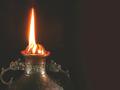
fire & guardian dragonsby kenboComment: Composition is good but the flame is a little overexposed. A slightly darker image would maybe have helped add some detail in the flame and also darkened the background some, which looks kinda streaky. Else you could have moved the lamp farther away from the background so it didnt show as much. |
| Photographer found comment helpful. |
| 03/04/2004 07:17:23 PM |
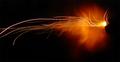
A Shot in the Darkby smittyComment: Fun shot. I like the 'plume' of orange and the streaks of light also add interest. Not sure what it is, but I dont think that really matters. Only nitpick is wishing that the streaks didnt end off the frame. |
| Photographer found comment helpful. |
| 03/04/2004 07:14:05 PM |
Gas Jetsby DiamondPeteComment: A classic shot but not quite the classic composition. Looks like a little camera shake on the bottom of the flames but I think it blends in with the whole mood of the shot. An interesting abstract. |
| Photographer found comment helpful. |
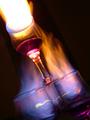
| 03/04/2004 07:12:25 PM |
almost burned down ceredigionby xburnerxComment: The eyes tend to naturally go to the brightest element in a shot and in this case it's the large white streak in the upper left corner. The diagonal tilt composition is interesting, almost looks like a rocket. I like the flames in the lower glasses, the mix of yellow/blue blends well and is pleasing to see, but the upper flame just seems like an overexposed blur that doesnt really add much due to the lact of details and a dominance of the shot. |
| Photographer found comment helpful. |
| 03/04/2004 07:09:04 PM |
W is for Warmby jrs915Comment: Having the second lick of flame in the back helps this image a lot, it gives it some depth. It is indeed a 'warm' image. |
| Photographer found comment helpful. |
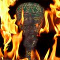
| 03/04/2004 07:07:44 PM |
by soccerdadComment: Interesting idea with mixing the mystery of the mask with the fire - gives it a somewhat mythical feel. |
| Photographer found comment helpful. |
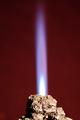
| 03/04/2004 07:06:17 PM |
Rock 'n Flameby DrakeComment: The gradient of the background is good and a nice tall flame with interesting color. There is something about the rock that I do not like, but I cant really put my finger on it. Overall it's a good shot. |
| Photographer found comment helpful. |
Home -
Challenges -
Community -
League -
Photos -
Cameras -
Lenses -
Learn -
Help -
Terms of Use -
Privacy -
Top ^
DPChallenge, and website content and design, Copyright © 2001-2025 Challenging Technologies, LLC.
All digital photo copyrights belong to the photographers and may not be used without permission.
Current Server Time: 08/09/2025 03:10:51 PM EDT.