| Image |
Comment |
| 03/24/2004 04:31:28 PM |
Dirt Track Racingby sherComment: Good composition, especially good negative space for title and blurbs. The lighting is good, as is the color, with the smoke almost acting like a leading line from right to left. If I were to say anything negative it would be maybe wanting the car a ltitle closer and a tad sharper, but it's fine as is. |
 Photographer found comment helpful. Photographer found comment helpful. |
| 03/24/2004 04:29:07 PM |
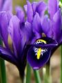
Horticultureby BAMartinComment: The focus seems to be on the top petals that received the light and the lower petal with the water drop(?) seems to be a little soft. Good composition and exposure, although I think it may be better to see it either with more or less depth of field. |
| Photographer found comment helpful. |
| 03/24/2004 04:22:55 PM |
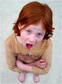
Parentingby sagestudioComment: Very vibrant hair that seems to set the tone for the image. Her expression and body language compliments the perspective that you've shot in, akin to an adult looking down at her. The eyes are nicely sharp with good catchlights. A good shot! |
| Photographer found comment helpful. |
| 03/24/2004 12:11:00 PM |
Wine Spectatorby MWittComment: Good composition and good color. Using the background to promote the potential background of the wine is nicely done and presents a story more than just a product shot. Plenty of space for title and blurbs. I'm not sure the second glass needed to be in the shot and find the rim just a tad distracting and it probably adds to the reflections in the glass. The reflections dont show or suggest anything unnatural, so that's good too! |
| Photographer found comment helpful. |
| 03/24/2004 12:07:48 PM |
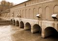
HYDRO REVIEWby fisheyeComment: First off I'm not familiar with this magazine so no idea what is normally on the cover or the subjects they write about. Secondly, the use of landscape mode, which I'm sure a magazine layout editor could still use but the composition does suggest a strong wide angle. I personally dont find much interest in the subject presented, but that's not to say that other people wouldnt either. I dont know the limitations you had while shooting, but as a suggestion - it may have been interesting to get a single tunnel/arch thingie and concentrated on that with the water coming through. |
| Photographer found comment helpful. |
| 03/24/2004 12:02:43 PM |
Dog Worldby willtataComment: Obviously the first thing to see is that it is shot in landscape mode, but I'm sure a magazine layout editor could do something with it. The image is seasonal, slightly amusing, and could cover a topic about pets in winter or similar so I could see it on the front of the magazine. It's a tad soft, and the eyes are a little dark, which is disappointing as they seem to be my main focus due to the expression. A little dodging on the eyes could bring out the catchlight a little more and make them more pronounced. |
| Photographer found comment helpful. |
| 03/24/2004 11:55:29 AM |
Railroad Enthusiastby ClubJuggleComment: Nice blue sky, fairly sharp, standard composition with plenty of room for title and blurbs. I could see this working well for a magazine cover. |
| Photographer found comment helpful. |
| 03/24/2004 11:53:57 AM |
TIMEby RonBComment: The composition and subject is certainly something you'd expect to see on a magazine, with plenty of room for the title as well. As for the image itself, I find it soft, probably as a result of being handheld. |
| Photographer found comment helpful. |
| 03/24/2004 11:51:58 AM |
Horticultureby vtruanComment: It's a good shot with nice details on the petals and stamen. Could have done with a little more contrast as a black and white image. Like I said, it's a good shot, but I think for a flower to be able to carry off black and white, especially for a magazine cover, it needs to be absolutely stunning. Black and white flowers tend to be classy and/or moody, and I would expect a lot more vibrant color from a magazine cover. As a side note, I'm not voting you down for it at all, it's merely an observation. |
| Photographer found comment helpful. |
| 03/24/2004 11:46:22 AM |
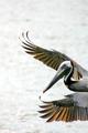
Outdoor Photographerby tyt2000Comment: It's a good shot with plenty of room for title and blurbs. Exposure and color is good on the bird, but it could have done with a tad more sharpness. |
| Photographer found comment helpful. |
Home -
Challenges -
Community -
League -
Photos -
Cameras -
Lenses -
Learn -
Help -
Terms of Use -
Privacy -
Top ^
DPChallenge, and website content and design, Copyright © 2001-2025 Challenging Technologies, LLC.
All digital photo copyrights belong to the photographers and may not be used without permission.
Current Server Time: 08/07/2025 06:57:06 AM EDT.