| Image |
Comment |
| 05/11/2004 10:15:02 AM |
Seaside Eclipseby marboComment: At first look there was a distinct 'wow' but then I also love eclipses. I like the tone of blue and the diagonal shoreline. But the more I look at it the less I'm liking the detail-less water. I'm assuming it was neatimaged to make it look smooth, but I think it's a little overdone and has taken away most of the characteristics that an ocean has. |
 Photographer found comment helpful. Photographer found comment helpful. |
| 05/10/2004 12:10:21 PM |
The Greatest Generationby blemtComment: This is quite abstract. I like the color combo of the yellowish white and the blue. I dont know if it's stars or a tread on a wheel or something completely different. The in-focus section has good clarity. I'm a big fan of shallow dof but not sure I see the benefit of having it so shallow in this shot. |
| Photographer found comment helpful. |
| 05/10/2004 12:01:20 PM |
Albany from across the Hudson Riverby Dave GordonComment: The image looks a little flat to me, possibly because of the muted colors from the overcast day. The composition is good and having the fisherman as a foreground element to the city backdrop is great. Unfortunately the image is a little soft/OOF and using USM may have helped a little. |
| Photographer found comment helpful. |
| 05/10/2004 11:49:15 AM |
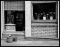
Box Lunchesby sherComment: It's very quaint and the toning is good although I'm curious about what it looks like in color. All those flowers just scream for color and life. Nicely captured. |
| Photographer found comment helpful. |
| 05/10/2004 11:45:51 AM |
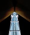
Woodlands Bridgeby Beerme425Comment: Those green circle things almost look like eyes peering down at me under covers. Probably not the image you were going for, but it looks neat to me! I like the brightness of the 'monster' and the light on the 'headpiece' and the surrounding darkness. Very cool! |
| Photographer found comment helpful. |
| 05/10/2004 01:23:42 AM |
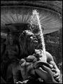
Neptuneby kellianComment: I like how it is almost like he is looking up at the light source. Interesting choice to use black and white. The water splashing and the fact that it is really hot here right now makes me want to think summery, but the black and white doesnt support that very well. I think I'm tempted to want the female over his shoulder to be less in the shadows also. It's a good capture of a fountain. |
| Photographer found comment helpful. |
| 05/10/2004 01:21:22 AM |
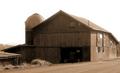
My First Barnby NeuferlandComment: Overcast skies are always unfortunate but I think it goes with the sepia tone that you've chosen. It's a good shot, but I just dont get much wow factor from it. Compositions of large buildings from up close can be difficult, and I think you likely got the best angle of it that you could. |
| Photographer found comment helpful. |
| 05/10/2004 01:19:21 AM |
14by spydrComment: Good composition and lighting, although the image seems a little soft. USM may have helped it out some. |
| Photographer found comment helpful. |
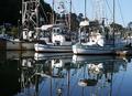
| 05/10/2004 01:17:57 AM |
Morning Harborby SusanFernComment: First thing I notice is that most of the shot is out of focus. There is a lot of clutter with the masts and not a singluar focal point. The masts are also cropped out, likely due to you trying to get the reflection in as well. Changing to a portrait format and isolating one boat may have given you less clutter and more of the whole of the boat, else stepping back some (if possible) to get more of the scene, or zooming in to get less, such as the two hulls(?) and their reflections. |
| Photographer found comment helpful. |
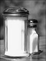
| 05/10/2004 01:14:44 AM |
Shy Saltby justineComment: The black and white is good although I think the contrast may be a little too high as the white of the taller salt shaker is a little too bright, almost blown. The toning is good and the texture of wood table and background go well with the black and white used. The perspective of the table gives it a sense of 'tilted horizon'. The overall idea of giving inanimate objects human personality is cute and of course works better with the tie-in with the title, but works well without as well. |
| Photographer found comment helpful. |
Home -
Challenges -
Community -
League -
Photos -
Cameras -
Lenses -
Learn -
Help -
Terms of Use -
Privacy -
Top ^
DPChallenge, and website content and design, Copyright © 2001-2025 Challenging Technologies, LLC.
All digital photo copyrights belong to the photographers and may not be used without permission.
Current Server Time: 08/06/2025 09:25:57 AM EDT.