| Image |
Comment |
| 08/02/2004 12:45:54 AM |
Until I Turn Blueby SkipComment: The blue is subtle but works. Love the air bubbles, I think that really makes the image for me. No idea how much control you had on this shot, but in a perfect world I'd love to see the blue tiled line go diagonally across the frame and also have her almost mirroring the line with an elongated body instead of her current pose. The light patterns on the bottom of the pool is neat. |
 Photographer found comment helpful. Photographer found comment helpful. |
| 08/02/2004 12:41:00 AM |
In my Elementby shangri_La_gypsyComment: I like the color and the depth of field. The focus on the element is great, although the OOF on the black bit is a little distracting. Like the way the light reflects and clings to the transparent item too. A tad more negative space on the left so the item isnt on the edge/cropped would have been preferred. |
| Photographer found comment helpful. |
| 08/02/2004 12:38:33 AM |
|
| Photographer found comment helpful. |
| 07/28/2004 06:56:27 PM |
Untitled - Mutedby jenesisComment: I think it works well for this image. The muted colors give it a hand-tinted color and feel that makes it look like it could have been taken any time in the last 50 years. |
| Photographer found comment helpful. |
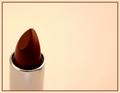
| 07/28/2004 12:15:56 PM |
Lipstickby Faye PekasComment: The first thing I think is 'wrong white balance' due to the white background having a significant yellow cast. It's actually fairly complimentary to the warm red of the lipstick but I guess the photographer in me keeps thinking 'wrong white balance'. The light on the rim of the holder is good and it is also nicely sharp there, but the actual lipstick seems a little soft or slightly out of focus. It has also a slight perspective tilt that makes it appear a little non-straight. I like the use of negative space and the composition is good. |
| Photographer found comment helpful. |
| 07/28/2004 11:52:10 AM |
Common Wine Glassby DCThiessenComment: Wow, bright and trippy! The reflection in the glass is good. You also did a great job with the lighting to get just the rim and edges lit with no badly distracting light reflections. The background is certainly bright and funky, personally find it a little too vibrant but that may just be my current mood, certainly not a bad thing, just a preference. |
| Photographer found comment helpful. |
| 07/28/2004 11:49:47 AM |
Black eyed sueby TLL061Comment: I dont really consider these everyday objects, unless they are plastic, but then again they are not totally out of the realm of meeting the challenge either. The composition and depth of field is good. It looks a tad underexposed but any brighter and you'd be running the risk of blowing the highlights. It does have a nice warmth to it. |
| Photographer found comment helpful. |
| 07/28/2004 11:44:02 AM |
A Shave A Dayby arbil14Comment: The background could have been a little brighter but it's not bad. The diagonal composition is good. Unfortunately the focus is a little off. |
| Photographer found comment helpful. |
| 07/28/2004 11:00:16 AM |
Fair Sunsetby BobsterLobsterComment: This is probably my favorite of the bunch. Very typical shot, but that doesnt mean it doesnt have its own unique flair. The gradient sunset sky is great, the action silhouettes are fun and the epitome of fairs. The only personal suggestion would be to clone out the bush on the right and the light fixture beside the sign as they dont really add much and I think having negative space there instead would strengthen the impact. |
| Photographer found comment helpful. |
| 07/28/2004 10:45:15 AM |
Time for a shine?by agrimaceComment: I think shining is beyond them. Shame you didnt have a pair of black dress shoes to go with the old-looking shine box. That said, perhaps you were going for the out of place type shot. Personal preference, but I probably would have liked to have seen the box in the foreground with its detail and texture and slightly OOF shoes in the background. I think that's mostly because the shoes dont hold much interest as they have no real interest or appeal or mood. Your shot isnt bad, I just dont think it holds much appeal, mood, or impact as is. |
| Photographer found comment helpful. |
Home -
Challenges -
Community -
League -
Photos -
Cameras -
Lenses -
Learn -
Help -
Terms of Use -
Privacy -
Top ^
DPChallenge, and website content and design, Copyright © 2001-2025 Challenging Technologies, LLC.
All digital photo copyrights belong to the photographers and may not be used without permission.
Current Server Time: 08/04/2025 02:49:19 PM EDT.