| Image |
Comment |
| 08/02/2004 01:48:01 AM |
authentic blueby GinaRothfelsComment: The texture and color of the jeans is good and the golden button compliments it well. The composition is simple but effective. Good shot. |
 Photographer found comment helpful. Photographer found comment helpful. |
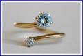
| 08/02/2004 01:47:11 AM |
blue diamond ??by gaurawaComment: The background looks like it could probably do with being a little brighter but the light on the ring isnt bad. The light reflection on the left is a little distracting but the streak on the right seems fine. The colors are fairly muted and lack impact - jewelry photography is usually very bright and flashy. |
| Photographer found comment helpful. |
| 08/02/2004 01:11:28 AM |
Mountain Gatewayby blemtComment: Composition and natural framing is good as is the layers of the grass and the mountain between the rocks. The light looks a little harsh and even but the color is good and complimentary to the blue sky. |
| Photographer found comment helpful. |
| 08/02/2004 01:06:29 AM |
Blue Fireby pmichaudComment: The centered composition works for this image and I like the subtle color of the blue. Exposure looks good too. Doesnt really have the 'wow' to it but it's a good shot. |
| Photographer found comment helpful. |
| 08/02/2004 01:04:59 AM |
First Kissby ruffianComment: Ceramics are quite difficult to photograph because of the light. You've done a fairly good job keeping down the reflections and the ones still present arent that distracting. The background is blurred nicely and doesnt detract from the foreground elements. Another problem with ceramics is getting it so the image doesnt look out of focus. The edges look fairly sharp but the details are not really there and so it suffers from looking like it is OOF. |
| Photographer found comment helpful. |
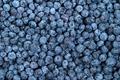
| 08/02/2004 01:01:26 AM |
Freshly Pickedby magnusComment: The main problem I have with this shot is there isnt any particular focal point. It has the repeated pattern and the abstract feel but it doesnt really require much thought or time spent looking at it. There is nothing to lead the eye around the image, nor is there anything for the eye to rest on. In images like this it is usually good to change something or add an element to make it a little more interesting. That said, the color is good, lighting isnt bad, and it looks fairly sharp. |
| Photographer found comment helpful. |
| 08/02/2004 12:58:47 AM |
Blue Torsoby wlevyComment: I get a very disjointed feeling looking at this. The torso crop is fairly odd. I do like the curve on the left but it leads up to an armpit that isnt particularly appealing. The background is also a little distracting as it isnt a solid color. I like the color of the shirt, and the torso looks in pretty good shape, but I think a better pose would have helped a lot more. |
| Photographer found comment helpful. |
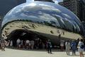
| 08/02/2004 12:55:40 AM |
Portal to the Blue Planetby flip89Comment: It's that sphere again! This does look very futuristic and has its own fisheye effect too. The skyline reflection is good and of course the blue skies and nice fluffy clouds are too. The people make it a little snapshotty but not necessarily in a bad way. The reflection of the people looks neat. |
| Photographer found comment helpful. |
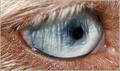
| 08/02/2004 12:52:56 AM |
Aussie Bluesby garrywhite2Comment: How totally unusual. I'm guessing this isnt human but I have no idea and I actually like that aspect of it. The blonde hairs contrasts nicely with the subtle blue of the eye and the relection of the eyelashes in the eye is good too. The unusual pupil makes it that more interesting. I cant wait to find out what this actually is. Very neat shot. |
| Photographer found comment helpful. |
| 08/02/2004 12:47:16 AM |
bludolphby byoungComment: I like the 'water' and background color, it's very funky and stands out. The creature is very cute, good color, no light reflections, and is nicely sharp. The light flare just above his/her head almost looks like thought bubbles. Composition is good too. I like it, it's cute and quirky. |
| Photographer found comment helpful. |
Home -
Challenges -
Community -
League -
Photos -
Cameras -
Lenses -
Learn -
Help -
Terms of Use -
Privacy -
Top ^
DPChallenge, and website content and design, Copyright © 2001-2025 Challenging Technologies, LLC.
All digital photo copyrights belong to the photographers and may not be used without permission.
Current Server Time: 08/04/2025 02:38:53 PM EDT.