|
|
|
Showing 1801 - 1810 of ~3000 |
| Image |
Comment |
| 06/08/2006 01:45:48 AM | Polythene Pamby AghrisComment: ::: Greetings from Critique Club :::
Hi, as requested, here is an indepth critique of your submission.
First Impression - the most important one:
Neat shot and I like the plastic look you seem to have been trying to achieve. She doesn't look much like a man though ;-)
Composition:
I like the square crop, but I think I want to see it a little less tight. It's sorta feeling crowded the way it is.
Subject:
Clear, in your face and works well.
Technical (Color, focus, and light):
Color: A bit warm for my tastes, but not overly distracting.
Focus: Focus looks sharp, but perhaps could stand a little more USM in post.
Light: I like it, it works well for you, other than beinga bit warm.
To grow its vote?:
I'm sure you got voted down a bit for the Neat Image, overprocessing. Not really anyway around that with what you were trying to do. That's more the fault of the voters. Colling the WB might have helped some as would a bit less crowded composition.
Summary:
Cool shot, shows creativity.
Hope to see more from you soon,
Leroy |  Photographer found comment helpful. Photographer found comment helpful. |
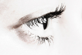
| 06/07/2006 08:04:50 PM | Sightby sigrun_thComment: ::: Greetings from Critique Club :::
Hi, as requested, here is an indepth critique of your submission.
First Impression - the most important one:
Nice hi-key shot. I like it.
Composition:
I'd like to see a bit more negative space in this image. Loosen the crop some and move the eye to a stronger part of the composition.
Subject:
It's an eye. It's right there. Can't miss it :-)
Technical (Color, focus, and light):
Color and focus look good.
Light is nice. I'd like to see it about a half a stop more to completely blow the highlights on the forehead.
To grow its vote?:
Clumps in the eyelashes stand out to me. I'm no makeup artist, so I don't know how to fix that. Also, I think the eye-liner could be darker.
Summary:
Cool shot, very punchy. Good work.
Hope to see more from you soon,
Leroy | | Photographer found comment helpful. |
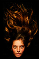
| 06/07/2006 07:19:32 PM | Golden Light, Golden Girlby talikfComment: ::: Greetings from Critique Club :::
Hi, as requested, here is an indepth critique of your submission.
First Impression - the most important one:
Nice hair :-) I really like this shot. Nice detail in the hair and the angle makes it look wild. Almost like the hair is a flame.
Composition:
Works well. I love that the face is located at the very bottom of the photo. The hair leads my eye to it.
Subject:
clear, stands out well with nice detail.
Technical (Color, focus, and light):
Color: Nice warm tone to it. I'm sure the 500 watt (probably halogen) light source helped with that.
Focus is sharp, looks nice. I do see some details in the hair that looks like you may have over-sharpened in post or perhaps it's jpeg compression artifacts.
Light: nicely done.
To grow its vote?:
Nudity? Really, I'm not sure how to grow the vote on this one.
Summary:
Awesome shot, nice finish. Congrats.
Hope to see more from you soon,
Leroy | | Photographer found comment helpful. |
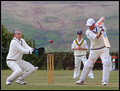
| 06/07/2006 05:28:41 PM | "Did I hear you say that there must be a catch?"by KHoltComment: ::: Greetings from Critique Club :::
Hi, as requested, here is an indepth critique of your submission.
First Impression - the most important one:
Nice action capture. Title works for the challenge.
Composition:
It's decent. The main subjects are in good positions to make them points of interest.
Subject:
Subject is clearly the man trying to make the catch. So you defined him well.
Technical (Color, focus, and light):
All excellent.
To grow its vote?:
Convince DPC voters that not all good photography has to be over-processed and dramaticly grungy :-)
Summary:
I really like your shot. Nice entry for this challenge.
Hope to see more from you soon,
Leroy | | Photographer found comment helpful. |
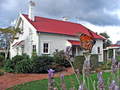
| 06/07/2006 04:37:26 PM | When I Get Homeby dx_powerComment: ::: Greetings from Critique Club :::
Hi, as requested, here is an indepth critique of your submission.
First Impression - the most important one:
Very nice shot. Unfortunate that the butterfly isn't in focus. But that would be almost impossible seeing that it is so close to the camera.
Composition:
It's decent. The chimney is crowding the top of the frame a bit and the satelite dish to the right kinda hurts the feeling of the photo.
Subject:
I'm having a hard time deciding if the subject is the building or the butterfly. In either case, I think I'd rather the butterfly be in focus than the building.
Technical (Color, focus, and light):
All good.
To grow its vote?:
I really think the focus is n the wrong subject. Had they been inverted this photo would have scored much higher IMO.
Summary:
Lovely shot overall. Good work and nice capture.
Hope to see more from you soon,
Leroy | | Photographer found comment helpful. |
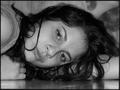
| 06/07/2006 04:21:11 PM | Another Girlby Shea927Comment: ::: Greetings from Critique Club :::
Hi, as requested, here is an indepth critique of your submission.
First Impression - the most important one:
Comes across as being a processed snapshot to me. Title seems to shoehorn the photo into the challenge.
Composition:
It's ok for a portrait. But it lacks any real pop to make it artistically sound. Also, the unmanaged hair isn't framing the face well.
Subject:
Clear and stands out well from the background.
Technical (Color, focus, and light):
Color: The B&W treatment is a bit flat. A curves adjustment to add more midtone contrast would help quite a bit.
Focus: sharp, looks nice.
Light: A little flat, also there is a hot spot on the end of her nose and above her eye that are a bit distracting.
To grow its vote?:
Lucky kinda summed up what most voters probably thought when voting. Overall, it comes across as a snapshot.
Summary:
Nice photo of your friend, I'm sure she will like it. And, it's a keeper for that reason. It just didn't work well for this challenge.
Hope to see more from you soon,
Leroy | | Photographer found comment helpful. |
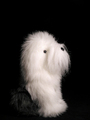
| 06/07/2006 04:12:17 PM | Did you say walkies?by joynimComment: ::: Greetings from Critique Club :::
Hi, as requested, here is an indepth critique of your submission.
First Impression - the most important one:
Interesting enough, I saw the thread about this photo earlier and was going to comment before I got distracted. Well, here I go :-) Lovely lighting and cute pooch, but crop seems a bit tight.
Composition:
I'd like to see this shot less tight. I really think that minimalizing the dog against more black background would have strengthened this shot immensely.
Subject:
Clear and stands out well against the black b/g.
Technical (Color, focus, and light):
All good on the technical side. I think the lighting is excellent, excepts for one hot spot above the eye.
To grow its vote?:
Strengthen the composition some. Ofcourse there are also voters that HATE dog shots, I can't help you with them :-( I think it's cute.
Summary:
Lovely shot of a cute poochie.
Hope to see more from you soon,
Leroy | | Photographer found comment helpful. |
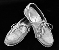
| 06/07/2006 03:50:35 PM | There's a chance that we may fall apart before too longby LenaComment: ::: Greetings from Critique Club :::
Hi, as requested, here is an indepth critique of your submission.
First Impression - the most important one:
Not bad, especially for your first entry. I really have to kind of dig to make a link between the photo, the title and the challenge.
Composition:
ehh, more of a product shot type composition, nothing particularly bold about it. I think use of negative space would have helped you out a lot here. Hey, don't worry, I do these types of comps all the time, sometimes they wrok :-)
Subject:
the subject is thre, clearly defined, no missing it.
Technical (Color, focus, and light):
Color: I like the grey-scale application you've used. Works well. I'd like to see this photo sepia-toned, just to see how that might affect it.
Focus is sharp: well done.
Lighting: I'm not sure you needed that center light. It is probably the light that is creating a few hot spots around the photo.
To grow its vote?:
Bolder composition would help. A stronger link to the challenge that doesn't lean on the title usually goes a long way.
Summary:
Nice shot and score for your first entry here. Keep up the good work. Cheers.
Hope to see more from you soon,
Leroy | | Photographer found comment helpful. |
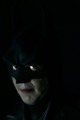
| 06/07/2006 03:43:23 PM | Prince of Darknessby rameviComment: ::: Greetings from Critique Club :::
Hi, as requested, here is an indepth critique of your submission.
First Impression - the most important one:
Fun concept, but lighting comes across as a bit on the green side.
Composition:
I appreciate the use of negative space, but I think it should be in front of the subject rather than behind the subject.
Subject:
Clear in your face composition, subject is well defined by the lightsource.
Technical (Color, focus, and light):
Color: As mentioned earlier it seems a bit on the green side.
Focus looks sharp.
Light: Very good, it illuminates just what you wanted illuminated.
To grow its vote?:
A little stronger composition would have helped some. Not sure a "batman" theme would score real high in most challenges though.
Summary:
I like it. It's fun and nicely done. Keep up the good work.
Hope to see more from you soon,
Leroy | | Photographer found comment helpful. |
| 06/07/2006 03:25:00 PM | | | Photographer found comment helpful. |
|
Showing 1801 - 1810 of ~3000 |
Home -
Challenges -
Community -
League -
Photos -
Cameras -
Lenses -
Learn -
Help -
Terms of Use -
Privacy -
Top ^
DPChallenge, and website content and design, Copyright © 2001-2025 Challenging Technologies, LLC.
All digital photo copyrights belong to the photographers and may not be used without permission.
Current Server Time: 06/27/2025 11:01:07 AM EDT.
|