|
|
|
Showing 761 - 770 of ~2723 |
| Image |
Comment |
| 11/14/2008 10:37:15 PM | SAM The Record Man - We will miss youby Shutter-For-HireComment: Hello from Critique Club :)
First impression is good. I like the sharpness, color... composition, although I wish you had stepped to your right a little more to make other lines on the other turntable more visible. With that angle, second one looks a bit bright.
Technically very nice exposed photo. Even with all that city movement, you captured pretty fast shutter speed somehow. Fisheye is a very good choice of lens for this shot, very well composed as I said, the angle of the road is just right. I like the way other side looks, very clear up to the girl on the billboard :)
I would give 6+ maybe around 6.3, 6.5 to this photo. Don't make your judgment with 5.5, I think it's a very low score for this picture.
I checked your photos. You are very creative photographer. More of a story teller than artistic way.. Keep up the good work.
Good luck :)
Leo |  Photographer found comment helpful. Photographer found comment helpful. |
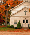
| 11/13/2008 10:46:37 PM | Morris Chapelby Ja-9Comment: Hello from Critique Club :)
Let me start saying, nice photo... Colors are giving the "wow" thing when I see it first time. Why this photo didn't do better? Let's analyze,
Paint on the building, some of the panels are whiter than others, the top roof is cut off a little. I think there is too much road on the bottom. Colors are good, could be bit sharper and cropped a bit more. Also if you did stepped to your right more, you could get rid of the wire pole top of the first roof.
You did capture the colors though, very bright and nice. If technically be better, you probably could get around 5.5 or 5.8 for this one :/
I checked your photos, for a first challenge, very nice. Mine was around 4 :/ also, I see you are trying to develop a better photographer's eye, just make sure the backgrounds will be jumk free... and keep them tight and clean :) of course I am talking about your photos LOL.
Good luck
Leo | | Photographer found comment helpful. |
| 11/12/2008 10:41:53 PM | The little girl with her hand to her mouthby danielvComment: Hello from critique Club :)
Gosh... I am a studio photographer myself, and this is a 99.99% perfection for a children portrait. (Technical) One light, good exposed and composed photo. Details are very nice including the catch lights in her eyes. Her impression... I don't see absolutely anything wrong with this photo, other than a bit low contrast, and could be a bit sharper, but it could be the lens, not your camera necessarily... I don't know what else to say. The shadows are perfect.
Gosh, this is the kind of photo you see in magazines, and I don't get that much impressed this easily.
I am sorry, nothing bad to say about this, (Personal)I checked your photos and you do know your thing. Keep up the good work. If you need a negative criticism(!) I think you should ask again for someone else to look at this photo, because I can't find anything wrong with it... I am so so sorry... you are good LOL
A 6.8, 6.9 photo for me.
Leo
| | Photographer found comment helpful. |
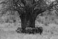
| 11/12/2008 10:09:37 PM | Ancient Shelterby scooter88Comment: Hello from Critique Club ;)
(Composition)This is a remarkable photo. I love the composition, the way you put everything in the middle. Tree and the elephants look very nice together... You were lucky there is no other elephant broken up from the group, so they kind of look like tree's root... or it looks like they are carrying the tree around, pushing it around.
(Technical)In my opinion if you would do a bit tighter cropping and give bit more contrast, you probably could get better votes. I also wouldn't mind to see a border, probably a thin white border, but that is totally me :)
(Personal)I checked your photos... Needlessly say you know what you're doing, so keep it up :)
Leo | | Photographer found comment helpful. |
| 11/12/2008 09:15:06 PM | UPSIDE DOWNby taylorpageComment: Hello from Critique Club,
(Composition) Your composition is pretty good. I like the way you have negative space there with rule of thirds... the blue color that covers the top of the image... Idea is good and well executed. I am not sure you were planning to use this photo for this challenge; the tip of the boat is almost touching to the frame of your photo, that's bothering me in this whole picture. It's not bad thing, but it takes a bit attention from overall.
(Technical) Some might think the overexposed area on the bottom a bit lighter than it should, but I don't think so. It looks good too. Seems like two boat attached, or stick each other and hanging in the air via a wooden lifter or something.
(Final) If you had a bit more space between the tip of the boat and the frame, I would say you would be taking it to the "6-land"... I think the over exposed area on your photo and being to close to the frame get your votes a little downwards.
(Personal) I checked your other photos. You seem like in right direction, just need some practice and that's it :)
Keep up the good work
Leo | | Photographer found comment helpful. |
| 11/08/2008 02:09:19 AM | | | Photographer found comment helpful. |
| 10/19/2008 12:37:06 AM | | | Photographer found comment helpful. |
| 09/10/2008 10:15:05 AM | | | Photographer found comment helpful. |
| 08/21/2008 06:56:24 AM | It's a Girl! by Art RoflmaoComment: Art, I see the DPC hat increased your creativity level LOL good one. I thought this would be the blue, but that's ok. Winner lineup is pretty much a story teller :P
Congrats ;) Message edited by author 2008-08-22 15:31:15. | | Photographer found comment helpful. |
| 08/18/2008 10:47:10 AM | Clerk by IreneMComment: Irene discovered the Sweet Spot of DPC... and it's like learning how to ride bicycle... Once you learned, that's it, you never forget :P
I hate myself (again) saying this, but.... keep up the good work | | Photographer found comment helpful. |
|
Showing 761 - 770 of ~2723 |
Home -
Challenges -
Community -
League -
Photos -
Cameras -
Lenses -
Learn -
Help -
Terms of Use -
Privacy -
Top ^
DPChallenge, and website content and design, Copyright © 2001-2025 Challenging Technologies, LLC.
All digital photo copyrights belong to the photographers and may not be used without permission.
Current Server Time: 08/20/2025 08:29:56 AM EDT.
|