| Image |
Comment |
| 05/17/2004 07:12:25 AM |
In The Redby debitiptonComment: Wonderful composition and portrait. Lighting is very good. Only thing I could say to slightly widen your crop so that you don't cut off one of the red bars in the bottom right. Well done! |
 Photographer found comment helpful. Photographer found comment helpful. |
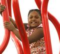
| 05/17/2004 07:09:38 AM |
Boy in playgroundby LesyaComment: Wonderful composition, but flesh tones could use some color balancing to get rid of the yellow cast. |
| Photographer found comment helpful. |
| 05/17/2004 07:07:24 AM |
Las Vegas Showgirlby dimitriiComment: I like the contrasts of flesh and rock and tones here. Also love the high grain. Though subjects pose is different and interesting, not sure what it's significance is. Minor issue is the visible tracks on the floor. This image sure leaves me thinking and returning. 9 |
| Photographer found comment helpful. |
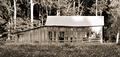
| 05/17/2004 06:47:42 AM |
Forgotten Benchby TooCoolComment: I like sepia toning and contrast. Your main subject could be more interesting and should have been more dominant in the image to meet the challenge better (as I think you already know based on your title). Composition could be improved, I feel, if you moved slightly to the left to help bring out the bench more so that it wasn't hidden behind the near bush. |
| Photographer found comment helpful. |
| 05/17/2004 06:42:07 AM |
|
| Photographer found comment helpful. |
| 05/17/2004 06:37:37 AM |
Welcome To Greektownby frychiknComment: Technically good, but suffers compositionally from distracting elements in background (bus, street lamp and sign, traffic signal and pole at top). |
| Photographer found comment helpful. |
| 05/17/2004 06:33:51 AM |
|
| Photographer found comment helpful. |
| 05/17/2004 06:22:51 AM |
Life without Greenby FalcComment: Very interesting composition with the color contrast between the gold subject and desaturated tiny leaves. Flash here is a bit too harsh, but not overly so. Well done. |
| Photographer found comment helpful. |
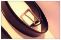
| 05/17/2004 06:18:38 AM |
Loosen up!by FotowereldComment: Love the use of the curved and diagnol lines to help center your subject. I also like the soft pastel colors of your background. At first I didn't like your subject (belt buckle) thinking it was too inconsequestial as subject, but now I find it to be a perfect style fitting with the rest of the compositon. I just wish your lighting was less harsh and would help bring out the belt buckle even more. Very creative composition. |
| Photographer found comment helpful. |
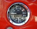
| 05/17/2004 05:56:45 AM |
Level Centreby shardyComment: Too much distracting glare in the glass and chrome of this guage. Can see your camera and hand in the reflections. |
| Photographer found comment helpful. |
Home -
Challenges -
Community -
League -
Photos -
Cameras -
Lenses -
Learn -
Help -
Terms of Use -
Privacy -
Top ^
DPChallenge, and website content and design, Copyright © 2001-2025 Challenging Technologies, LLC.
All digital photo copyrights belong to the photographers and may not be used without permission.
Current Server Time: 08/15/2025 03:04:34 PM EDT.