| Image |
Comment |
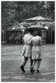
| 06/25/2007 12:45:32 AM |
The Shared Umbrella by MelethiaComment: Stunning capture and very interesting and unique image. I really like how the umbrella fits in nicely with the background gazebo and tent. I also like the contrast between the solid toned subjects and the nearly pointillistic background and foreground from the downpour. Congratulations on your ribbon. Well deserved. |
 Photographer found comment helpful. Photographer found comment helpful. |
| 06/25/2007 12:36:22 AM |
Placid by lovethelightComment: Fantastic image! Really love the color contrasts of the sky and the image is so well balanced too. Congrats on your ribbon. |
| Photographer found comment helpful. |
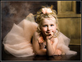
| 05/08/2007 01:23:56 AM |
Contemplation by dwterryComment: Beautiful portrait and the colors are superb. I also like how her face is the brightest. I do however think that placement of the hands could be better as her left hand blocks a good part of her lips and seems a bit awkward, and the right shows the back of her hand. Still, an exceptional image. Congratulations on your first ribbon! |
| Photographer found comment helpful. |
| 04/08/2007 01:47:08 AM |
Thought Processby WeefanComment: A very hearty congratulations, Weefan. I'm very happy to see this on the front page. This is just awesome! Looking forward to seeing more from you in the future. |
| Photographer found comment helpful. |
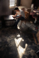
| 04/06/2007 11:36:22 AM |
Shadow Romanceby librodoComment: Composition is impeccable and I like how her headdress fills the right side of the frame. However, the image lacks punch. I think you could have brightened her eyes, espcially her right eye, her earring, and the sequence. This may have also required brigher, and more broad lighting. |
| Photographer found comment helpful. |
| 04/06/2007 10:54:21 AM |
Time for Father and Sonby karmatComment: Hightlights on the water are too distracting and can usually be eliminated by using a polarizer filter. Contrast is too high in this image. |
| Photographer found comment helpful. |
| 04/06/2007 02:05:12 AM |
reminisceby arsenalComment: Distance to subject, angle of view, and lighting are effective in conveying a sense of thinking about the past. Out of focus areas also contribute, but need some work in their implementation, imo, as they look too spotty. What the heck is that electrical cord doing dang smack in the middle of your picture???!!! Ruins the affect for me. |
| Photographer found comment helpful. |
| 04/06/2007 01:55:09 AM |
Brandyby fotomann_foreverComment: Too much dragon and along with the wide angle, distorts to become a caricature. Does your model think this is flattering? Maybe I'm wrong. |
| Photographer found comment helpful. |
| 04/06/2007 01:45:57 AM |
|
| Photographer found comment helpful. |
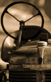
| 04/06/2007 01:40:05 AM |
Tractorby izadoodleComment: I like the vintage toning but wish the lettering weren't in focus as it detracts from the otherwise dreamy affect. |
| Photographer found comment helpful. |
Home -
Challenges -
Community -
League -
Photos -
Cameras -
Lenses -
Learn -
Help -
Terms of Use -
Privacy -
Top ^
DPChallenge, and website content and design, Copyright © 2001-2025 Challenging Technologies, LLC.
All digital photo copyrights belong to the photographers and may not be used without permission.
Current Server Time: 08/10/2025 12:41:07 PM EDT.