| Image |
Comment |
| 06/06/2010 12:58:07 AM |
|
 Photographer found comment helpful. Photographer found comment helpful. |
| 06/06/2010 12:56:34 AM |
|
| Photographer found comment helpful. |
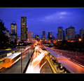
| 06/06/2010 12:54:23 AM |
Another Friday in San Franciscoby pjangelComment: Wonderful photo, just wish there was a bit more separation between subject and background. Colors are great and subject is very interesting. |
| Photographer found comment helpful. |
| 06/06/2010 12:52:50 AM |
|
| Photographer found comment helpful. |
| 06/06/2010 12:49:06 AM |
|
| Photographer found comment helpful. |
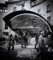
| 06/06/2010 12:46:49 AM |
Urbanityby PaulComment: Nice processing, but the composition is a bit haphazard, imo. |
| Photographer found comment helpful. |
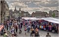
| 06/06/2010 12:45:16 AM |
Saturday Marketby ThingFishComment: I like your viewpoint. Distant enough to get a broader view, yet close enough to see faces and detail. Your photo also conveys the hustle/bustle of a market and the HDR processing is not over-the-top, although the sky is a bit more dramatic than street level so that I think you processed it
separately. Nice job, on the whole. |
| Photographer found comment helpful. |
| 06/05/2010 11:54:55 PM |
|
| Photographer found comment helpful. |
| 06/05/2010 11:54:37 PM |
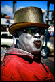
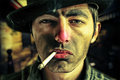
Bum a Smokeby NHzJOKERComment: Edgy and in your face. I hate him (like a bum or drunk) but a good concept that's carried out very well. I like the realism here: scruffy 5 o'clock shadow, red nose and lips (ETOH abuse), harsh and discolored street lighting, dirty and hardened facial features. There's a fear factor like you're meeting up in some backstreet alley. Quite refreshing from the milquetoast portraits, actually, but some may find this OTT and a bit too theatrical, like excessive makeup. Strange donut shaped background bokeh. Mirror lens? 9 |
| Photographer found comment helpful. |
| 06/05/2010 11:49:00 PM |
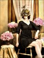
me and my peoniesby libertyComment: I love the color scheme, arrangement of props, and vintage feel to this. However, your pose looks a bit stiff, your feet are cut off at the ankles, and overall I feel it's a bit on the bright side, almost overexposed. A little cloning in darken mode to the glare on the skin, as well as, selective burning around border and corners would really make this pop, imo. Also, I think an improvement in pose would be to hook your feet under the crossbar of the chair while crossed at the ankles (feminine); and to not show the broad side of your hands, (masculine). One last issue is that there's a bit too much room at the top. 8 |
| Photographer found comment helpful. |
Home -
Challenges -
Community -
League -
Photos -
Cameras -
Lenses -
Learn -
Help -
Terms of Use -
Privacy -
Top ^
DPChallenge, and website content and design, Copyright © 2001-2025 Challenging Technologies, LLC.
All digital photo copyrights belong to the photographers and may not be used without permission.
Current Server Time: 08/06/2025 05:48:23 AM EDT.