| Image |
Comment |
| 06/11/2010 03:51:41 AM |
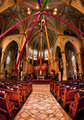
Resplendentby jfritz27Comment: Fisheye effect is a bit tight here. Color, lighting and detail good. |
 Photographer found comment helpful. Photographer found comment helpful. |
| 06/11/2010 03:28:06 AM |
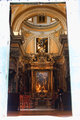
Divine lightby ELLIPSComment: This rotated view doesn't work for me because of the paintings. |
| Photographer found comment helpful. |
| 06/11/2010 03:18:43 AM |
Looking insideby Rino63Comment: It may not go over that well with many voters, but I like the natural border created by the blown outside facade and the off-centered interior creating a very interesting, if not, quirky crop. Exposure and lighting are right on and the colors are exquisite! A human presence is good but what's she doing in that position? Looks like she's talking to another across the isle. I would have expected you to crop that person out had basic editing allowed you to. Also, you may want to clean up the flare/noise in the lower sides. The last two points will not detract from the score. 8 |
| Photographer found comment helpful. |
| 06/11/2010 03:15:45 AM |
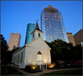
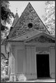
Now I Lay Me Down To Sleepby scarbrdComment: Captured and processed well, but the church holds no visual interest for me. It's so plain and overshadowed by the dominating skyscrapers that appear to be looking down upon it. I realize you're presenting a dichotomy but the church can't compete with the slick looking skyscrapers creating an unbalanced image. |
| Photographer found comment helpful. |
| 06/11/2010 03:08:09 AM |
Fading Stormby PugPopComment: Good composition. Also appears that flare is decreasing contrast some. |
| Photographer found comment helpful. |
| 06/11/2010 02:44:29 AM |
...the 'not-so-inviting' back door...by TullyComment: The back door is plugged and lacks any detail or interest. There are hot spots in the foliage to create a near IR look (a negative). The composition doesn't really work for me and neither does the unnecessary elaborate borders. |
| Photographer found comment helpful. |
| 06/11/2010 02:36:09 AM |
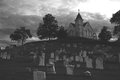
Country Churchby daevansComment: I think you've fallen over the precipice into Topaz hell, but I'm giving you a 7 for its edgy quality. |
| Photographer found comment helpful. |
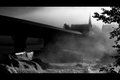
| 06/11/2010 02:32:05 AM |
|
| Photographer found comment helpful. |
| 06/11/2010 02:27:54 AM |
|
| Photographer found comment helpful. |
| 06/11/2010 02:27:01 AM |
|
| Photographer found comment helpful. |
Home -
Challenges -
Community -
League -
Photos -
Cameras -
Lenses -
Learn -
Help -
Terms of Use -
Privacy -
Top ^
DPChallenge, and website content and design, Copyright © 2001-2025 Challenging Technologies, LLC.
All digital photo copyrights belong to the photographers and may not be used without permission.
Current Server Time: 08/05/2025 04:46:18 PM EDT.