| Image |
Comment |
| 10/09/2003 01:29:14 AM |
Down Town Sunday Morningby GraciousComment: Technically well executed...Good exposure and focus and colors are very vivid. I guess it has a Sunday morning feel to it, as it seems deserted, but I don't find anything in the image very interesting to look at. I don't like the overhand and the picture just shows small pieces of buildings that leaves me feeling too confined |
 Photographer found comment helpful. Photographer found comment helpful. |
| 10/09/2003 01:09:17 AM |
Main Streetby WildpurpleComment: Image quality is poor and I think you could have cropped out the right side of the image up to the red brick. Effective use of perspective but it leads to nothing interesting. |
| Photographer found comment helpful. |
| 10/09/2003 12:51:49 AM |
The Old Town Clockby BeagleboyComment: I find this image to be a bit too cluttered and bottom heavy for a portrait format. Colors are vivid but lighting is too harsh as man walking towards camera is obscured by shadow. |
| Photographer found comment helpful. |
| 10/09/2003 12:35:45 AM |
Across the Great Miamiby MarjoComment: Good focus and clarity but I don't like the blown out sky that has no detail and the image appears overly post-processed, possibly to compensate for dark lighting conditions? Contrast is too high. I like your inclusion of the flowers in the foreground...they add a nice touch and are not imposing or interfering with the rest of the image. |
| Photographer found comment helpful. |
| 10/09/2003 12:28:47 AM |
The Coastby ZoomdakComment: Even though I don't believe this meets the challenge, and your focus is too soft in the foreground, I am a sucker for mist images and this one has a great sci-fi feel to it. Almost appears to be a distant planet's landscape. 6 Would have been higher had it met the challenge. |
| Photographer found comment helpful. |
| 09/21/2003 11:15:43 AM |
Portrait of a Schoolgirlby danh669Comment: Somber and sobering shot of a part of life most don't like to acknowledge. Don't know why this young woman with her life ahead of her is so distraught, but it tugs at my heart to see. Are you making a statement about the different abuses that has taken place within the church or its schools? This picture almost appears as a mug shot, implying she is a prisoner of her fate. Well done. |
| Photographer found comment helpful. |
| 09/21/2003 11:06:00 AM |
Protectionby DennisFComment: I like your angle of view against the stark sky, but wish there were more contrast between your subject and the background. |
| Photographer found comment helpful. |
| 09/21/2003 09:12:13 AM |
Wellspringby kostiaComment: Wonderful colors and pattern here, but I"m not sure how exactly it relates to the challenge. Is this some kind of microscopic underworld? |
| Photographer found comment helpful. |
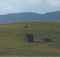
| 09/21/2003 08:39:39 AM |
summer loveby gciboComment: Despite the diminutive and unusual scale here from use of what I believe to be a wide angle focal length, there is something very compelling about this image. I think it's that I find it to be both simple, yet grand at the same time. The abandoned (?) structures and animals together along with the desolate, stark landscape bring together feelings of aloneness and companionship simultaneously. Though I wish the horses were larger and less merged, and wish it were technically more sound (such as more contrast, better focus and more saturated color), I find this to be a wonderful image that makes a real statement about the existential quality of life and believe it to be a work of art. It has sparked feelings in me. Well done. |
| Photographer found comment helpful. |
| 09/21/2003 12:52:19 AM |
Life goes onby fotomann_foreverComment: I'm not sure there is a cogent statement being made here, but if I'm wrong and there is, I don't like it. To me, the title is flippant and makes a statement that life is cheap. It's insensitive. I also don't like the use of bright colors or the flag here. I think the use of B&W would have been more appropriate. |
| Photographer found comment helpful. |
Home -
Challenges -
Community -
League -
Photos -
Cameras -
Lenses -
Learn -
Help -
Terms of Use -
Privacy -
Top ^
DPChallenge, and website content and design, Copyright © 2001-2025 Challenging Technologies, LLC.
All digital photo copyrights belong to the photographers and may not be used without permission.
Current Server Time: 08/21/2025 05:18:54 PM EDT.