| Image |
Comment |
| 01/05/2004 02:59:34 PM |
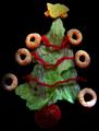
Eat Drink and Be Merry!by lizzyc3Comment: This is the best, I love it! Funny as hell, albeit a bit dark. Also, lettuce looks like it's been out a bit too long. |
 Photographer found comment helpful. Photographer found comment helpful. |
| 01/05/2004 01:18:18 PM |
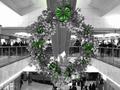
Old Fashion in Fashion Centre!!!by Reza1968Comment: I really love the tones and color in this photo! Great job, in that respect. Just wish you had blurred the background a little more to make it less distracting from the main subject. Also, I wish there was a little more light shined on the wreath. |
| Photographer found comment helpful. |
| 01/05/2004 12:48:58 PM |
Is this a Christmas present?by kinksComment: Although I don't find her to be tacky at all, I like the concept very much. Lighting is a bit too harsh and you've lost some detail in the highlights on her legs. Would also have preferred this in color. Not crazy about the composition either. Her upper torso is so enlarged compared with other elements in the shot and half of her is in focus, half out. Would have preferred her maybe to be curled up under the tree with other presents? |
| Photographer found comment helpful. |
| 01/05/2004 12:25:05 PM |
Alas Angelesby ImagineerComment: Picture is too busy....too much color and your lighting too strong. I wish you had dimmed the background somewhat and made it even more blurred. |
| Photographer found comment helpful. |
| 01/05/2004 12:11:25 PM |
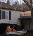
Sailin' Santaby ShelleyComment: That is pretty tacky! but your picture is a little on the dark side. Wish you had cpatured this at night when it was lit up. |
| Photographer found comment helpful. |
| 12/27/2003 01:29:23 AM |
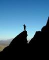
2000 feet above the groundby LoudDogComment: The use of silhouettes against blue sky to make your subjects stand out is very good, and the inclusion of just enough background mountain range in the lower left gives scale and perspective as importan clues. The only thing I don't like is the centrally located placed person which gives a static feel to the photo. Maybe placing him/her up higher in the photo would have added a more dynamic feel. Overall, well done. |
| Photographer found comment helpful. |
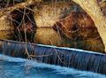
| 12/27/2003 12:04:21 AM |
At the Millby WildflowerJoyComment: Beautiful scene. I especially like the colors and the lighting. I think this picture meets the challenge better than any picture I have seen in the challenge as it shows the transition from still water to turbulence, by way of the waterfall (which, I might add was very well captured !) The tree in the foreground is quite bothersome and distracting though. Too bad you didn\'t, or couldn\'t, take another vantage point. Nevertheless, very well done. Did I say how much I love how you cpatured the waterfall? :) |
| Photographer found comment helpful. |
| 12/27/2003 12:02:58 AM |
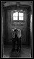
The inner Canyons are the deepestby Harz_JoergComment: Dramatic and very gut wrenching scene that few photos on DPC have been able to accomplish for me. You\'ve captured the conflict and anguish of a person in this dilemna very well. I especially like the tones and bleak and barren setting in this tudor style room/house. It almost gives the impression of being in a dungeon or torture chamber, which, metaphorically speaking this person appears to be in.
Another effect I like very much is the constrained, hemmed-in feeling in this picture due to the, albeit, slanted walls and border and long portrait format, which leads to the "no way out" feeling. Though the light from the window is way too harsh and blown out, it giives the impression of life outside weighing too heavily on this person. The harsh light also gives a slight haze or film to the shot, which in this instance I like.
It\'s too bad that the electrical cabling shows on the ceiling, which I find distracting, as well as, some unknown object in the upper left hand corner. Other than that, very well done. Great job. |
| Photographer found comment helpful. |
| 12/27/2003 12:00:05 AM |
|
| Photographer found comment helpful. |
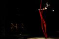
| 12/26/2003 10:55:57 PM |
Without a netby sergutComment: I wish you had zoomed in on this performer and used a portrait format. The subjects are too smalll and the surroundings are so dark that it doesn\'t matter that you\'ve included the setting as you can\'t see it. In addition, the trapeze artist is mostly in shadow and so barely visible. Perhaps different expousre settings would have improved this picture. The performer also appears out of focus, probably do to subject mvement. I do, however, like very much the concept of this picture. The woman hanging suspended by a long red sash, along with the dramatic lighting could make for a very compelling picture. |
| Photographer found comment helpful. |
Home -
Challenges -
Community -
League -
Photos -
Cameras -
Lenses -
Learn -
Help -
Terms of Use -
Privacy -
Top ^
DPChallenge, and website content and design, Copyright © 2001-2025 Challenging Technologies, LLC.
All digital photo copyrights belong to the photographers and may not be used without permission.
Current Server Time: 08/21/2025 10:43:05 AM EDT.