| Image |
Comment |
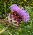
| 09/07/2006 01:50:40 PM |
Bad Hair Dayby barbaraanneComment: Nice detail! I would have cloned out the stray leaves coming off the stalk at the bottom. |
 Photographer found comment helpful. Photographer found comment helpful. |
| 09/07/2006 01:47:47 PM |
Portal to Tomorrowby sackerComment: I don't see tomorrow there... Just glass reflecing nothing of interest and a big circle... |
| Photographer found comment helpful. |
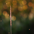
| 09/07/2006 01:46:47 PM |
Relaxby TooCoolComment: Spartan and beautiful in its simplicity! The only nit-pick is that the detail on the plant could be sharper. Very good work though!!! |
| Photographer found comment helpful. |
| 09/07/2006 01:44:15 PM |
Pray for Surfby ShannonLeeComment: Too little detail in the sea and sky. Nice colors, but that doesn't push it over the edge. |
| Photographer found comment helpful. |
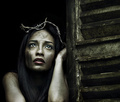
| 09/07/2006 01:43:30 PM |
abandonedby librodoComment: Not sure what the crown of barbed wire is supposed to symbolize? Good facial expression on the model's face. Too much negative space on the right. Her lips are too well made-up for the intended effect. It makes her look like a model that has been smudged with dirt and ash as opposed to an abandoned waif lost in the world. If she agreed to the smudges, you should have had her remove ALL make-up first. Also, the implied nudity is not necessary or effective. A tattered short sleeved frock would have conveyed the intended message better than attempting titilation with the bear shoulders covered by the long tresses. (Afterall, who WOULD abandon such a beauty clad such?!?!?! A complete IDIOT?) |
| Photographer found comment helpful. |
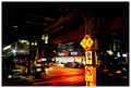
| 09/07/2006 01:37:20 PM |
under the tracksby k4ffyComment: Too much saturation. Too blown out on the "Food world". too little detail in the shot in general. |
| Photographer found comment helpful. |
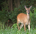
| 09/07/2006 01:36:29 PM |
It\\\'s A Doe Dearby JOHNBOY1970Comment: Too much negative space to the left. A closer crop would improve the image. Also, what are the \\\'s in the title for? |
| Photographer found comment helpful. |
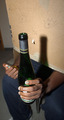
| 09/07/2006 01:34:07 PM |
Alcoholics Anonymousby RiderGalComment: Focus is wrong (top of bottle blurry) and the humor just not that good to compensate for the ugly background and lackluster forground. |
| Photographer found comment helpful. |
| 09/07/2006 01:32:44 PM |
Bird of Preyby jimikaComment: Too blown out on top of the head (though as a balding man I appreciate the difficulty of lighting such... LOL!) I'm also just not sure that the focus is there enough. |
| Photographer found comment helpful. |
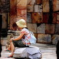
| 09/07/2006 01:31:19 PM |
Contemplateby TejComment: This would be better if the model were contemplating something in the other direction or she were on the right-hand side of the frame. Also, the blobs framing the shot are distracting and should be cropped out. (A portrait 4x6 crop should do it.) |
| Photographer found comment helpful. |
Home -
Challenges -
Community -
League -
Photos -
Cameras -
Lenses -
Learn -
Help -
Terms of Use -
Privacy -
Top ^
DPChallenge, and website content and design, Copyright © 2001-2025 Challenging Technologies, LLC.
All digital photo copyrights belong to the photographers and may not be used without permission.
Current Server Time: 08/22/2025 04:15:29 AM EDT.