| Image |
Comment |
| 03/15/2006 10:28:31 AM |
School Daysby JudiComment: Very nice composition with great RGB colors and you captured a terrific expression. It is an appealing composition.
I will join the chorus of others pointing out that the out-of-focus apple in the subject's hand is a major distraction. Out-of-focus foreground generally does not work as well as out-of-focus background in most cases anyway but it is exceptionally distracting in this one because the apple is a major element in the composition. |
 Photographer found comment helpful. Photographer found comment helpful. |
| 03/15/2006 10:13:04 AM |
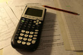
"Modern education"by squeeky jeeComment: The arrangement and composition of this image is fine.
Lighting and color could be improved. The shadow of the calculator distracts from the image. Adding lighting from the right would mute the distaction, illuminate right side detail and add interest to the image.
White balance is off which gives it a yellow hue that should be corrected in post processing.
You might also consider shifting your central focus point from the center of the calculator to the "5" on the keypad. That would excentuate the effect of your shallow depth of field and minimize the distracting effect of having the near foreground slightly out of focus. |
| Photographer found comment helpful. |
| 03/15/2006 10:04:10 AM |
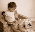
Education begins earlyby cvhs99Comment: Use of sepia in this composition works well and you captured your young subject at a moment of discovery and learning. This image captures true education far better than 98% of the images that will score above it.
The biggest defect in this image is focus. Your model should be in tack sharp focus. You can see that your autofocus decided the background should be focused and not your subject since it occupies more space.
Your perspective is not necessarily bad but is "snapshot-like". Taking it from the right up from floor level where you could see the whole face might be worth trying. You can't see the contents of the book from that perspective but you have a different angle and the facial expression is what makes the image. The contents of the book are inconsequential.
You might also consider a tighter crop and cut out as much wall in the background as possible. It adds little to the composition and the wall plug is a major distraction. There is a tendency for photographers to include the entirety of an object, like the book on the right, in the image. But you can achieve a very pleasing effect by including part but not all of an object. Cropping out part of the book would achieve that effect as well as get rid of the wall plug. |
| Photographer found comment helpful. |
| 03/15/2006 09:45:01 AM |
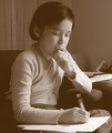
Enlightenmentby pineappleComment: Nice composition and sepia works well. Well focused. You captured your subject in a studious pose.
The image lacks a full tonal range. Try this... set a black point at the darkest spot in the composition and you may find the image will maintain its current tonality but will have much better contrast and will stand more. It is a little "flat" as it is currently. In photography there is a constant battle between tonality that shows nice gradations from one tone to another and contrast which washes out tones. It is hard to find the happy medium. |
| Photographer found comment helpful. |
| 03/15/2006 09:34:56 AM |
I Can't Go To School Today Dad, I'm As Sick As A Dog!by Penny LaneComment: Good composition, great concept, needs to have better focus on the dog's head. Looks like the dog moved during the shot since the near foreground is focused and the background tie is focused. The object (ruler?) under the dog's chin is a distraction. |
| Photographer found comment helpful. |
| 03/15/2006 01:36:07 AM |
|
| Photographer found comment helpful. |
| 03/06/2006 06:31:16 PM |
|
| Photographer found comment helpful. |
| 03/06/2006 05:58:30 PM |
How souls play basketballby krytaComment: This is an interesting attempt with decent color and good black to white balance that meets the challenge in a different way from many. General image quality is good. The net result, however, is a "busy" image that appears more like a random error than a purposeful effect. The area in the bottom middle part of the image needs something of interest to better balance the picture. Viewers, like me, will have no idea what is in the lower left corner and will find that to be a distraction.
A great picture has everything carefully planned and thought out and controlled and there are zero distractions. Nothing is included that does not directly support whatever the photographer wants the viewer to get from the image. The old 198os movie, "Back to the Future", is a great example of this concept. No matter how many times you watch it you will always discover more and more tie-ins from one part of the movie to another. There isn't a single thing that happens in that movie that does not tie into later action. That is how good photographs should be to. |
| Photographer found comment helpful. |
| 03/06/2006 05:30:54 PM |
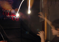
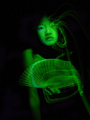
untitledby kateasanovComment: The basic concept of this image is very good. The greenish color gives it a "night vision" look. Yours was a valient attempt at the challenge and is proper light painting technique, unlike many, many others.
I tried something similar, though in standard colors, but could not get the light painting the way I wanted it so did not enter. Mine was of a heart shaped pillow given to open heart surgery patients and signed by well wishers. I wanted to light paint to simulate the escape of the human soul should the patient not survive. I just could not get light patterns that "worked". Your image suffers in the same way as mine where the light painted over your attractive model's left eye is more of a distraction than anything else. You got the technique down but this implementation, like mine was, comes up a little short. |
| Photographer found comment helpful. |
| 03/06/2006 05:02:12 PM |
LEAVES IN BLUEby DAWARComment: Composition and subject matter fine. The flat purplish color is so unnatural that it will act as a distraction to a lot of voters. Sharper focus on the fine leaf detail might make this image more appealing. Generally speaking, painting with light involves taking a long timed exposure with the subject in complete darkness and the photographer uses a mobile light source to illuminate the subject from different angles and directions in ways that generally cannot be done with stadard lighting. Yours does not look like it was done in this way and some voters will fault you for it. |
| Photographer found comment helpful. |
Home -
Challenges -
Community -
League -
Photos -
Cameras -
Lenses -
Learn -
Help -
Terms of Use -
Privacy -
Top ^
DPChallenge, and website content and design, Copyright © 2001-2025 Challenging Technologies, LLC.
All digital photo copyrights belong to the photographers and may not be used without permission.
Current Server Time: 08/15/2025 07:52:48 PM EDT.