| Image |
Comment |
| 03/19/2007 02:33:20 PM |
Spotsby oscarmeyerComment: Positives:
Composition strong. B&W works. Nice easy curves. It's simplicity is a strength.
Technicals:
Lighting and range of black to white is fine. Focus is soft on the brightest areas and the DOF may be misplaced.
The challenge:
Meets the Patterns challenge topic well. The technicals are what holds this image back more than anything else, particularly the choice of focal point, and explains why it has a less than average DPC score.
Suggestions:
To this viewer the choice of focal point for a shallow DOF is it's biggest fault. Normally, I would want the closest object to the camera to be in sharpest focus, but not in this case. Consider a reshoot with the focus centered on the most distant bright areas in sharpest focus and the grey closer circles in softer focus (or sharp themselves). You might like the result better. |
 Photographer found comment helpful. Photographer found comment helpful. |
| 03/19/2007 02:17:49 PM |
Bubbles and Blossomsby CitadelComment: Positives:
Unique twist on the challenge theme. Interesting concept and generally pulled off well. Good combination of warm and cool colors.
Technicals:
Overal good. Exposure and lighting generally good. Sharpness and DOF is fine though some of the bubbles look a little soft despite taken at f/22. That might have been caused by motion.
Looks to be slightly oversharpened. There are a few digital effects that show up as a result.
The challenge:
Your unique approach helps it fit the challenge in ways acceptible to DPC voters.
Suggestions:
By far, the thing that most affects this image reducing its score, inmho, is the crop. Looks like you were careful to include all the drops you worked so hard to create. You don't need to. In fact, it will make a better composition if you do not. You might consider cropping closer to remove any signs of the rounded edges of the bowl. Though, yes, it adds more 'roundness' to the composition for the challenge, removing it would make a much better overall composition. Try it to see for yourself. |
| Photographer found comment helpful. |
| 03/19/2007 01:50:48 PM |
My Kingdomby mia67Comment: Positives:
Beautiful macro with good color and softness that highlights the butterfly well. Nicely captured profile view. Good attempt at DOF such that the butterfly is sharply focused and everything else is not.
Technicals:
You chose to make the head and thorax sharpest and that is the correct decision. The impact of this image is absolutely dependent on perfect technicals. Though good, there are some things that are slightly off. The wing is little soft. In this particular instance the viewer will subconciously want the wing as sharp as the rest of the image and it is not.
There is a lot of extra space both above and below the butterfly that add very little to the composition. The space above the butterfly particularly has some sharpness aspects that actually act as a viewer distraction.
The challenge:
In a free study the technicals of a photograph affect it more than anything else since there is not such thing as DNMC. Technicals held this back more than anything else.
Suggestions:
You might consider cropping out some of the the top and bottom parts of the image to reduce \'wasted\' space. If you want to include the top part then you might want to use the blur tool to reduce it\'s distracting aspects. The wing is very close to the border and that is a slight distraction so moving it to the right would help.
You might consider bagging the white border all together. I\'m biased about that, though. I think borders are a waste of space, especially when limited to 640 pixels and would likely be removed for prints anyway. I don\'t vote down for them, but others could.
It would be nice to have the antennae in focus but that is tough.
The original was taken at f/2.8 and 1/125th second. Butterfly\'s generally have to be taken hand held and that affects what you can do. When the subject is still like this one is taking at a slower shutter speed for a slightly larger f/stop and therefore a little greater depth of field would be recommended.
Btw... I like butterfly imagery and taken a few myself:
//www.pbase.com/azleader/butterfly |
| Photographer found comment helpful. |
| 03/19/2007 01:06:27 PM |
Explosivesby BAMartinComment: Positives:
Technicals generally are good. Appriopriate subject and very well framed. This is nice image. Lots to like about it. It is better than it's score.
Technicals:
Color, composition, overall exposure, brightness and framing are all excellent. Your unique application of the rule of thirds in this composition is superb. Really, really nice texture. You paid close attention to the framing and it shows up nicely.
You have some digital "jaggies" on the angle lines of the 'explosives' sign that holds this image back, otherwise the sharpness is great.
The challenge:
Meets the challenge in a very creative and direct way both in color and content. Unfortunately, it looks like the concept of danger as red was above the heads of voters and you suffered because there was less 'red' in it than they expected.
Suggestions:
This is an excellent image. It's sharpess is fine except for the digital 'jaggies' that hurt this image more technically than anything else. I would recommend this sharpening strategy...
At the end, duplicate your flattened unsharpened layer and apply exactly the same sharpening to that layer that you did before. Then add a layer mask to that layer and brush with a feathered black brush on the mask to reduce sharpening on the 'jaggie' edges to mitigate their digital effect. An alternative might be to use the blur tool to soften the edge slightly PRIOR to sharpening and/or a combination of both. |
| Photographer found comment helpful. |
| 03/19/2007 12:34:12 PM |
Infinitesimal Planetesimalsby freakin_hilariousComment: A good photograph in any genre will score well in the right challenge.
Positives:
Overall general quality is good and the blue as a duotone works well. The viewer may not be able to figure out what it is, but it looks interesting and that is all that matters. It has a 'spacey' feeling to it.
Technicals:
As was said, quality and blue tones work well. Composition generally OK. Lighting and exposure are good. Nothing really bad here.
The challenge:
It fits the challenge and meets it in an unexpected way and probably contributed to the higher than expected score. And, of course, anything done well SHOULD get a good score even though they often don't. In your case you were not punished for DNMC and that is why you got a better than average score.
Suggestions:
You might consider cropping smaller to get rid of the lower right corner. That would add to it's overall 'spacey' feeling. Apply spot sharpening to the lower bubbles... they are on the soft side and incompatible with the rest of the image. |
| Photographer found comment helpful. |
| 03/14/2007 10:16:10 PM |
Lonely Lighthouseby tivoComment: Positives:
Excellent 1st DPC submission. Composition is good. Framing to emphasize those interesting clouds is the right choice. Sepia gives the image a feeling of impending storminess. It is visually appealing.
Technicals:
This is nicely done all the way around. Classic horizon on the lower rule of thirds line, lighting and exposure are right. Great tonality and it lacks serious digital defects. The near foreground looks a touch soft but the clouds are great.
The Challenge:
Free study challenges are tough because voters set very high expectations for technical excellence. This image is done well and that explains its above average score and 67% ranking. 5.8 is considered a good score by most DPC voters.
Suggestions:
Though you probably have little control over this the lighthouse is very small in the frame. You might consider a tighter crop to allow it to take up more image real estate. It would be tough to decide the crop, though. You may not have control over this either, but if there were some near foregrond object that to could be include in the frame (like a rock, bush or tree) it would add more viewer interest to an image that already has quite a bit.
You should be pleased with this first effort. Look forward to seeing more. |
| Photographer found comment helpful. |
| 03/14/2007 03:10:50 PM |
Redby inshaalaComment: Originally posted by inshaala:

I think that is within the first 10. |
It is. :)
Positives:
Oh boy! How could this image score so poorly? It is the type of image that makes me shake my head. It is technically a very good picture. There is so much to like about it technically. Framing is good, lighting and color are very good. What is wrong with it? I'd love to know what people think is wrong with this photograph to justify such a incredibly low score. Do tell? I'm listening.
Technicals:
As I said there is little technically you can fault about this image. It is not oversharpened and it is not under or over exposed. The match head is not perfectly horizontal and should be rotated counterclockwise slightly, but I've seen ribbon winners out of level far more that.
The challenge:
This is where I need help. Looks like it meets that challenge fine to me. One person suggested this was out of focus. Wellll... it does have a shallow depth of field but certainly is not out of focus. Another voter lamented, "... i'm diappointed that that was the only red thing you could find to take a picture of"? Is this image just boring or something? Is this voter correct? I certainly don't think so.
This is pure speculation, but perhaps voters have become accustomed to the fact that when they see a closeup of a match head that it should be burning and since it is not that is why they voted it lower.
But I'm really at a loss why this was scored so harshly.
Suggestions:
Light the match next time. :) Of course, to meet a red challenge you would have to capture it at mid-ignition in order to show some red. That is very hard but if you could capture that then it most certainly would be a ribbon contender with the same technical quality you already achieved.
You might also consider stopping down the lens more for greater depth of field, but I really don't think it needs it. |
| Photographer found comment helpful. |
| 03/14/2007 02:41:59 PM |
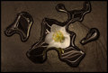
Stone Artby Trinity_12_12Comment: Originally posted by Trinity_12_12:
 |
Positives:
Nicely captured tones in a low-key image. Creative and very surrealistic photograph. Love the juxtaposition of the and use of a flower against with the strange watery background. This is a fine photograph.
Technicals:
Centering lighting on the flower is perfect. Tones are very nice. The distended stretching of the flower reflection is photographic genius. Basically centering it in the composition hurts its visual esthetics.
Unfortunately, like most of mine, this image is slightly oversharpened. There are a lot of digital "jaggies" in the water drops. That is to bad.
The challenge:
This image meets the challenge well but I would not be surprised to hear some voters suggest this is 'not low-key enough'. DPC voters can be narrow minded and flat out wrong at times and some of that may have affected your image in voting. I suspect framing played as much or more of a roll as that in lowering the score.
Suggestions:
Correct the "jaggies". There is no substitude for technical excellence. A slight framing change would help to offset the flower from a centered position in the frame. This could be achieved by croping closer to the rightmost water drop and adding more 'negative space' to the left side if that is possible. It is not much but would add more viewer interest to the composition. |
| Photographer found comment helpful. |
| 03/14/2007 02:10:35 PM |
Artanis Arcamenelby ShauryaComment: Originally posted by Shaurya:

Thanx |
Positives:
Nice solid black background. (There is a vocal subgroup of DPC voters who may call this a fault and will vote this down because of it, but ignore that). The choice of minimalism is nice.
Technicals:
As a minimalist composition it is critical that the technicals have no faults. Unfortunately this image is slightly oversharpened and suffers from digital "jaggies" in all the arched, narrow parts.
The challenge:
This choice of imagery and minimalism can do very well at DPC and DPC for this particular challenge but it has to be perfect techically. The technicals held it back more than anything else. "Jaggies" is a serious technical flaw, even in a non-technical challenge but despite that it scored above average. In thumbnail this image is not at all impressive and that probably affected some voters.
Low-key imagery, perhaps, works best with a lot of tonality that yours lacks and that could have affected it in voting. Your choice using strong highlighting is not wrong, it can and does work well, but the technicals held it back.
Suggestions:
By far, correcting the "jaggies" would be the single most important improvement that would get this a higher score. Unfortunately, since this is a basic challenge you would have to do that at the cost of softer focus on the rest of the image and that might not work either. It might be this image composition was not the best for this particular challenge. |
| Photographer found comment helpful. |
| 03/14/2007 01:44:45 PM |
Frozen Fish (Icicle!)by NeilComment: Originally posted by nshapiro:
 |
Positives:
Great choice of blue tones. General overall technical quality is good. Tonality is nice.
Technicals:
The image contains a few white specks that should be cloned out. Unsure but think that would be allowed in basic editing now. It is slightly oversharpened, but not much. The interior of the 'porpoise' has some oversharpened spots. Lighting is OK.
The challenge:
Meets the challenge. That is no problem. Your assumption that voters would see the 'porpoise' and vote it higher as a result is probably in error and explains why it scored lower than you thought.
Suggestions:
Clone out the white specks. The brightest areas of the interior of the 'porpoise' should be toned down. Unsure if this is possible in basic but reducing overall sharpness would help with this. Overall composition is not bad, but you might want to experiment with other framing to see if it 'looks better'. |
| Photographer found comment helpful. |
Home -
Challenges -
Community -
League -
Photos -
Cameras -
Lenses -
Learn -
Help -
Terms of Use -
Privacy -
Top ^
DPChallenge, and website content and design, Copyright © 2001-2025 Challenging Technologies, LLC.
All digital photo copyrights belong to the photographers and may not be used without permission.
Current Server Time: 12/14/2025 08:41:54 PM EST.