| Image |
Comment |
| 06/17/2005 08:08:27 PM |
Burnt Outby PsycheComment: Not a unique concept but one that fits the challenge well. Focus is a fundamental issue with all dogital imaging. This image seems soft focused. The DOF is that no-man's land where it is either too shallow or not shallow enough. |
 Photographer found comment helpful. Photographer found comment helpful. |
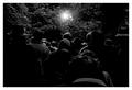
| 06/17/2005 07:29:59 PM |
Refugeesby e301Comment: Terrific image. Perfect as taken from behind with the bight light overhead. Great tones and a good full rnage from black to white.The forground guy that is out of focus is a little distracting but not that bad. Voters will easily see this as meeting the challenge. |
| Photographer found comment helpful. |
| 06/17/2005 07:19:05 PM |
Eternal Darknessby jasm8Comment: Nice shallow depth of field. The color is good if not slightly over exaggerated. It is a little unclear what is going on in this image. It is too bad the green plant is in the front where it is a little distracting to the overal composition. |
| Photographer found comment helpful. |
| 06/17/2005 06:48:38 PM |
Mystic Riverby ingvarComment: Nice concept that might be better in B& W rather than color. Misty subjects five great tonal range that are perfect for B&W. This image has a bluish unnatural color most apparent on the trees to the right that detract from this otherwise wonderful image. |
| Photographer found comment helpful. |
| 06/17/2005 06:45:30 PM |
|
| Photographer found comment helpful. |
| 06/17/2005 06:41:05 PM |
feeling darkby nikantComment: Good concept tried by others in this challenge. It is a great technique for a challenge of this nature. Nice perspective. There is an overexposed triangle on the subject's forehead that should be toned down with a bit of burning. Unsure if the neckwear adds or detracts from the composition. |
| Photographer found comment helpful. |
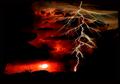
| 06/17/2005 06:36:28 PM |
Stealing the sunby thelucasComment: A good surrealistic image regardless how it was achieved.
Having taken a lot of lightining images myself it is obviously this is not natural. Certainly there will be voters that feel you are trying to pull something over on them and will vote it lower because of that.
It appears there are fingers or something that is not a natural gelogic feature coming in from the left side of the frame that is alluded to in the title. Be intersting to see how voters react to this image. |
| Photographer found comment helpful. |
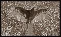
| 06/17/2005 06:30:21 PM |
"Are you ready for me?"by blancericComment: I've went on four or five photo safari's specificall to capture turkey vulture images in the last several weeks and did so during the challenge week but was unable to capture anything worthy of submission for this challenge. I like catching them in the early morning sunning themselves like you have here.
It is a good capture but the background is overwhelming of the bird. This can be corrected by reducing the background brightness by 10-30 percent and possibly reducing it's contrast as well. You might try to add some bright highlights to the bird to make it stand out above the background. Unsure if this is better as sepia or would be better as B&W. You might try both to see what you think. |
| Photographer found comment helpful. |
| 06/17/2005 06:24:41 PM |
Scottish to the Coreby bravo sixComment: Voters will certainly question it's inclusion in a darkness challenge but not this one. I'm of scottish descent and understand. :)
This is a great introspective candid capture. the tones are good and the background detail perfectly fits the image. This should score higher than it probably will. |
| Photographer found comment helpful. |
| 06/17/2005 06:22:27 PM |
Tapsby SCI 009Comment: Good concept and great angles on the tombstones. Black and white is a good choice for this image. It might be even better if you increased the contrast in the image and gave it a true black point. Unfortunately the detail between the stones seems mottled and a little distracting to the overall image. |
| Photographer found comment helpful. |
Home -
Challenges -
Community -
League -
Photos -
Cameras -
Lenses -
Learn -
Help -
Terms of Use -
Privacy -
Top ^
DPChallenge, and website content and design, Copyright © 2001-2025 Challenging Technologies, LLC.
All digital photo copyrights belong to the photographers and may not be used without permission.
Current Server Time: 08/18/2025 06:20:24 PM EDT.