| Image |
Comment |
| 06/20/2005 10:37:13 AM |
From within the closet comes...by bhoundComment: General overall photographic quality is OK. The lighting is well conceived and the composition is fine. Nice solid black background.
Some voters may view this as a slightly cheesy setup and not representative of what darkness might REALLY mean to you. Dumb, yes, but will influence how some think and vote. |
 Photographer found comment helpful. Photographer found comment helpful. |
| 06/20/2005 10:30:06 AM |
Racing Under The Lightsby DrakeComment: Great action capture. Good motion blur and perspective on the vehicle. Including the dust behind the racer in the composition is a good idea. Color and exposure are right and the image has no overexposed areas.
In some cases there will be voters that feel you are "shoehorning" this image into the "darkness" challenge but it really does fit it well if they opened their minds. Unfortunately there are some very narrow thinking voters out there.
On the technical side there is a lot of electronic noise that you should apply noise reduction to if you can. |
| Photographer found comment helpful. |
| 06/20/2005 10:23:46 AM |
My Dark Winter Shirtby morpurgoComment: A very nice abstract composition. Greys are generally good and you have a full tonal range from black to white. Fine detail is grainy sharp without looking oversharpened.
The reflection off some of the metal parts are overexposed.
This is generally a very nice image. |
| Photographer found comment helpful. |
| 06/20/2005 09:57:42 AM |
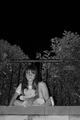
Childhood Lostby TooCoolComment: Excellent clarity in the fine detail and a good capture of the child's expression. Great tones and B&W works well in this situation.
Most voters will likely "get it" but some may just think it is another kid picture.
You might consider cropping it closer on the child to highlight her. She is the main subject and much that is around her adds little to the composition.
Looks like the lines of the bricks and the top of the fence are slightly off horizontal by a third to a half a degree. In that situation you should rotate the image to make them perfectly level. |
| Photographer found comment helpful. |
| 06/20/2005 09:41:17 AM |
Breaking the darkby guenivere_mensyComment: Capturing rays of sunlight on an overcast day is a worthy concept for this difficult challenge topic. But this is an example of a great idea that gets lost in the generally poor technical quality of the final composition.
You may have left this there intentionally but most viewers will see color and electronic noise in the image as a technical flaw and not an artistic expression.
Focus is exceptionally poor and the open areas through the clouds are excessively overexposed. That is very, very hard to get right in an image of this type.
Compositionally you could increase the drama of the rays by cropping about an inch off the top and right sides of the image. This will extend the influence of the rays across the full frame and give them a more dominent position in the composition. |
| Photographer found comment helpful. |
| 06/20/2005 09:32:43 AM |
A City of Sinby bobdaveantComment: Fits the darkness theme. The general quality of clarity of the image are the strength of this picture. Composition is OK and you have a level horizon.
Compositionally the dark patch below the line of lights at the bottom of the frame seems empty and unneeded. You might consider cropping that out of the composition. |
| Photographer found comment helpful. |
| 06/20/2005 09:27:45 AM |
Look who's coming to dinner!by EricSorenWComment: Excellent B&W image. Very clean composition. The perspective is good and the silhouette is nice. Compositionally it is simple without distracting elements. The tones are perfect and there are no overexposed areas. The clouds are an exceptionally well defined background and the strength of the composition.
Viewers will have trouble figuring out what you are trying to say with this image and it will suffer a little in voting because of it. Your title does not help them.
On the technical side the triangle and support appear to be oversharpened and have distracting digital "jaggies". You will need to apply some type of smoothing as drastic as cloning to remove them. |
| Photographer found comment helpful. |
| 06/20/2005 09:17:54 AM |
Solitude in Blueby colourBlindComment: A simply wonderfully beautiful composition. The blues are great. The lines generated by the blinds are terrific. You have an eye for a great capture.
It is unfortunate that some, perhaps even many, voters will have a tough time relating it to the darkness challenge topic and will vote it accordingly.
On the technical side there are only a couple compositional suggestions. I don't know if there is any way you could have changed things so that you could have lighting on the several darkened blinds near the top of the frame but it would have been more uniform and perhaps more balanced if you could.
There is a small dark triangle in the lower left corner of the image. It just feels like there should be more of it or that it be cropped out of the final image entirely. If you cropped it out completely just above where it hits the rocker shadow it would give much better balence to the bottom of the frame. If you included more of it then it might be best to extend it all the way to the rightmost corner. Whichever way looks best would work.
Kudos to you for a terrific image. |
| Photographer found comment helpful. |
| 06/20/2005 09:05:25 AM |
Prowlerby RistyzComment: Cats are creatures of the night so fit a darkness theme well. The composition and image quality are good. It is properly exposed. You've captured the cat's eyes particularly well.
Though they should not, some voters may mistake this for a "pet picture" and mistakenly score it lower.
On the technical side you might have considered having equal lighting on both eyes. Generally speaking that would work better for most reviewers and give it better balance. The light patch on the lower right of the image is a distraction that should be removed. Curiously, it almost looks as though the cat has no mouth. |
| Photographer found comment helpful. |
| 06/20/2005 08:57:55 AM |
Overtakingby SimonkasprzakComment: Fascinating concept you've captured for this challenge. The perspective and the composition is terrific. Technical quality is excellent. This will finish near the top in voting. |
| Photographer found comment helpful. |
Home -
Challenges -
Community -
League -
Photos -
Cameras -
Lenses -
Learn -
Help -
Terms of Use -
Privacy -
Top ^
DPChallenge, and website content and design, Copyright © 2001-2025 Challenging Technologies, LLC.
All digital photo copyrights belong to the photographers and may not be used without permission.
Current Server Time: 08/18/2025 03:35:40 PM EDT.