|
|
|
Showing 391 - 400 of ~575 |
| Image |
Comment |
| 05/02/2007 05:20:52 PM | Pi-lonsby jprhea25Comment: Creative take on the challenge. A bit of a distracting scene, and the immediate foreground is out of focus (which distracts me). |  Photographer found comment helpful. Photographer found comment helpful. |
| 05/02/2007 05:19:23 PM | | | Photographer found comment helpful. |
| 05/02/2007 05:18:39 PM | The PI Masterby McFrikkiComment: Good focus. The white ring around his left eye (our right) is distracting. | | Photographer found comment helpful. |
| 05/02/2007 05:17:43 PM | Pi in binaryby kiskatComment: Nice detail in the front and good depth of field. Nice colours. | | Photographer found comment helpful. |
| 05/02/2007 05:17:00 PM | | | Photographer found comment helpful. |
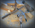
| 05/02/2007 05:02:32 PM | Resourceful Woodworkingby GreetmirComment: Hi from the Critique Club,
I see that Steve already gave you a killer critique, so I'll try to limit mine to what he didn't say.
Great job on this shot. It is creative, well exposed, and in focus. I would say that the contrast could be greatly increased, as the black handles are not even close to black (and the eye expects them to be). Some would argue against the vignette, but I find it effective here. Without it, the eye might drift to the edges and expect more (i.e. run off the image and look elsewhere). Perhaps a different perspective (not top-down) would have yielded a higher score.
Much of the grain in the wood could have been emphasized to really strengthen this shot. Also, the shadow on the knife on the back piece of wood (with the tongs on it) is distracting.
Not a bad shot at all, although a few of the improvements from the commenters below would have bumped it into the top 50, if not higher. Obviously you couldn't apply those comments to this image, but they are certainly beneficial for future submissions.
Good job.
Regards,
Geoff Ball | | Photographer found comment helpful. |
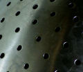
| 05/02/2007 04:50:17 PM | Abstract Collanderby SoulMan1978Comment: Hi from the Critique Club,
First of all, congratulations on your first submission. This image is well lit and has good global contrast. Even in the dark areas, the dark holes of the colander provide nice local contrast.
As was mentioned by other commenters, the water spots are very distracting. Had you cleaned the colander prior to this shot, it would have had a nice, flowing (i.e. continuous) brushed metal look. My eyes are drawn to each of the water spots, and are unable to take in the image as a whole.
Certainly not a bad shot, although I think the water spots probably hurt your vote on more than just three occasions. You certainly have the skills to break five on your second submission, which is quite an accomplishment.
Welcome, and congratulations again on your first challenge entry.
Regards,
Geoff Ball | | Photographer found comment helpful. |
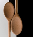
| 05/02/2007 04:39:09 PM | Yin-Yangby meneleComment: Hi from the Critique Club,
You've done a great job here of using kitchenware creatively. Though certainly not the most exciting of the kitchenware shots, you have conveyed a particular message, and that is extremely important in my opinion.
Technically, there are a few issues with this shot, but overall it is well done. The left spoon looks a bit crooked (needs to rotate clockwise a bit), but that is extremely minor (and I might be wrong; I'm simply eyeballing it). As I said in my original comment during the competition, the white is not white, and I believe it should have been. I see that you probably would have run into contrast issues with the left spoon handle had the white been white (since the handle is quite light), but I would call the area below the right spoon gray (not even off-white). The uneven spoon sizes distract a bit from the symmetry of the image, but it certainly doesn't make the image a bad one. Indeed, this is a great shot, and is every bit worthy of a top 30 finish.
Great detail in the spoons, with nothing out of focus. I like the right spoon--and especially the handle--with the browns balancing against the black nicely.
Very nicely done, and congratulations on a new personal best.
Regards,
Geoff Ball | | Photographer found comment helpful. |
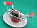
| 05/02/2007 04:25:10 PM | Apple Desaturatorby jgriecoComment: Hi from the Critique Club,
Wow! What a clever concept! Very crisp image with good detail. Good choice of background for bringing out both the red and the black of the apple. The handles are a bit distracting (white or black might have been better), and you missed a bit of the apple that should have been desaturated (behind the handle on the right).
Great lighting, contrast, and concept!
Regards,
Geoff Ball | | Photographer found comment helpful. |
| 05/02/2007 03:37:40 PM | Curved Spacetimeby posthumousComment: Hi from the CC,
First of all, great use of the rule of thirds, using the chain, edge of the reflection, and water line. The detail on the inside of the well is exceptional. Contrast is great throughout, and there's no under- or overexposure. I like that the tree is slightly out-of-focus, and the debris in the water helps to define the water line.
There are only two criticisms I have. First, that thin blue line that borders the water looks fake / hand-drawn. It could well have existed in the original scene, but it looks out of place, since it continues throughout with the same luminosity. Second, the image wasn't as exciting as some of the others in the competition. From a technical POV I find it to be an excellent shot, but I can understand why it didn't score as high as some of the others.
To sum up, this is a great shot with few (if any) technical flaws. Great job.
Regards,
Geoff Ball | | Photographer found comment helpful. |
|
Showing 391 - 400 of ~575 |
Home -
Challenges -
Community -
League -
Photos -
Cameras -
Lenses -
Learn -
Help -
Terms of Use -
Privacy -
Top ^
DPChallenge, and website content and design, Copyright © 2001-2025 Challenging Technologies, LLC.
All digital photo copyrights belong to the photographers and may not be used without permission.
Current Server Time: 08/26/2025 10:32:18 PM EDT.
|