| Image |
Comment |
| 09/23/2006 09:01:11 PM |
|
 Photographer found comment helpful. Photographer found comment helpful. |
| 09/23/2006 08:59:51 PM |
Day 06 (Sept 10)by LERtasticComment: again nice POV. I really dig the composition on this one as wel great job. I jsut wich the background was less busy. |
| Photographer found comment helpful. |
| 09/23/2006 08:58:58 PM |
|
| Photographer found comment helpful. |
| 09/23/2006 08:52:54 PM |
Day 8 - Vacationing in Mauiby SunnieeComment: I need a real vacation too but with the kids I am at least 13 years from that! LOL. great processing. You look wonderfull, nice expression. |
| Photographer found comment helpful. |
| 09/23/2006 08:50:23 PM |
|
| Photographer found comment helpful. |
| 09/23/2006 08:49:14 PM |
|
| Photographer found comment helpful. |
| 09/23/2006 08:45:40 PM |
|
| Photographer found comment helpful. |
| 09/22/2006 07:28:18 AM |
Future Food Suppliesby Art RoflmaoComment: I had a feeling this was yours and as I said before it is great. one of only 2 10s I gave, sorry you didn't ribbon. |
| Photographer found comment helpful. |
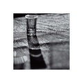
| 09/17/2006 08:20:14 PM |
Shadow of Emptinessby unicumComment: Greetings from the critique club.
First thing that stands out is the border to me. Fromt he comments it seems kind of hit or miss on people liking it. For me I don't think I would have used it in the challenge. I really like it overall and think it works very well for the image at ahnd hoever with the size restaints here it ends up taking too much of the total photo. you can always approach things here two ways. go for score or show off your art. sometimes you can get both and sometimes not. for this you would know that the border will get you some low votes but it may be important enought for you to show it regardless of low votes( I think this was the best choice)
on to the photo. some things I love about it. first I love the overall feel of it. the texture of the mat is great and I really like the Black and white conversion. The shadow is very nice and judging from your settings there was some pretty strong light and you did a great job of toning it down.
I don't like the blurs (other glasses?) in the foreground and if this was set up I would have removed them. of course without seeing it that way I may be wrong:) I think a deeper DOF on the glass would have been nice as well.
In the end who can argue with a decent score and 4 favorites. Great shot. Let me know if you ahve any questions.
Elvis. |
| Photographer found comment helpful. |
| 09/17/2006 04:55:43 PM |
|
| Photographer found comment helpful. |
Home -
Challenges -
Community -
League -
Photos -
Cameras -
Lenses -
Learn -
Help -
Terms of Use -
Privacy -
Top ^
DPChallenge, and website content and design, Copyright © 2001-2025 Challenging Technologies, LLC.
All digital photo copyrights belong to the photographers and may not be used without permission.
Current Server Time: 06/21/2025 12:05:38 PM EDT.