| Image |
Comment |
| 11/11/2009 01:12:47 AM |
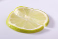
Nails? Pssh, give me the bed of crayons!by Eagle40Fox2Comment: a smaller aperture would IMO improve this photo....I can't tell what point you were trying to focus on if you were trying to make it fuzzy in the forground and fuzzy in the background...a smaller aperture might help your lens bring out some sharpness assuming that the above statement was not your goal |
 Photographer found comment helpful. Photographer found comment helpful. |
| 11/11/2009 01:10:13 AM |
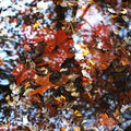
Cabbage Patchby witt34Comment: The subject looks more like a texture than a symmetry, Yes it has symmetry, but it does not exhibit it in the way most will think of.
But the biggest reason I lowered my score is because I think the black and white makes this photo less interesting than it would be in colour. There is no definition of lines or structure, giving it less colour definition only makes it less interesting. |
| Photographer found comment helpful. |
| 11/11/2009 12:56:24 AM |
INSEPARABLEby hotpastaComment: I don't see the symmetry, repetition is not the same thing
I am sure you will get a lower score from others on DPC for the same reason |
| Photographer found comment helpful. |
| 11/11/2009 12:43:18 AM |
Two partsby hajekaComment: If the focus was sharper I would give it at least another point or two |
| Photographer found comment helpful. |
| 11/09/2009 12:58:50 AM |
immersionby posthumousComment: a polarizing filter to reduce reflection could have helped this shot a lot |
| Photographer found comment helpful. |
| 11/09/2009 12:58:22 AM |
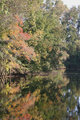
Peaceful Lakeby cowboy221977Comment: The saturation is an awkward level. I think it would look better with more saturation...if nothing else increasing it in the orange/yellow range would help a lot better |
| Photographer found comment helpful. |
| 11/09/2009 12:26:50 AM |
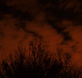
Storm's a comin...by ahjennyComment: I don't like the white balance. If this is supposed to look like a night shot, I tend to think a bit of a blue white balance helps a ton. |
| Photographer found comment helpful. |
| 11/09/2009 12:11:26 AM |
|
| Photographer found comment helpful. |
| 11/09/2009 12:11:06 AM |
|
| Photographer found comment helpful. |
| 11/09/2009 12:10:40 AM |
untitled no. 3by EstimatedEyesComment: i think it would be better with a smaller border....the images in these contest are IMO too small to waste it on borders |
| Photographer found comment helpful. |
Home -
Challenges -
Community -
League -
Photos -
Cameras -
Lenses -
Learn -
Help -
Terms of Use -
Privacy -
Top ^
DPChallenge, and website content and design, Copyright © 2001-2025 Challenging Technologies, LLC.
All digital photo copyrights belong to the photographers and may not be used without permission.
Current Server Time: 06/16/2025 04:34:37 PM EDT.