| Image |
Comment |
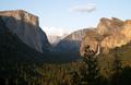
| 04/28/2004 12:11:09 PM |
California Torchby photomComment: Beautifully lit and composed, but lacking in sharpness. Nice angle of view, though. |
 Photographer found comment helpful. Photographer found comment helpful. |
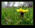
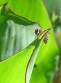
| 04/28/2004 12:10:32 PM |
Bugs Viewby rwingardComment: I like the shot - a lot - but find the frame distracting, especially since it's so much larger on the bottom. 6 |
| Photographer found comment helpful. |
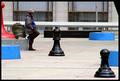
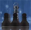
| 04/28/2004 12:09:48 PM |
Checkmateby zwhitleyComment: Very clever composition. This could be used for a textbook example of how to position objects within the frame. It's composed in a nice dynamic line, and the eye is actually led from front to back, as if looking into a 3-D scene. (The little triangle up in the right corner is a distraction, but other than that, it's perfect.) Great colors, contrasts and human interest. |
| Photographer found comment helpful. |
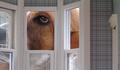
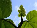
| 04/28/2004 11:55:53 AM |
Ollie in Wonderland by rileyComment: Fantastic! I had this exact same idea for the "inside looking out" (or something like that) challenge a while back, but never got it done. Very fun shot! |
| Photographer found comment helpful. |
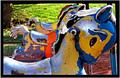
| 04/28/2004 11:53:11 AM |
Of Equal Proportionby ShakeyComment: Very artistic, beautiful shot. Looks like it should be hanging in an art gallery. Perfect camera positioning, great eye-catching, saturated colors. 9 |
| Photographer found comment helpful. |
| 04/28/2004 11:07:49 AM |
small bby beckettbootsComment: Nice compositon with the dynamic lines leading up to the subject. Nice saturated colors, too. |
| Photographer found comment helpful. |
| 04/28/2004 11:06:33 AM |
one halfby severinComment: Beautiful! Normally I don't care for unusually cropped photographs, because they give me the feeling that the photographer just didn't bother to frame it right and had to get rid of distracting elements. However, this is really wonderful, and a perfect example of when to use a non-standard size frame. 10 |
| Photographer found comment helpful. |
| 04/28/2004 11:01:27 AM |
Chess Proportionsby s4nd3r99Comment: I think this would be better if your lens was centered behind the middle subjects, giving leading lines that pointed towards the king (like you see on the left row of pawns). I'm not too sure about the coloring, either. The white line under the pieces is a little distracting, and I think the background could be "punched up" a little with a more saturated blue - perhaps a bit more exposure or a levels adjustment in Photoshop. |
| Photographer found comment helpful. |
| 04/28/2004 10:59:26 AM |
|
| Photographer found comment helpful. |
| 04/28/2004 10:59:03 AM |
God's Countryby JimQComment: Lovely landscape. It would be better at a different time of day without the shadow, and perhaps a polarizing filter to make that sky and cloud really leap off the page and cut down on the haze.. |
| Photographer found comment helpful. |
Home -
Challenges -
Community -
League -
Photos -
Cameras -
Lenses -
Learn -
Help -
Terms of Use -
Privacy -
Top ^
DPChallenge, and website content and design, Copyright © 2001-2025 Challenging Technologies, LLC.
All digital photo copyrights belong to the photographers and may not be used without permission.
Current Server Time: 06/19/2025 07:52:15 AM EDT.