| Image |
Comment |
| 02/15/2003 12:24:10 PM |
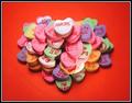
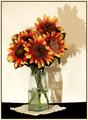
Love -- Mah Jongg Styleby karmatComment: Good idea, well executed. I can picture this being used in a commercial of some sort. The shadows might be a tiny bit harsh, but I love the background, idea and composition. 8 |
 Photographer found comment helpful. Photographer found comment helpful. |
| 02/15/2003 12:13:56 PM |
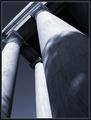
Side By Side - Forever Togetherby jerrftComment: Unique idea for the challenge, fitting sentiment. I'm not sure that I'm wild about the pinky tone to the image, but perhaps that's my monitor. Otherwise, it's a lovely composition. 7 |
| Photographer found comment helpful. |
| 02/13/2003 02:17:04 PM |
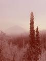
Who? Where? by JeanComment: Beautiful... This not only meets the challenge, but is an extremely beautiful piece of fine art. I look forward to seeing the technical details when the results of the challenge are published. Congrats on a wonderful shot. (10) |
| Photographer found comment helpful. |
| 02/13/2003 02:06:34 PM |
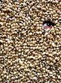
blackEYE peasby BukiosComment: Truly great image. Very creative, technically well done and meets the challenge very well. 9 |
| Photographer found comment helpful. |
| 02/13/2003 01:54:14 PM |
|
| Photographer found comment helpful. |
| 02/13/2003 01:32:56 PM |
Peek a Boo!by mcraelComment: This is one of my favorites so far. A lovely photograph that meets the challenge in a unique way. I especially love the piece of material under the vase that ties it all together and the high-contrast feel this has. |
| Photographer found comment helpful. |
| 02/10/2003 10:36:54 PM |
|
| Photographer found comment helpful. |
| 02/10/2003 10:23:22 PM |
Round by albright1Comment: Beautiful. The warm lighting really makes this stand out. Great shot. (8) |
| Photographer found comment helpful. |
| 02/10/2003 09:34:04 PM |
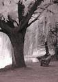
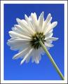
Flip sideby JackoComment: Extremely beautiful coloring and perfect exposure of the whites. |
| Photographer found comment helpful. |
| 02/10/2003 09:32:55 PM |
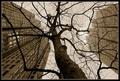
"hey!, my cousin the Redwood is taller than you, guys!"by Pep VentosaComment: Lovely. I really like the juxtaposition of the tree and the buildings. It's a bit different take than what I'm used to seeing. I think the sepia coloring works well with it, also. The only thing I find a tiny bit distracting is the lighter tops of the buildings on the right - but perhaps that's just me. Overall I think it's quite good. (8) |
| Photographer found comment helpful. |
Home -
Challenges -
Community -
League -
Photos -
Cameras -
Lenses -
Learn -
Help -
Terms of Use -
Privacy -
Top ^
DPChallenge, and website content and design, Copyright © 2001-2025 Challenging Technologies, LLC.
All digital photo copyrights belong to the photographers and may not be used without permission.
Current Server Time: 06/15/2025 03:45:41 PM EDT.