| Image |
Comment |
| 07/16/2007 07:57:29 AM |
|
 Photographer found comment helpful. Photographer found comment helpful. |
| 07/16/2007 07:55:45 AM |
Divisionby colorcarnivalComment: o, dear, so grossly underrated. that is too bad. it's alovely shot, and i meant to go back and bump it up (i gave you a 6), but forgot. sorry.
light and dark - surely the first dichotomy of which we are aware. the lens flares make it, it think. well done indeed. this is why you'reo n team suck - great work that few get! |
| Photographer found comment helpful. |
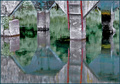
| 07/16/2007 07:52:38 AM |
Sweet and Sourby griz210Comment: a very, very nice image. the colours, texture, lighting, all spot on. the reflection under the plate: lovely. my only niggle is the white area in the top left - it's really very distracting. if it could just be toned down a hair, that would make this even better. |
| Photographer found comment helpful. |
| 07/16/2007 07:49:42 AM |
|
| Photographer found comment helpful. |
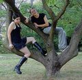
| 07/16/2007 07:49:02 AM |
Good Girl / Bad Girlby KelliComment: a great idea, but i'll agree with the comments about over-sharpening. all the textures become distracting, and make the image shallower, until it becomes about the surface texture of the image, rather than what the image contains. i think a simpler composition, without the tree, forcing the viewer to really look at the girls, might have served you better. |
| Photographer found comment helpful. |
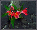
| 07/16/2007 07:46:32 AM |
Beauty & the Beastby HipychikComment: a nice shot, but i think the title could have helped viewers see the dichotomy more. the contrast between the flowers and the cement is very nice, and i like the leading lines. |
| Photographer found comment helpful. |
| 07/16/2007 07:45:00 AM |
|
| Photographer found comment helpful. |
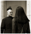
| 07/16/2007 07:42:38 AM |
the wild and the tamedby krnodilComment: wow - much hair! great shot. i'd love to see a little more light on her face, just a smidgen. Message edited by author 2007-07-16 07:43:12. |
| Photographer found comment helpful. |
| 07/16/2007 07:41:51 AM |
Human nature-1 - Mother nature-0by seeComment: very nice image, and great project! i think the forground here is a little distracting - it could either be cropped out, or darkened a bit. at the moment, it's the clearest thing in the image, and draws the eye, when you really want the viewer to look deeper. also, darkening it would really bring out the atmospheric perspective, which is lovely here. |
| Photographer found comment helpful. |
| 07/16/2007 07:39:35 AM |
Person : Minor or Adult by kashiComment: i thought this might be yours, lea. very nice, but i kind of wish it was in black and white; i find the colours a little distracting. i love the love i can feel from this image. beautiful work. |
| Photographer found comment helpful. |
Home -
Challenges -
Community -
League -
Photos -
Cameras -
Lenses -
Learn -
Help -
Terms of Use -
Privacy -
Top ^
DPChallenge, and website content and design, Copyright © 2001-2025 Challenging Technologies, LLC.
All digital photo copyrights belong to the photographers and may not be used without permission.
Current Server Time: 06/21/2025 05:53:26 PM EDT.