| Image |
Comment |
| 07/19/2005 06:49:32 PM |
Get my point ?by gprinslooComment: I have no idea what I'm looking at here. Looks like some sort of machine. Don't know how it links to sports, but I'll give you the benefit of the doubt |
 Photographer found comment helpful. Photographer found comment helpful. |
| 07/18/2005 05:52:45 PM |
Some Dayby CalliopeKelComment: Now if the guy on the left was cropped out and the guy on the right was not chopped in half this would be real nice. Its the small things which are important when composing a shot |
| Photographer found comment helpful. |
| 07/18/2005 05:47:05 PM |
|
| Photographer found comment helpful. |
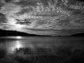
| 07/12/2005 01:16:58 PM |
Dark Daysby tristaliskComment: BW Mentor Group
Hi Tristalisk,
Now this one is my sort of image, I love b/w landscapes and this is well up there with the best. The sky especially is very very nice, Lots of texture aith all the gradients and shapes pulling the eye into the highlight where the sun pokes through the cloud. The highlight is nicely placed on the third line, maybe the horizon is just a tad high, but nothing too wrong with it. The reflections too carry the tones up and left towards thos highlights.
Theres not much I can offer in terms of making this much better, perhaps just cloning out those bouys in the water, but hey nothing serious.
Falc |
| Photographer found comment helpful. |
| 07/12/2005 05:34:30 AM |
Intimate Settingby aboutimageComment: B/W Mentor Group.
Still life is not one of my strong points, in fact its one of my pet hates - sorry!!
However, having said that lets have a real look at this image.
WIne, rose, small intimate table, all suggests romance to me, but look at the tonal range you have used. Stark contrasts with very little between shadow and highlight. For me this subject calls for soft easy flowing tones, almost high-key, with parts overblown to let the imagination fill in the blanks. OK its a cliche I know, but maybe it would work ;-)
Hope that doesn't sound too negative. The image is anice enough image but to take it to the next level it needs mmore atmosphere, and a different conversion might add that little something. |
| Photographer found comment helpful. |
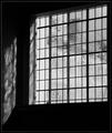
| 07/11/2005 11:28:07 PM |
Old Panesby KaveyComment: B/W Mentor Group.
Hi Kavey,
I think you are correct in the fact that this is a classic subject for monochrome, the lines are stark and contrast very well against that textured glass. Its the lines which provide the structure, whilst the whites and greys provide the detailed infill, and its these areas which the eye drops onto and explores.
I can't decide whether I would like to bump the contrast in those swirls and textures in the window, I'd be scared of losing too much detail. If you look through the window at the left hand side you can see that there is no grey in that section becasue of the window jamb on the outside. That area would need some special treatment to not simply blow out.
Do you know what this image calls out for?
Something in silhouette on the window cill at the right hand side. A candle maybe, just something simpe to balance those textures.
Falc |
| Photographer found comment helpful. |
| 07/10/2005 04:22:29 PM |
An Obsolete Way of Lifeby rlinn3Comment: OH I just found out this got DQ'd. Thats a real bummer.
I voted this one for blue ribbon, its simplicity and composition just hit the nail on the head.
Shame, hope we see more of your work |
| Photographer found comment helpful. |
| 07/06/2005 03:11:42 PM |
Ambienceby sprite777Comment: nice, but a bit over the top with neat image of gaussian blur for me |
| Photographer found comment helpful. |
| 07/06/2005 03:10:40 PM |
|
| Photographer found comment helpful. |
| 07/06/2005 03:06:17 PM |
|
| Photographer found comment helpful. |
Home -
Challenges -
Community -
League -
Photos -
Cameras -
Lenses -
Learn -
Help -
Terms of Use -
Privacy -
Top ^
DPChallenge, and website content and design, Copyright © 2001-2025 Challenging Technologies, LLC.
All digital photo copyrights belong to the photographers and may not be used without permission.
Current Server Time: 06/21/2025 05:49:09 PM EDT.