| Image |
Comment |
| 10/23/2006 01:24:26 AM |
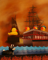
Pirate Devil Ducky Claims Another Soulby theSajComment: *Critique Club*
Wow, you seem to have gotten some great comments on what you may have improved, so I'll just talk about what I really like about this shot. Hope that's okay! (I gave it a 9, so there will be plenty to talk about :-) )
Well the first thing I love about this is the group of ducks on the ship. Those three just have such great personality! I especially love the one on the left - with the eyebrows he just looks so devious! The angle you shot at really helps emphasize them... it seems almost like their mouths (bills) are raised upward in a shout. In contrast, the duck on the plank looks relatively innocent and meek. The combination here really helps to make this shot humorous and engaging.
You did a good job, in my opinion, at using "props" as your background. You obviously couldn't put duckies in a real ship like this, but I think there are ways that people could use props and end up looking cheesy. I don't know how to describe it... it's like you're using the background and the cutouts/paintings/etc of the waves and the flames to really enhance things, rather than making us think "oh, that's just an excuse for not finding the real thing".
I like the colors and composition. Your "tilted horizon", instead of being distracting, helps add a sense of aliveness and motion to the shot. Also, I think the whole concept is just wonderful - the "devil duck" is just brilliant and really helps make the whole shot. |
 Photographer found comment helpful. Photographer found comment helpful. |
| 10/23/2006 01:08:23 AM |
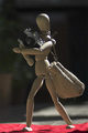
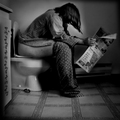
Goodbye DPCby Rino63Comment: *Critique Club*
When I came across this image during voting my first thought was that I LOVED the little camera. I think that's just so creative... I saw more than one shot with a small camera and I didn't even know they made those!
The background is nice - I like how it is blurred and not distracting. I agree with the comments that say that improvements in lighting or a curves tweak could help this. I want the main focus to be the woody but it seems that the red at the bottom is competing for attention. Composition is nice and so is the positioning of the elements in the shot (I think you did a pretty good job making him seem like carrying those things is natural).
So overall, could use a bit of improvement but it is a good image that is fun to look at. Great job. |
| Photographer found comment helpful. |
| 10/23/2006 12:19:59 AM |
|
| Photographer found comment helpful. |
| 10/23/2006 12:18:33 AM |
|
| Photographer found comment helpful. |
| 10/23/2006 12:18:31 AM |
|
| Photographer found comment helpful. |
| 10/23/2006 12:14:00 AM |
yuck... waiting for the busby elmomarieComment: Hm, unlike most I actually LOVE the snapshot-like feel to this. My main problem would be that it looks pixelated. A higher file size would help, so take advantage of the maximum allowed size of 150K. |
| Photographer found comment helpful. |
| 10/23/2006 12:11:36 AM |
|
| Photographer found comment helpful. |
| 10/22/2006 01:09:04 AM |
Abundant Povertyby SquishyBComment: Oh man, I just love the composition here. And I hope people aren't giving you grief about the "blown highlights" because there isn't much detail in that area of the penny and the way you have the lighting really sets off the figure on the penny. Great job. |
| Photographer found comment helpful. |
| 10/22/2006 01:07:29 AM |
|
| Photographer found comment helpful. |
| 10/22/2006 01:03:31 AM |
|
| Photographer found comment helpful. |
Home -
Challenges -
Community -
League -
Photos -
Cameras -
Lenses -
Learn -
Help -
Terms of Use -
Privacy -
Top ^
DPChallenge, and website content and design, Copyright © 2001-2025 Challenging Technologies, LLC.
All digital photo copyrights belong to the photographers and may not be used without permission.
Current Server Time: 08/18/2025 12:28:36 PM EDT.