| Image |
Comment |
| 06/02/2009 06:10:36 AM |
|
 Photographer found comment helpful. Photographer found comment helpful. |
| 06/02/2009 06:10:26 AM |
Tournée du Chatby ZigomarComment: Very nice blurred effect, and overall an absolutely amazing way to portray a cat. |
| Photographer found comment helpful. |
| 06/02/2009 06:08:32 AM |
"Make Me A CoverGirl" by albc28Comment: I love the colors, lighting, and the tilt. I could do without the pipe in the ceiling and the different places that different models are looking. Overall very nice. |
| Photographer found comment helpful. |
| 06/02/2009 06:07:47 AM |
Dreamingby kingskingdomComment: I like the photo. I don't think the title fits at all though. Doesn't look like a comfortable post for dreaming. I almost wish that this had been rotated 90 degrees counter-clockwise and titled something like "Flying"... although you'd probably not appeal to as many voters that way (I am quite frequently odd). Wonderful contrast and detail, and nice smooth skin without being overly smooth. |
| Photographer found comment helpful. |
| 06/02/2009 06:04:47 AM |
|
| Photographer found comment helpful. |
| 06/02/2009 06:03:44 AM |
Reflections in a Rainy Civicby posthumousComment: I gave this a 9. If I were in a market for a car, this would certainly help sell one to me!! I didn't give it a 10 because, although I understand that the dull colors fit with the overall theme, I thought just a tad more color or contrast could have helped. This was one of those out of the box shots that aren't OOB simply for its own sake, but because it actually means something. Wonderful! |
| Photographer found comment helpful. |
| 05/25/2009 03:19:38 PM |
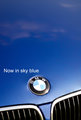
BMW in Sky Blueby mileskeaComment: One of my top three picks. Your image is one of the very few in this challenge that I feel actually looks like an advertisement, instead of a photo trying to look like an advertisement. The reason that I love this so much is because I really love simple ads. Television ads shout at us all the time and so I really feel that an ad that has simply soft music or nothing at all, sound-wise, has more of an impact. This is the visual equivalent of that, and brings to mind the intelligent tone of some Mac ads or the slick, simple feel of the Google website. I love the image itself because the white at top, to mimic clouds, is very visually appealing. The composition, both of the parts of the car and the placement of the text, is also appealing. I do think that to make it absolutely perfect, the "grainy" feel above the text and around the logo could be changed, but otherwise this is a wonderful advertisement and one of my favorites. |
| Photographer found comment helpful. |
| 05/25/2009 03:15:13 PM |
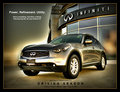
Infiniti FX by peterComment: One of my top three picks. Your image is one of the very few in this challenge that I feel actually looks like an advertisement, instead of a photo trying to look like an advertisement. I love the fact that you have the Infiniti building in the image - it helps to "sell" the shot. I also like the text that you included, because it seems very professional. The colors throughout the image are very nice and I like the blurring and lighting effect, although it may be just a tad bit too strong for my tastes. Very good job at making a professional looking advertisement. |
| Photographer found comment helpful. |
| 05/25/2009 03:13:28 PM |
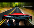
The Ultimate Driving Machine by bassboneComment: One of my top three picks. Your image is one of the very few in this challenge that I feel actually looks like an advertisement, instead of a photo trying to look like an advertisement. I love the colors, the motion, the contrast... I also very much like the placement and color of the text, and I think that the statement really fits with the feeling of the photo. If I had to nitpick a little, I can't help but feel that the left side of the car is tilted down a bit, and it's a tad bit distracting, but otherwise this is a very perfect entry, both as a photo and as an advertisement. |
| Photographer found comment helpful. |
| 05/23/2009 05:12:07 AM |
Farm-4.jpgby judojoeComment: I think the lighting works because it helps to show that she is in an environment that is a bit more natural or everyday. But I do not like the post as much, because it seems a bit forced. I'd really love to see her interacting with the environment somehow so that the image tells an interesting story. Also the background seems a bit tilted. I love the colors - the bright colors of the dress are still somehow matching with the colors of the background, I think because there are a lot of warm colors. |
| Photographer found comment helpful. |
Home -
Challenges -
Community -
League -
Photos -
Cameras -
Lenses -
Learn -
Help -
Terms of Use -
Privacy -
Top ^
DPChallenge, and website content and design, Copyright © 2001-2025 Challenging Technologies, LLC.
All digital photo copyrights belong to the photographers and may not be used without permission.
Current Server Time: 08/01/2025 05:06:21 PM EDT.