| Image |
Comment |
| 04/16/2008 05:52:10 AM |
|
 Photographer found comment helpful. Photographer found comment helpful. |
| 04/14/2008 12:31:10 AM |
|
| Photographer found comment helpful. |
| 04/14/2008 12:19:31 AM |
Happy to see me? No, guess not.by MelethiaComment: So close to a new ribbon. Maybe you should call up last place for validation and hope it gets dqed. ;)
And the Too family secret recipe - you are too funny. |
| Photographer found comment helpful. |
| 04/09/2008 01:03:27 AM |
Fire & Water by h2Comment: Well done Oliver. I need to get off my duff and pull in another ribbon or two. I just voted in centered and (if I am not mistaken) think you may have another coming your way.COngrats! |
| Photographer found comment helpful. |
| 04/08/2008 07:45:50 AM |
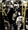
(h)edge of continuityby posthumousComment: Hah! I ended up not voting on this but just perusing thumbs trying to find interesting images. I actually had not come across this one until Aimee had made her initial vote through. That night I had to go through and find it for myself. I still think this is brilliant. WHat the heck is wrong with me? ;) |
| Photographer found comment helpful. |
| 04/08/2008 07:43:44 AM |
|
| Photographer found comment helpful. |
| 04/08/2008 12:20:31 AM |
Red Foxby AlainComment: Very nice Alain. I dont think you could have asked for anything sharper. Great color and detail. Congrats on top 10 and a new image in your top rated! |
| Photographer found comment helpful. |
| 04/07/2008 05:13:35 AM |
Glass curvesby bobonacusComment: I didnt vote in this challenge but I would have probably given this a 5. You did meet the challenge by presenting the voter with somethign that had curves. But IMO its just a straightforward picture of a vase/sculpture thing. There just isnt a whole lot of creativity to the presentation of the object. Its centered, the angle isnt overly interesting. It's more of a product shot style. Allowing some shadows on your backdrop may have been nice to show some depth or light play.
Its in focus, exposed well, no real technical issues that I can see. It just doesnt have any real wow impact that the DPC voters want. Hope that helps.
Tim |
| Photographer found comment helpful. |
| 04/07/2008 05:04:02 AM |
Body Parts Crated for Recyclingby raishComment: The title makes it even better. Had this shot just been blurry or somethign I would have voted low and never come back. But there is something about this shot that goes beyond. The grainy effect and the motion blur work well together and make this a more compelling image. I dont mind the selective desat - but the border is all wrong IMO. No border or a thin black border would have been better IMO. The border you have though just looks to "pretty" for the image. Bumping up 1. |
| Photographer found comment helpful. |
| 04/07/2008 04:56:01 AM |
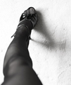
Phalangesby molly12341Comment: The curve of her leg along with the shadow from the shoe work really well together. I am glad you chose this orientation rather than foot down. Works well here. Bumping up 1. |
| Photographer found comment helpful. |
Home -
Challenges -
Community -
League -
Photos -
Cameras -
Lenses -
Learn -
Help -
Terms of Use -
Privacy -
Top ^
DPChallenge, and website content and design, Copyright © 2001-2025 Challenging Technologies, LLC.
All digital photo copyrights belong to the photographers and may not be used without permission.
Current Server Time: 08/15/2025 06:52:34 PM EDT.