| Image |
Comment |
| 04/29/2006 03:51:08 PM |
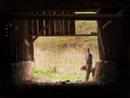
The Old Barn and Iby nards656Comment: I gave you a 5 on this one. The barn itself looks cool - though I would have liked to have seen more detail in the shadows. That board that cuts across takes away from the lines that you have going behind it. Maybe taken at a different time of day so that the outside light isnt such a contrast to whats going on inside. My eyes are more immediately drawn to the grass and trees rather than the barn. And then there is you. I am indifferent on that. Not sure if it adds or takes away. As far as the challenge goes, you weren't necessary (outside of the fact that you had to take the picture - my attempt at humor). Overall the shot has a good feel but more detail and different lighting could have made it stand out more. (I didnt read the other comments first this time - I will try to do this more often - great idea again this club thing) |
 Photographer found comment helpful. Photographer found comment helpful. |
| 04/29/2006 02:11:27 AM |
|
| Photographer found comment helpful. |
| 04/29/2006 02:09:31 AM |
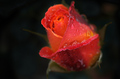
Grand Openingby DelRioPhotoComment: Very nice shot. One of my higher flower choices in the challenge. Great dof. The water droplets stand out well. Nice color blend on the rose. Well done. |
| Photographer found comment helpful. |
| 04/29/2006 02:07:16 AM |
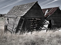
Faded and Fallingby deepfrog17Comment: Good shot overall. Personally I think a bit more color would have made it better. Also a wider crop - some more sky and background could help give more of a desolate feel. I scored you higher than your average. |
| Photographer found comment helpful. |
| 04/29/2006 02:05:00 AM |
In The Old Wine Pressby elhessarComment: Not a bad shot. Maybe just not enough of the press to give a person a good feel as to what he was looking at. I think you may have fared better had you included more of the press. Good colors and lighting. The sharpness overall is good as well. Just not a picture that draws in your attention. |
| Photographer found comment helpful. |
| 04/29/2006 02:02:35 AM |
Sands of Timeby TelehubbieComment: Beautiful shot. Great colors and lines and a good neverending fell. I gave you a 7 on this one. |
| Photographer found comment helpful. |
| 04/29/2006 02:01:24 AM |
Available, first month freeby ericwooComment: I am surprised this didnt do better. I found it funny. For me I think the color has an odd yellow/green cast to it all. You may have been able to blend the blur in a bit better on the tree in the immediate background - a bit too much in parts. But still I found it better than a 5.0. Good concept. Maybe going black and white would have been good. |
| Photographer found comment helpful. |
| 04/29/2006 01:57:29 AM |
|
| Photographer found comment helpful. |
| 04/27/2006 12:10:17 PM |
|
| Photographer found comment helpful. |
| 04/26/2006 11:32:32 PM |
Ignition by kiwinessComment: Very nice colors and great texture in the smoke. I like this one alot. Well done. Bumping up. |
| Photographer found comment helpful. |
Home -
Challenges -
Community -
League -
Photos -
Cameras -
Lenses -
Learn -
Help -
Terms of Use -
Privacy -
Top ^
DPChallenge, and website content and design, Copyright © 2001-2025 Challenging Technologies, LLC.
All digital photo copyrights belong to the photographers and may not be used without permission.
Current Server Time: 08/05/2025 06:59:31 AM EDT.