| Image |
Comment |
| 11/21/2006 04:43:07 PM |
|
 Photographer found comment helpful. Photographer found comment helpful. |
| 11/21/2006 04:42:33 PM |
|
| Photographer found comment helpful. |
| 11/21/2006 04:42:05 PM |
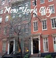
West Village Brownstonesby BethieBComment: The words blend into the photograph a bit too much. Perhaps a slight drop shadow would make them stand out more. |
| Photographer found comment helpful. |
| 11/21/2006 04:40:03 PM |
Outdoor Museumby gsalComment: The colors really jump out here, I can see this being a postcard. Interesting composition and an overall great shot. |
| Photographer found comment helpful. |
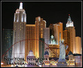
| 11/21/2006 04:39:12 PM |
Vegas Vacationby BlackboxComment: Nice image, and the text works well with it. The font does blend into the photo a little too much, but I see an attempt has been made to fix that with the outer glow. Good choice. 9 |
| Photographer found comment helpful. |
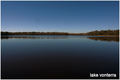
| 11/21/2006 04:37:37 PM |
Visit lake Vonterraby CamComment: I don't feel like the text really adds anything to this as a whole. It's not really interesting and doesn't really go with the photo. |
| Photographer found comment helpful. |
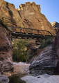
| 11/21/2006 04:36:50 PM |
Fish Creek Bridgeby AZSnapperComment: I know postcards don't need them, but I feel as if this could use some words and a border to balance out the photo with so many elements in it. The photo works well for postcards. |
| Photographer found comment helpful. |
| 11/21/2006 04:34:20 PM |
Meadowhall Shopping Centre, Sheffieldby PegasusComment: Nice photograph with pretty colors, but I can't read the font well and I think the empty top space could better be used for the wording. The border is also a bit distracting. |
| Photographer found comment helpful. |
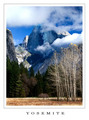
| 11/21/2006 04:32:47 PM |
by mpetersComment: Classy, beautiful and lovely. Clean layout works really well with the complicated photo. 10 |
| Photographer found comment helpful. |
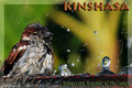
| 11/21/2006 04:31:58 PM |
Wild Kinshasa !by StrikeslipComment: I don't personally care for the font, seems a little too bold, especially the bottom, but the layout and photo work really well. 8 |
| Photographer found comment helpful. |
Home -
Challenges -
Community -
League -
Photos -
Cameras -
Lenses -
Learn -
Help -
Terms of Use -
Privacy -
Top ^
DPChallenge, and website content and design, Copyright © 2001-2025 Challenging Technologies, LLC.
All digital photo copyrights belong to the photographers and may not be used without permission.
Current Server Time: 12/20/2025 10:29:12 PM EST.