| Image |
Comment |
| 09/06/2006 12:35:39 PM |
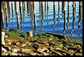
Spearsby Vapor63Comment: Excellent photo. My only suggestion would be to crop out more of the cluttered foreground--or at least use a DOF that blurs it a bit. |
 Photographer found comment helpful. Photographer found comment helpful. |
| 09/06/2006 01:55:57 AM |
Thirteen And One Thirdby gsalComment: Her head looks too centered, IMHO. A little more space to the left of the frame would have worked much better. |
| Photographer found comment helpful. |
| 09/06/2006 01:55:09 AM |
|
| Photographer found comment helpful. |
| 09/06/2006 01:54:01 AM |
A Third of Seattleby PhilipDyerComment: The skyline seems too small (like a snapshot). Maybe a tighter crop would highlight the skyline more toward the bottom of the frame. Or, when shot, include more sky which would emphasize the height of the buildings more? |
| Photographer found comment helpful. |
| 09/06/2006 01:19:45 AM |
|
| Photographer found comment helpful. |
| 09/06/2006 01:15:13 AM |
A Kissby roO_dawgComment: A closer crop would emphasize the kiss a bit more. |
| Photographer found comment helpful. |
| 09/06/2006 01:12:30 AM |
|
| Photographer found comment helpful. |
| 09/06/2006 01:11:26 AM |
From Father to Sonby rushartistryComment: With this photo, the viewer is pulled toward the frog. It just seems like the frog is not quite sharp and in focus enough. |
| Photographer found comment helpful. |
| 09/06/2006 01:10:07 AM |
sundayby shenanigansComment: Image is overexposed? The tile wall is blown out too much. Possibly because of the strong light source, which also produces those harsh shadows. |
| Photographer found comment helpful. |
| 09/06/2006 01:06:20 AM |
Cookies 'n Creamby SquishyBComment: Not enough contrast. While I like the front shadows, they are a bit to dull. Adjusting the Levels more would probably help to bring out those features. |
| Photographer found comment helpful. |
Home -
Challenges -
Community -
League -
Photos -
Cameras -
Lenses -
Learn -
Help -
Terms of Use -
Privacy -
Top ^
DPChallenge, and website content and design, Copyright © 2001-2025 Challenging Technologies, LLC.
All digital photo copyrights belong to the photographers and may not be used without permission.
Current Server Time: 08/01/2025 03:42:45 PM EDT.