DPChallenge: A Digital Photography Contest You are not logged in. (log in or register
 
Browse Settings
Currently viewing:
Registered UserBakerBug

Show comments:

Per page:

Order:

Comments:


Comments Made by BakerBug
Pages:   ... [72] [73] [74] [75] [76] [77] [78] ... [169]
Showing 741 - 750 of ~1686
Image Comment
Green on Gray
06/07/2006 11:05:13 PM
Green on Gray
by donnamt24

Comment:
It's green, but just doesn't hold my interest.
Photographer found comment helpful.
adj: ecofriendly or resourse conserving
06/07/2006 11:04:17 PM
adj: ecofriendly or resourse conserving
by cdcootie

Comment:
Great idea, but it would be much better if the DoF were deep enough that it was all in focus.
Photographer found comment helpful.
Green 2 Orange
06/07/2006 10:58:00 PM
Green 2 Orange
by pinbokeshatta

Comment:
Beautiful shot! Great DoF.
Photographer found comment helpful.
Flying Saucer
06/07/2006 10:56:54 PM
Flying Saucer
by Ken

Comment:
Would be much better if the focus were sharper.
Photographer found comment helpful.
Photosensitive
06/07/2006 10:52:41 PM
Photosensitive
by debapaka

Comment:
The level of post processing done on this really doesn't make me feel that this is photography. I would consider this digital art.
Photographer found comment helpful.
color blind
06/07/2006 10:50:46 PM
color blind
by charliebaker

Comment:
Great idea!
Photographer found comment helpful.
Wrinkle Hill
06/07/2006 10:48:36 PM
Wrinkle Hill
by lambie83

Comment:
I'm not real sure what I am looking at. However, it does look like you have some dust on your lens.
Photographer found comment helpful.
Mondovi Green
06/07/2006 10:47:20 PM
Mondovi Green
by NoellaSue

Comment:
This lacks "Wow" factor.
Photographer found comment helpful.
Twist of lime
06/07/2006 10:46:12 PM
Twist of lime
by sallyjo1

Comment:
It would be much better if the focus were more crisp.
Photographer found comment helpful.
The Jewelry Mart
06/06/2006 08:00:48 PM
The Jewelry Mart
by Catherine_B

Comment:
Hello from the Critique Club

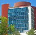
My first impression of this shot is that it doesn't stand out from the crowd. Although the building itself does represent a unique architecture, there are a few elements in this photo that really brought it down.

First off, I think the composition of this shot is not very flattering. The trees, light post, and small building in the foreground all are terribly distracting from the subject. They give this photo a cluttered feeling that steals the all important POP factor. This perspective is what anyone walking or driving by this building would see, and because of that, makes this shot seem ordinary. If there were a building facing this one, it would have been worth the effort to try and take the picture from on top of that building. This would have brought the viewer to a new perspective that would have been out of the ordinary and helped bring this shot more interest.

The lighting is also a little harsh. Adjusting the brightness down a bit would help a lot. I very much like the blue and red of the building against the blue sky, but the white facade seems almost over exposed The white with the sharp shadows grab my attention and and keep pulling me away from the more pleasing blue and red.

I think to improve this shot I would try two things. A different perspective, and shooting at a different time of day. How does this building look at night, or maybe on a partly cloudy day?

Please feel free to PM me if you have any questions!

-Bill
Photographer found comment helpful.
Pages:   ... [72] [73] [74] [75] [76] [77] [78] ... [169]
Showing 741 - 750 of ~1686


Home - Challenges - Community - League - Photos - Cameras - Lenses - Learn - Help - Terms of Use - Privacy - Top ^
DPChallenge, and website content and design, Copyright © 2001-2025 Challenging Technologies, LLC.
All digital photo copyrights belong to the photographers and may not be used without permission.
Current Server Time: 06/22/2025 09:54:58 AM EDT.