DPChallenge: A Digital Photography Contest You are not logged in. (log in or register
 
Browse Settings
Currently viewing:
Registered UserHarz_Joerg

Show comments:

Per page:

Order:

Comments:


Comments Made by Harz_Joerg
Pages:   ... ...
Showing 81 - 90 of ~256
Image Comment
GERONIMO!
01/10/2004 04:16:14 AM
GERONIMO!
by scrum8

Comment:
Great stop motion with well used DOF. The exposure is a little on the dark site for the dog, however, that's not an issue of your camerawork, it's just due to the though light situation. Good luck.
Photographer found comment helpful.
Break!
01/10/2004 04:12:40 AM
Break!1st Place
by wingy

Comment:
Great shot! Like the composition and how you manged to get the exposure fairly well on the non-moving and moving parts. Was probably hard to achiev. The lines coming from the reflections are just great. How many balls made it into a pocket?
A 9 from me
Photographer found comment helpful.
cd spinner
01/10/2004 04:10:13 AM
cd spinner
by ScantyNebula

Comment:
Like the colour play very much. The angle of view and cropping could be improved though. Still, a 9 from me.
Photographer found comment helpful.
Wedding day
01/09/2004 12:55:39 PM
Wedding day
by MrAkamai

Comment:
Wonderful use of selective desaturation: works great here. Also the angle of view is well choosen and cropping is also good. Good luck!
Photographer found comment helpful.
THAW
01/09/2004 12:53:19 PM
THAW
by ellamay

Comment:
Wonderfull clarity and colorful background. Like the cropping too.
The star reflection is just so well set and not too strong that it increases the briliance of the image while not taking overhand.
Good luck!
Photographer found comment helpful.
Fingering Ghost
01/09/2004 12:45:54 PM
Fingering Ghost
by kiwiness

Comment:
That's just a great idea! Does the bulb wire produce the wonderfull smoke by itself or did you add some smoking stuff onto it?
And yes, I do see the hand and finger too, so the title fits very well. Good luck
Photographer found comment helpful.
Enrich your life with music...
01/09/2004 12:19:32 PM
Enrich your life with music...
by WILDBLUE

Comment:
Greetings from the Critique Club

Initial thoughts/My opinion
Like the strong red colour and the way you cropped the image. Text would be great on the right side. The digital glow effect is too much.

Content/Composition
I do see the artistical concept of this submission, but somehow this concept does not get through to me very well. While a guitar and the title fit very well together and also fit to the challenge topic, I don't really get why the message gets better to the viewer when the guitar is glowing and is loosing due to that almost all details. For electric guitar this might have worked better, but for an acoustic everything looks too hot and "loud".
Beside of that I do like the composition and crop: it follows the roll of third and works mainly with shape and lines (very appropriate for a guitar).
Not adding the text into the image itself was however not a so good choice: text in a well chosen (probably red) colour with some shadow and maybe curved along the guitar would have increased the overall look considerably.

Camera work -technically
Can't tell much about it, seems to be well focused. Exposure seems fine too but because of the post processing hard to judge.

Digital Processing - Technical
See my comments made above.

Fits the challenge
Yes, it does.

Personal remark
I looked through your portfolio and other submissions and one thing is striking: you are extremely versatile and you are trying to work out new perspectives and techniques. This shows in many of your very good pictures: they are all very different and creative. Like this a lot.
And in this context this image gets a new perspective to me in the sense that you tried to see what's possible for you and the voters. I appreciate this very much.

Good luck for your further submissions
Photographer found comment helpful.
Sky is the Limit
01/09/2004 10:03:03 AM
Sky is the Limit
by flip89

Comment:
Greetings from the Critique Club

Initial thoughts/My opinion
Just excellent: full of symmetry and leading lines, with a well-chosen title and subtitle. Very good

Content/Composition
Not much to say that has not already been said: very well composed, B&W is a great choice, good text. As others, I do think that different fonts could fit better to the strong, esthetical lines of the building though.
Also the lower text is hard to read at this size.

Camera work -technically
You did it just right and it shows.

Digital Processing - Technical
Also very well done. The border is well chosen

Fits the challenge
Of course it does.

Taking 14th place in such a strong contest as this was is almost like winning a ribbon in one of the less strong ones, so thumb up and lets wait for your first ribbon.

Good luck for you further submissions
Photographer found comment helpful.
Headache In The Makin'
01/09/2004 07:20:43 AM
Headache In The Makin'
by Drake

Comment:
Fits wonderfully to the challenge and the title is great too. Like the background too.
What disturbs me though is the green/cyan coloration of the plastic: selective desatuaration might have helped here a lot to take a way the viewers attention from this not so important part of the image.
Photographer found comment helpful.
The cave you fear to enter holds the treasure you seek.
01/09/2004 04:16:07 AM
The cave you fear to enter holds the treasure you seek.
by melongrind

Comment:
Greetings from the Critique Club

Initial thoughts/My opinion
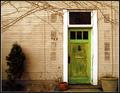
Nice, friendly looking door scene living from pleasantly looking pale colours and a variation of textures. Title not well suited though.

Content/Composition
I do like the overall composition, how the door, pots and bush are placed. It's also nicely framed at the top and bottom by the ivy and the small piece of garden that can be seen.
The image is living from texture (the wall and the old paint on the door) and shape (mainly the rectangular door and the dark spots on the wall, where probably post-boxes once were placed).
The light is looking fine to me: no sharp shadows, everything is smooth.
The colours are also very pleasant: everything has some patina, no bright shiny colours are shown. However, the scenery does not look rotten. One could envision that behind this door an elderly, friendly couple is living in old Victorian furniture. Old but nice.
At this point comes the biggest drawback of your submission: the title and image do not fit together well. There is nothing that brings up fear or cave in my mind when looking at the image. "Treasure" is fine, but to me the possibility that there are treasures behind the door is already visible when looking at the outside.
In this particular challenge, in which title/added text was much more important then usually, this was probably the reason why voters didn't vote much higher.

Camera work -technically
I think you did well very on exposure: you used the full range from dark to bright and that the lower left is underexposed fits to the overall composition. Focus could be a tad sharper (seen best on the ivy): it's just on the edge between looking soft and slightly out of focus.

Digital Processing - Technical
Looks mostly good to me: if you adjusted the saturation of this image digitally, you did just great. A bit more unsharpening mask might have been better though
You made the framing suitable for normal submissions. For this challenge however, adding a wider border with the text in it would have been the better way to go.

Fits the challenge
The image is for sure suitable for a motivational poster, the title too, but their combination not so much, as already stated above.

Good luck for you further submissions
Photographer found comment helpful.
Pages:   ... ...
Showing 81 - 90 of ~256


Home - Challenges - Community - League - Photos - Cameras - Lenses - Learn - Help - Terms of Use - Privacy - Top ^
DPChallenge, and website content and design, Copyright © 2001-2025 Challenging Technologies, LLC.
All digital photo copyrights belong to the photographers and may not be used without permission.
Current Server Time: 06/18/2025 04:15:30 PM EDT.