| Image |
Comment |
| 01/12/2004 04:30:11 PM |
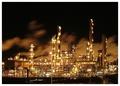
Nightshiftby geewhyComment: I personaly like to look at these bright shinning plants very much: can't take my eyes from them when I pass by.
This picture stands out for its brilliance, the lights come out almost like diamonds. I like the clouds in the back, they give a wonderfull background.
Acctually I was planning to make a simillar image too (not of such a great plant though) and the title would have been also "Nightshift".
Good luck to you. |
 Photographer found comment helpful. Photographer found comment helpful. |
| 01/12/2004 04:22:14 PM |
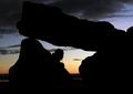
Hiding in the Darkby NazgulComment: Beautiful place captured in a beautiful scene. Well chosen title too. Like the colors and how the cloud with darknes come in form the top/back. The sharpness is great to, especially on the face.
One of my favourits. Good luck! |
| Photographer found comment helpful. |
| 01/12/2004 10:27:30 AM |
Past Her Bedtimeby dsa157Comment: Awesome picture!
I like the light in her face very much and the expression: very concentrated. Also the complete darknes surrounding her adds a lot to the mood of this picture. One of my favorits. Good luck! |
| Photographer found comment helpful. |
| 01/12/2004 04:38:50 AM |
Fountain of Youth by dsa157Comment: Yeah! Great that you and your son got a ribbon for this marvellous image.
Was my favourite as you know.
Now that I know that it is your son I even better understand the title.
It was probably the eye that made most of us voters believe that he is a girl. Also his beard isn't that strong at the moment! How old is he?
Jörg
|
| Photographer found comment helpful. |
| 01/11/2004 10:30:43 AM |
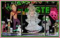
Bachelorette Centralby flip89Comment: Greetings from the Critique Club
Hi Ken, got you again!
Initial thoughts/My opinion
LOL! As tacky as can be! Frontal composition works well here. Great colours, also on the border.
Content/Composition
As others already commented, this is extremely tacky with a good portion of bizarreness. Very well chosen.
I thing you did the composition just right by giving the viewer a full view to the displayed objects, allowing him/her to let the eyes walk around and laugh here and there. There are so many things to look at, focusing on just one item might have not been as good. What I especially like is that the "tree" decoration hangs across the eyes of the "lady".
A strong element in your composition is the border: it looks almost like being the window frame and probably nobody would be surprised if the real window frame would look like that. Therefore it would have been better to crop more at the bottom.
Camera work -technically
Looks fine too me, maybe a tad underexposed (-1/3 EV or so). Focus is just right. Whitebalance too.
Digital Processing - Technical
Sharpening has been well done, it could have been brightened up a little though. As mentioned great job on the border.
Fits the challenge
Yeeeeeeeeees!
Good luck for your further submissions!
|
| Photographer found comment helpful. |
| 01/11/2004 09:42:04 AM |
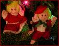
The Ugliest Ornaments.... EVERby ahazeComment: Greetings from the Critique Club
Initial thoughts/My opinion
Ugly? No. Tacky, yes (still not sure about the term tacky though). Nicely composed, a little on the dark side.
Content/Composition
I believe your submission would have done way better with a different title. When I saw the image during voting I was really amazed about the title and thought "Our 7 years old would love to have our tree only made up with these dolls". So to me the title came out a little harsh. And your story behind these ornaments tell me that you don't see them as soooo ugly too.
Of course, the dolls might be the ugliest ornaments given to you by your grandmother, but the voters didn't know.
Coming to the image itself, I have to say that it is nicely composed with the tree as background and the dolls left and right. Only the light in the middle is to bright. You may have avoided this be shining some light from a desk lamp or so onto the dolls, so you could have used a shorter shutter time. This would have also brightened up the whole scene (of course, too bright should be avoided).
I like the green glow on the boy's hair.
Camera work -technically
Focus is set fine, just a little underexposed. Also the white balance seems a little of: the image has an orange cast.
Digital Processing - Technical
The issues exposure and white balance could have been addressed very easily digitally, because the picture quality itself is good enough to withstand some alteration without starting to look digitally overdone.
I thing that a stronger, multiple colour border might have been better for this kind of image too.
Fits the challenge
Of course it does.
Good luck for your further submissions
|
| Photographer found comment helpful. |
| 01/10/2004 05:29:13 AM |
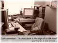
good exusesby MadMordegonComment: Greetings from the Critique Club
Initial thoughts/My opinion
Great funny submission, technically well made, should have done better. Has some compositional issues.
Content/Composition
The general concept in combination it well thought of. Of course some voters might have had problems in seeing the motivation, but to me that is not an issue.
To me the image is actually too clean: the main focal point, the chair and the PC in the back, are too clean and very inviting. Only the left desk looks a little messy, but still not too strong. And that's my main issue: intention and image do not fit as well as they probably could. Also the overexposed window brings too much order in the image.
The soft light and the warm colour choice make it very cosy, even for people (not me :)) who like a tidy desk.
So turning the camera more to the messy parts might have been a better choice.
I do like the way the light is set though: as mentioned, the softness is great and that the window is overexposed is something I like as an compositional element too.
Camera work -technically
Looks good to me: everything is sharp and exposure is good too.
Digital Processing - Technical
Again good work here: especially I like how you brightened up the lower portion for the text. In principle I do like that for the border too, but where the bright areas of the border overlap with the one for the text there is a sharp boundary which is not so good.
I like the font you selected.
Fits the challenge
Yes it does (see above). I only would have skipped the second line: it's not necessary to get the message through.
Good luck for your further submissions
|
| Photographer found comment helpful. |
| 01/10/2004 04:29:36 AM |
Text-book landingby marboComment: Being a hobby pilot myself I have to say that this looks realy like a textbook landing, allthough the front wheel could be a little higher. Like how you combined great sharpnes with just a bit of motion in the propeller. A narrower DOF blurring the background would have been great, but technically for sure not achievable directly from the camera. Great submission and a 9 from me. |
| Photographer found comment helpful. |
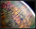
| 01/10/2004 04:24:46 AM |
As the World Turnsby dsidwellComment: I like the spinning motion very much: not to strong so one gets where one is looking at. Also like how you set the light: the overexposed right edge with its blue tint is looking great. don't know if a portion of the globe with some ocean might have been better though. Good luck! 8 |
| Photographer found comment helpful. |
| 01/10/2004 04:19:57 AM |
HIGH FIVEby ColeyComment: Great concept and very well arranged. Like the colours of the wall and the clothes of the girl. Also that only her right leg is in motion. Was it hard for her to achiev that? Good luck. |
| Photographer found comment helpful. |
Home -
Challenges -
Community -
League -
Photos -
Cameras -
Lenses -
Learn -
Help -
Terms of Use -
Privacy -
Top ^
DPChallenge, and website content and design, Copyright © 2001-2025 Challenging Technologies, LLC.
All digital photo copyrights belong to the photographers and may not be used without permission.
Current Server Time: 06/18/2025 04:15:19 PM EDT.