DPChallenge: A Digital Photography Contest You are not logged in. (log in or register
 
Browse Settings
Currently viewing:
Registered UserHarz_Joerg

Show comments:

Per page:

Order:

Comments:


Comments Made by Harz_Joerg
Pages:   ... ...
Showing 51 - 60 of ~256
Image Comment
Ancient Egyptian
01/23/2004 02:55:36 AM
Ancient Egyptian
by jayke

Comment:
Great subject with well ste light and delicate texture. Would have loved it if the background would be a little more visible. The colour of the background is great though.
Photographer found comment helpful.
My Last One
01/20/2004 11:59:16 AM
My Last One
by Spanish_Grease

Comment:
Greetings from the Critique Club

Initial thoughts/My opinion
Great stuff, very well composed. Like the use of inverting the picture.

Content/Composition
Very well made! I especially like the ratio between the small cigarette and the large smoke and how you positioned the cigarette and the smoke along the diagonal.
Also, as it has been already mentioned by others, the use of negative space is great.
The only flaw I can think of is the darker portion of smoke at the lower right: elsewhere one has the feeling to see almost the whole smoke and only small portions have already faded out of the frame, but at the lower right the "thick" smoke is cut, so the viewer knows that there is more smoke around.
But this is really a minor issue.

Camera work -technically
Everything done as it should be: exposure and focus is right (judged it by inverting the image back).

Digital Processing - Technical
Inverting the image was a very good idea: it does not look unnatural, but gives it a final kick. That the inversion results directly in a sepia was a surprise to me. The border works very well too.

Fits the challenge
Of course it does and I hope you still keep your resolution (unless you didn't ever smoke at all). I tried to stop this year, but I failed.

Good luck for your upcoming submissions.

Photographer found comment helpful.
Woe be to him that reads but one book
01/20/2004 11:42:33 AM
Woe be to him that reads but one book
by MrOlafsson

Comment:
Greetings from the Critique Club

Initial thoughts/My opinion
Great resolution, nice looking books, too sad that a flash was used.

Content/Composition
The books themselves look nice due to their colour and nice texture. Taking just one out of the row is also a good choice. Showing a hand taking the books out might have actually been even better.
One compositional element that is important to such an image is to keep the image clean, i.e. showing only the things that are necessary and avoid anything else that does not belong there. In this image it's the lower row of books that is unnecessary. If it is cropped away the image gets much clearer, the book shelve serves way better as leading line and the more rectangular image looks much better.
In principle similar arguments can be used for the shelve itself: the wood disturbs a little too, especially at the very right. However, this could be better addressed using different light.

Camera work -technically
A major issue is the light: an important rule for indoor still-life photography is to avoid direct flashlight: it's simply too harsh, gives bad reflections that cannot be controlled by you and also strong shadows. Taking a simple desk lamp and moving it around the subject to see when the light and shadows look best is not only fun, but makes the whole atmosphere. Of course for doing so, a tripod or another good support for the camera is needed. Focus is set to the book that is taken out and that̢۪s just right.

Digital Processing - Technical
The image could have been sharpened a bit. A well fitting border might be good here too.

Fits the challenge
Yes, very well, the intention gets through even without the title.

Good luck for your upcoming submissions
Photographer found comment helpful.
A Quiet Seaside Town
01/20/2004 10:58:21 AM
A Quiet Seaside Town
by Konador

Comment:
Greetings from the Critique Club

Hi Ben;
Now it's up to me to give you a critique!

Hmmm..., let's see what we have here....

Initial thoughts/My opinion
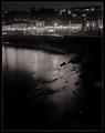
Wonderful scenery living from the high contrast between the deep black and the bright lights. The leading line coming from the quay could have be pronounced more.

Content/Composition
The image gives a feeling of being at a nice small town at a calm, still cold night. One likes to look at the scenery but also likes to go inside the friendly houses along the seaside. This is probably due to the choice of B&W with a relatively high contrast: it looks as if there are just three values of brightness: pure black, the medium grey of the sea and houses and then pure white of the lights. I like that.
The viewers eyes always follow the leading line of the quay and I would have preferred it if it would stretch more diagonal along the image, i.e. if your position would be more to the right. This would have probably also lead to a less large dark area at the lower left and at the right side. These areas are a little large IMO.
A tighter crop would have result almost in the same effect.

Camera work -technically
Looks very good to me: focus seems right, although I don't want to call the image crisp.
Exposure time seems to be relatively short, judged from the not completely smooth sea surface. That was a good choice: made the water more interesting.
Exposure is well set for the achieved effect. Does the graininess come from selecting a high ISO-value?

Digital Processing - Technical
Looks a little over sharpened, might this be another reason for the graininess? I do like the frame.

Fits the challenge
Of course it does: very after dark!

Good luck for your upcoming submissions
Photographer found comment helpful.
Cardinal Bracing Against The Snow Storm
01/20/2004 10:24:35 AM
Cardinal Bracing Against The Snow Storm1st Place
by Drake

Comment:
That's areal beauty! Like the colour, crispness and the snowflaks on the bird as well as on the background. I can feel the coldness! Good luck to you.
Photographer found comment helpful.
Prehistoric Sea Animals from the Ordovician Sea
01/20/2004 10:22:58 AM
Prehistoric Sea Animals from the Ordovician Sea
by Marjo

Comment:
Nice use of DOF in this colourfull image. It's a little bright though and also too grainy. Otherwise well composed and captured.
Photographer found comment helpful.
Nemo: The Truth About Clown Fish
01/20/2004 10:21:18 AM
Nemo: The Truth About Clown Fish
by KING

Comment:
I like the light and the colour very much. Only the balance between the fishs and the rocks is a little off. Maybe only showing just one fish would have been better.
Still, I hope you do well with this wonderfull image.
Photographer found comment helpful.
Surveying the scene
01/20/2004 10:18:10 AM
Surveying the scene
by dan_pendleton

Comment:
Even without the current cahllenge subject everybody would associate this image with NG! Great pose of the kitty and very crisp. One of my favorits. Good luck.
Photographer found comment helpful.
Weighing In the Future
01/20/2004 10:16:42 AM
Weighing In the Future
by librodo

Comment:
Great image: love the composition and colour. Also well cropped.
One of my very favorits. Good luck to you!
Photographer found comment helpful.
MENACING
01/19/2004 02:24:01 AM
MENACING2nd Place
by ellamay

Comment:
Also congratulations from me! Awesome building presented wonderfully.
Photographer found comment helpful.
Pages:   ... ...
Showing 51 - 60 of ~256


Home - Challenges - Community - League - Photos - Cameras - Lenses - Learn - Help - Terms of Use - Privacy - Top ^
DPChallenge, and website content and design, Copyright © 2001-2025 Challenging Technologies, LLC.
All digital photo copyrights belong to the photographers and may not be used without permission.
Current Server Time: 06/18/2025 04:15:17 PM EDT.