| Image |
Comment |
| 04/07/2003 10:06:40 PM |
Coral Roseby basia03Comment: This one definitely meets the color challenge as color dominates the photo, but roses are a pretty common subject so the competition is pretty stiff with this subject. The soft focus is a tad strong for my taste. I am also distracted by the dark edge of the bottom left petal. Composition and use of color are very good in this picture and I also really like the background (especially the top left section of it). Finally I don�t care for the border on this picture. Good effort, I gave it a 5.
Greg
|
 Photographer found comment helpful. Photographer found comment helpful. |
| 04/07/2003 10:01:57 PM |
Sunset in the parkby scrooslooseComment: I was surprised that there weren�t more sunset pictures this week. It looks like you made a good capture of a pretty sunset. I think the composition is good and I like the exposure on the sky. The problem with sunset pictures is that a lot of people do them and a lot of people do them very well. This means that when you enter one it has to pretty much be spectacular in order to do very well. I gave this one a 5.
Greg
|
| Photographer found comment helpful. |
| 04/07/2003 09:48:45 PM |
Little Pink Housesby Rosie20Comment: This is a cool picture, I can�t believe someone painted their house like this! I do, however, find some of the lines to be disturbing. Particularly the way the fence appears to be at a slant with respect to the awning over the patio. It might have been better to crop away the bottom part of the picture to avoid this. The top part of the house and the roof appear to be blown out also which detracts from the photo. If you use a little negative exposure compensation you can prevent this. Slightly underexposing the picture should also bring out the colors more. Compositionally I would rather see the house not smack in the middle of the picture and I would like to see more sky about the house. I find it uncomfortable that the chimney is cut off. Finally, I would strongly recommend turning off the date-stamp function for challenge pictures. This is a very good picture for the challenge and with a little more work it could score very well. As it is now I gave it a 3.
Greg
|
| Photographer found comment helpful. |
| 04/07/2003 09:41:25 PM |
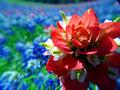
Paintbrush in Bluebonnetsby AnachroniteComment: Very neat picture here. I have spent the last couple of weekends driving the TX highways taking pictures of wildflowers and I really like what you have done here. I love the way you did the background, it really strengthens the photograph. I have found the paintbrushes to be somewhat difficult to photograph. The color on them is so intense I have had problems with the colors clipping but you seem to have it very much under control here. I think the focus could stand to be a tad sharper, maybe if you stopped down the lens maybe one or two more stops but it is tough to say. There also appears to be some viganetting on the top right corner of the photo. I would crop that out if it were my picture along with the dark area in the top of the picture. Unfortunately this might place the paintbrush too close to the top of the picture so you might need to have more view on the top. It just feels uncomfortable with the horizon so close to the top of the picture. By the way, the color is the dominant element of this photograph so it does meet the challenge very well. Great effort I gave it a 7.
Greg
|
| Photographer found comment helpful. |
| 04/07/2003 09:35:34 PM |
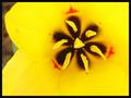
First spring bloomby steveh552Comment: This is an interesting picture. I love the shape of the center of the flower and the color definitely is the dominant element of the photograph so it meets the challenge well. The focus looks a bit soft to me and the petals look somewhat oversaturated to me. Composition is very good bit the brown and green in the background is distracting me. I wish the background was smoother and monochromatic. I think if you used a brown or green backdrop it would help a lot. Very good effort, I gave it a 5.
Greg
|
| Photographer found comment helpful. |
| 04/07/2003 09:32:24 PM |
Mom's gift Quilt handquilted by Momby Crafty SueComment: You made a nice use of color here but I think the picture could be more exciting. I think the lighting is what is getting you here as well as to a lesser degree the composition. I don�t know if this is possible with the equipment that you have but I think the perspective could be better. You might try this one with a longer focal length so the lines are a little closer to parallel. To me it detracts for the picture that the center row of squares isn�t exactly centered. If you had really offset it then it wouldn�t be an issue, but it is so close to being centered that for me it really needs to be centered. The other issue is the lighting. This, for me, is the more critical issue with this picture. The lighting looks a bit harsh and unnatural. I am guessing you used the on-camera flash in conjunction with the ambient room lighting. I think what would really help this picture would be to place some tissue-paper over the light sources to diffuse the light. I would also boost the saturation and contrast to make the colors richer. Keep working on it, I think you have a good start here. I gave it a 4.
Greg
|
| Photographer found comment helpful. |
| 04/07/2003 09:22:43 PM |
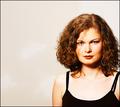
.......by dimitriiComment: This is a very nice picture of a beautiful woman. I like the composition and I like the use of negative space. The lighting is great. I don�t, however believe that color is the dominant element in this photograph. I think this photo does meet the challenge. If the colors were a little more dramatic I think I would score it higher but as it is I am going to give it a 7.
Greg
|
| Photographer found comment helpful. |
| 04/07/2003 09:17:29 PM |
Colorful!by nathaliedooComment: Cool colors here but I wish they weren�t in such bad shape. How did you get them to be all those different colors? The focus looks a little soft and the lighting looks very harsh. I think the composition is nice but the focus and lighting take a lot away to a potentially strong picture. You might be able to soften up the light by making a diffuser out of tissue paper and holding it in front of the light source. You could also possibly place the flowers in the shade and use a white piece of poster-board to reflect the light onto the flowers to make things softer. I gave it a 3 but I think with a little more work it could be a lot better.
Greg
|
| Photographer found comment helpful. |
| 04/07/2003 08:27:25 PM |
untitledby EJComment: Are these straws? This is a really cool idea I think but the focus seems to be a little off. There also looks like there is a small white balance issue at work here. I could be wrong about this but the white lids on the bottom of the picture are yellowish and I think the picture would look more natural if they were white. The other things that I find distracting are the words and bar code behind the straws. I would have also cropped out the blown out areas in the top of the photograph. With a little work this picture could really be wonderful. Keep up the good work -4
Greg
|
| Photographer found comment helpful. |
| 04/07/2003 08:23:24 PM |
Kids Colorsby vtruanComment: I like the idea for this picture but there are a few things that are taking away from an otherwise strong photograph. I would have liked it better if none of the letters were flipped over and if the light was softer. These two problems are easy enough to fix. To make the light softer you can place a piece of tissue over the flash to diffuse the light some. You could also try it outdoors in natural light. I think you might have left some upside down so we can see that they are magnets but for me I would like tem all to be right-side-up. The other thing that seems to be detracting from this photo is the cropping. I would have completely cropped away the drawer so it is only letters. I think that with a little more work here this one could be a prize winner. The way it is now I give it a 4.
Greg
|
| Photographer found comment helpful. |
Home -
Challenges -
Community -
League -
Photos -
Cameras -
Lenses -
Learn -
Help -
Terms of Use -
Privacy -
Top ^
DPChallenge, and website content and design, Copyright © 2001-2025 Challenging Technologies, LLC.
All digital photo copyrights belong to the photographers and may not be used without permission.
Current Server Time: 08/20/2025 10:46:15 AM EDT.