| Image |
Comment |
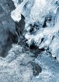
| 12/18/2003 11:19:37 PM |
Freezing along the way...by timmiComment: One of my favorites of the challenge. The colors are great, really gives a cold feeling to the image. I think the one big "thing" of ice (kinda looks like an inverted mushroom) takes a way slightly from the flow of the rest of the ice. Still, great job. -9- |
 Photographer found comment helpful. Photographer found comment helpful. |
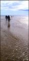
| 12/18/2003 11:16:17 PM |
Walking on Waterby puyaComment: Lovely colors in the sky. I also like how the surf flows to and from each side of the image, nice composition. I think I'd actually like it better without the people in it, but I understand that probably wasn't possible. |
| Photographer found comment helpful. |
| 12/18/2003 11:13:25 PM |
Winter Creekby Firstrich1Comment: The water color looks a bit unnatural, but the saturation looks pretty good on the grass and the foliage. I think toned down a little (color), this would be a great shot. -7- |
| Photographer found comment helpful. |
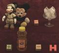
| 12/04/2003 11:28:44 PM |
Rebusby jvanderauComment: lol, very interesting. creative interpretation of the challenge. Seems a little low in contrast, maybe playing with levels and such would give more life to the subjects. |
| Photographer found comment helpful. |
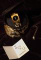
| 12/04/2003 08:22:57 PM |
The "spell" of moneyby RonBComment: I haven't heard of a few of those, but I'll take your word for it = )
Nice idea, the exposure is just right imho, although it seems slightly out of focus in the lower left, might be just my eyes. |
| Photographer found comment helpful. |
| 12/04/2003 08:20:21 PM |
Material Girlby RiderGalComment: Nice idea, I think I would include a little more light, or a different colored background - It matches the camera case, but the two seem blend together and are hard to distinguish - this is really only a slight issue though. Cropping is well done and the subject conveys the topic well. -7- |
| Photographer found comment helpful. |
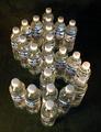
| 12/04/2003 08:17:58 PM |
Water.... Who'd A Thunkit !by DrakeComment: I like both the idea and the meaning behind it, but I think the exposure could be done better. The lighting is such that it creates faint shadows - If they were either more prominent or non-existent it would create a stronger effect. The lighting also seems to be throwing off the white balance. I think the setting for the bottles is fine. With different lighting, I think this could be a very good picture. |
| Photographer found comment helpful. |
| 12/03/2003 09:53:47 PM |
|
| Photographer found comment helpful. |
| 12/03/2003 12:25:46 AM |
|
| Photographer found comment helpful. |
| 12/03/2003 12:21:19 AM |
What Do You Want? - Help!!!!!!!!!!by gstrotmannComment: Cute idea, I think it would be strengthened by a greater emphasis on the hammer, perhaps a stronger light source. I think more light on the bank may also work well. |
| Photographer found comment helpful. |
Home -
Challenges -
Community -
League -
Photos -
Cameras -
Lenses -
Learn -
Help -
Terms of Use -
Privacy -
Top ^
DPChallenge, and website content and design, Copyright © 2001-2025 Challenging Technologies, LLC.
All digital photo copyrights belong to the photographers and may not be used without permission.
Current Server Time: 07/21/2025 02:21:14 PM EDT.