| Image |
Comment |
| 10/10/2005 12:47:13 PM |
|
 Photographer found comment helpful. Photographer found comment helpful. |
| 10/10/2005 12:46:51 PM |
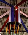
Decorationsby rebelgirlComment: A bit out of focus and underexposed. I like the composition with the banners, but the lights in the background are distracting. I'd suggest cropping the left and right sides evenly to eliminate the light on the left and cropping the bottom to get rid of the bottom light (even at the expense of cutting off part of the ribbons). Additionally, the color balance is a little off - the white banners have a pink shade to them. |
| Photographer found comment helpful. |
| 10/10/2005 12:44:46 PM |
October feastby BrianRComment: I'm not sure what the focus of this image is. I'm guessing its the sign, but the composition really doesn't emphasize it, especially with the pole in front. Keep trying, improvement will come. |
| Photographer found comment helpful. |
| 10/10/2005 12:36:41 PM |
'Still Crazy after all these years..'by barbaraanneComment: Nice subject, but I think it could be improved with higher contrast, and possibly in a black and white format. Also, to add a personal element to the shot, I'd suggest including their faces in the shot somewhat. |
| Photographer found comment helpful. |
| 10/10/2005 12:35:13 PM |
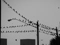
Breakfast Meetingby RN PattiComment: While an interesting scene, I think the composition could be improved (crop out the pole on the left and the bottom of the scene to focus only on the birds on the wires). Regardless, I don't think this really fits the celebration focus of the challenge - this has more of an ominous tone with the dark shades and silhouettes. |
| Photographer found comment helpful. |
| 10/10/2005 12:33:18 PM |
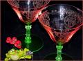
She'll be here any minute......(please say yes)by AzCKellyComment: Lighting is a bit harsh on this. If you have an external flash, I'd bounce it off the ceiling. If you are using a point-n-shoot I'd set the camera on a tripod with a long exposure or increase the ambient lighting in the room. That should take care of the blown highlights on the glasses as well as give a softer look to the scene. Also, I feel attention should be drawn to the frog and the ring, but the glasses are a bit overpowering. Some shallow depth of field (using a larger aperture to blur the background) could help here as well. Good subject / cause for celebration though. |
| Photographer found comment helpful. |
| 10/10/2005 12:30:31 PM |
Familyby leafComment: Great expression on the child! I'd like to see more of the mother's face though to show more of the relationship between the two. As shot though, the highlights on the baby draw my attention, so it isn't really a big issue not showing the mother's face. |
| Photographer found comment helpful. |
| 10/10/2005 12:57:33 AM |
|
| Photographer found comment helpful. |
| 07/07/2005 11:51:26 PM |
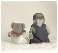
Snuggle Bearby SonifoComment: Nice work, the soft textures are really emphasized well. The color tones are nice and work well here, but I think I'd also like to see a warmer tone to give a more personal look to the shot. Congratulations on 11th place = ) |
| Photographer found comment helpful. |
| 05/29/2005 11:54:50 AM |
|
| Photographer found comment helpful. |
Home -
Challenges -
Community -
League -
Photos -
Cameras -
Lenses -
Learn -
Help -
Terms of Use -
Privacy -
Top ^
DPChallenge, and website content and design, Copyright © 2001-2025 Challenging Technologies, LLC.
All digital photo copyrights belong to the photographers and may not be used without permission.
Current Server Time: 07/21/2025 09:16:01 PM EDT.