| Image |
Comment |
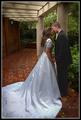
| 10/13/2005 01:01:41 AM |
Private Celebrationby rjksteschComment: Beautiful capture. The couple really stand out well against the background but still fit within the overall scene. Strong composition and exposure as well. |
 Photographer found comment helpful. Photographer found comment helpful. |
| 10/13/2005 01:00:35 AM |
Victoryby holyfamComment: Great expression and angle, would be stronger imho if the left hand wasn't cut out, though it does look ok as it's not cropped right at the wrist. The bright colors add impact as well. |
| Photographer found comment helpful. |
| 10/13/2005 12:59:30 AM |
|
| Photographer found comment helpful. |
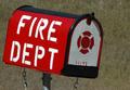
| 10/13/2005 12:58:12 AM |
Thanks for Making House Callsby vtruanComment: To me, this subject might work best for a photojournalistic approach - maybe including the fire hall or a fire truck (if possible) in the background. The mailbox by itself doesn't hold a lot of interest imho. However, a more abstract approach might work as well -- perhaps a closup of the red side of the mailbox emphasizing the textures + geometry of the box. Just my thoughts. |
| Photographer found comment helpful. |
| 10/13/2005 12:54:02 AM |
ROTC Members Holding The Flagby eaglebeckComment: I think this is a good subject, but might benefit from a more interesting/less rigid composition. Framing the image such that the stripes create diagonals (rather than straight forward lines as they are here) in the image would strengthen it in this way imho. Seems to be a little bit of motion blur (on the girl at the right) as well - faster shutter speed should clear that up. Nice candid capture. |
| Photographer found comment helpful. |
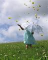
| 10/13/2005 12:51:24 AM |
Rainy Daisy Days by CNovackComment: Great idea and subject. Did you try any with the umbrella at the girl's back? I think a classic childhood smile here could really add emotion and impact to the image. As it is now, my attention is drawn more to the daisies, but I think it would be more powerful with the girl (and her facial expression) as the focus. |
| Photographer found comment helpful. |
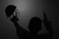
| 10/13/2005 12:49:37 AM |
Ton up at Lordsby tonyvComment: From my view, it seems that the mask is the focus of the shot - it has the most contrast in the cage and top. You might structure the composition to better emphasize this (maybe crop off a bit on the right to put it more into the upper left third of the frame). Alternately, if you'd prefer to have focus on person (doesn't seem to be the case here as his back is turned), a little more light to show or hint at his features should emphasize that subject. I'm on the other side of the pond so I don't know anything about crickett, but he seems to be enjoying it = ) |
| Photographer found comment helpful. |
| 10/13/2005 12:46:10 AM |
On Week 18by ergoComment: I don't quite get the title, but I'm a little dense when it comes to things like this = P
Nice, creative image. |
| Photographer found comment helpful. |
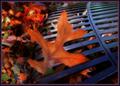
| 10/10/2005 09:54:30 PM |
Autumn's Offeringby JutildaComment: Nice shot, the colors and the slight blur make this. Ordinary object shot extra-ordinarily. |
| Photographer found comment helpful. |
| 10/10/2005 09:53:39 PM |
|
| Photographer found comment helpful. |
Home -
Challenges -
Community -
League -
Photos -
Cameras -
Lenses -
Learn -
Help -
Terms of Use -
Privacy -
Top ^
DPChallenge, and website content and design, Copyright © 2001-2025 Challenging Technologies, LLC.
All digital photo copyrights belong to the photographers and may not be used without permission.
Current Server Time: 07/21/2025 09:17:04 PM EDT.