| Image |
Comment |
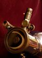
| 06/11/2003 02:08:37 PM |
Sky & Telescope ~ Eclipse of Sunby ladpupmoeComment: The bright white behind the BUSHNELL on the telescope is very annoying, it totally draws my eye from the main point to it... I think I would have used a lighter colored background... because the wine color is almost similar to the telescope, and it makes the telescope blend in. Watch your reflections. |
 Photographer found comment helpful. Photographer found comment helpful. |
| 06/11/2003 02:05:27 PM |
Scientific American - Relativistic DNAby ArtifactsComment: This is pretty cool, almost doesn't look like a photograph. What are the red splotches here and there? the black on the bottom right is kind of annoying... I think cropping that out would have made it more of a vertical photo and fit it better to the theme. Not sure I care for the border, but I'm not usually big on borders. |
| Photographer found comment helpful. |
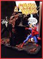
| 06/11/2003 02:03:20 PM |
W i R e Dby miss parkerComment: Imaginative and nicely done. I really actually like this... it fits the theme... it works... nicely done. Not sure I care for the border, but I'm not usually big on borders... |
| Photographer found comment helpful. |
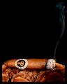
| 06/11/2003 01:25:20 PM |
Cigar Aficionadoby crabappl3Comment: This is a great photo that really fits the challenge... plenty of space for type, very well done. Not sure I would have put the black border, but I don't think it detracts substantially from the photo... The whisps of smoke produced by the cigar are pretty much "picture perfect" very nicely done! |
| Photographer found comment helpful. |
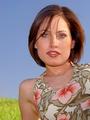
| 06/11/2003 02:26:55 AM |
ELLEby jenaromComment: Pretty model... nice, natural lighting, plain backgournd, room for words. Nicely done, could definitely see this as a cover! Good luck with this! |
| Photographer found comment helpful. |
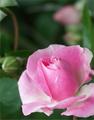
| 06/11/2003 02:25:33 AM |
Rose Magazineby PHOTOCHlXComment: Nice and simple... lots of space for words and title... pretty, eye catching... attractive... could definitely be a cover. Good luck! |
| Photographer found comment helpful. |
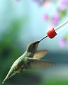
| 06/11/2003 02:21:51 AM |
Birds and Bloomsby MarjoComment: Great stop action photo here... I can't imagine what shutterspeed you had to use for this photo! I like this photo a lot, although it looks maybe a tad bit dark. The brightness at the top takes away from the main subject, but I'm not sure how you could have avoided that. How muchdid you crop for this phtoo? it looks maybe a tad bit grainy, but doesn't bother me too much. Nice catch! Good luck. |
| Photographer found comment helpful. |
| 06/11/2003 02:19:20 AM |
Moja Beba (eng. My Baby Magazine): Sweet Little Angel's Dreamby gaja_tzComment: This is beautiful... maybe just slightly too dark, but it gives this a nice dreamy feel. I love the shadows that fall over the crib and the sleeping baby. The bottom area leaves room for words which is nice. I would have lightened this slightly but I think it's very well done. Good luck! |
| Photographer found comment helpful. |
| 06/11/2003 02:15:32 AM |
New Jersey Monthlyby mattsComment: Personally I do not consider magazines to be in a horizontal shape... thats just me though. I do hope your one of the people coming to Saturday's East Coast GTG in NYC. Lots of blue in this photo! I think that unless you planned to put a lot of REALLY BIG words at the top there is too much sky, and that makes up almost half of the whole photo. I would have cropped out a large part of that! I do like the parachuter/parasailer in the background though. |
| Photographer found comment helpful. |
| 06/11/2003 02:13:04 AM |
Reptilesby Krawf47Comment: Corn/fox snake? What a beautiful animal. Is that how his eyes normally are? Since I'm guessing this is a pet snake I would have like to have seen him in a more natural environlment... or at least stretched out some. You also lose a lot of detail in the whiteness or lightness of the shavings at the bottom of the photo, which detract from the photo... The snake is also too centered in this photo, I think, cropping in from all sides might have helped, although maybe this leaves sufficient room for words? I think I would have tried to make the snake a more substantial part of the overall photo. |
| Photographer found comment helpful. |
Home -
Challenges -
Community -
League -
Photos -
Cameras -
Lenses -
Learn -
Help -
Terms of Use -
Privacy -
Top ^
DPChallenge, and website content and design, Copyright © 2001-2025 Challenging Technologies, LLC.
All digital photo copyrights belong to the photographers and may not be used without permission.
Current Server Time: 08/21/2025 10:40:00 AM EDT.