| Image |
Comment |
| 08/10/2003 11:55:50 PM |
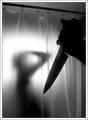
Psycho by JackoComment: I can definately see this one in first place... AWESOME SHOT! great lighting, very well done... WAY TO GO! -10- |
 Photographer found comment helpful. Photographer found comment helpful. |
| 08/06/2003 02:15:20 PM |
KRGBby thelselComment: I hate to tell you this, but I don't see any actual right angles in this photo. I like the photo though... the lighting on the colors is very nice... but I'm just not sure it fits the challenge. |
| Photographer found comment helpful. |
| 08/06/2003 02:13:13 PM |
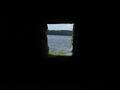
Right Angled Windowby MikaelComment: To me there is too much empty space heere... I think it would have been nice if you had cropped in some on all sides... cool window though. Might have been nice also for inside looking out. |
| Photographer found comment helpful. |
| 08/06/2003 02:10:59 PM |
90° Abstract by timmiComment: Very cool. I like it... I kind of wish the middle went straight up, it sort of tilts to the right, but it's not a bid deal. I like this photo... artsy and interesting. -9- |
| Photographer found comment helpful. |
| 08/06/2003 02:09:11 PM |
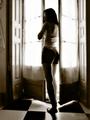
Study of Body and Linesby BlurryComment: Very interesting look here. Your going to get ripped on the blown out window, but I really like it, I think it gives it a mysterious look. Thank you for not putting the girl dead center. Really interesting artsy photo you have heree. I'm going to give it a -10- as it strikes me for some reason. |
| Photographer found comment helpful. |
| 08/06/2003 02:07:33 PM |
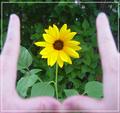
Photographer's Frameby sagestudioComment: This would have been REALLY cool if you had used a much larger DOF and managed to focus on the fingers... I actually would have preferred if the fingers were in focus and the flower wasn't. Good idea, but could have been executed better. |
| Photographer found comment helpful. |
| 08/06/2003 02:03:34 PM |
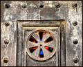
Portalby sherComment: Rotating this slightly so that it was straight would have helped. I like the fact that there is the color (stained glass?) behind the open parts. Interesting subject... |
| Photographer found comment helpful. |
| 08/06/2003 02:02:22 PM |
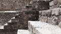
Symphony of Light and Shadowby La-LunaComment: Too much light on the closest step, you lost all the detail, which would have been really nice to see. I like the subject though... very cool. Where is this? |
| Photographer found comment helpful. |
| 08/06/2003 01:52:14 PM |
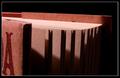
Pagesby frankensteinComment: I like this... very nicely done with not showing the entire book. I like the lighting, although I might have liked to see a little more detail at the top of the pages. Not too big of a deal though. -8 |
| Photographer found comment helpful. |
| 08/06/2003 01:48:21 PM |
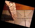
ALL THE RIGHT ANGLES!by basia03Comment: Extremely imaginative... I'm guessing you did this with cropping and rotating in the frame? AWESOME. I haven't seen this done before, but it's totally legal. Very Very nice job... the photo is great too, it gets a little dark in the left hand corner, but I'm not going to count off for that... I really lke this. -10- |
| Photographer found comment helpful. |
Home -
Challenges -
Community -
League -
Photos -
Cameras -
Lenses -
Learn -
Help -
Terms of Use -
Privacy -
Top ^
DPChallenge, and website content and design, Copyright © 2001-2025 Challenging Technologies, LLC.
All digital photo copyrights belong to the photographers and may not be used without permission.
Current Server Time: 08/22/2025 04:14:40 AM EDT.