DPChallenge: A Digital Photography Contest You are not logged in. (log in or register
 
Browse Settings
Currently viewing:
Registered Usercresus

Show comments:

Per page:

Order:

Comments:


Comments Made by cresus
Pages:   ... ...
Showing 61 - 70 of ~244
Image Comment
Proof of Spring
04/20/2006 12:28:24 PM
Proof of Spring
by Kivet

Comment:
The sky looks oversaturated here. Doesn't look real. It looks like you've got some haloing from the sharpening as well.
Photographer found comment helpful.
Vivace
04/20/2006 12:24:40 PM
Vivace
by xXxscarletxXx

Comment:
I don't know what this has to do with "Something New." Interesting color.
Photographer found comment helpful.
Blooming Rose
04/20/2006 09:07:16 AM
Blooming Rose
by Mush

Comment:
Image is soft. I would've cloned out the problems with the leaves in the background.
Photographer found comment helpful.
Early buds on a trunk
04/19/2006 09:27:12 PM
Early buds on a trunk
by cooperj7

Comment:
This is pretty soft. Lighting is very harsh...especially bottom right.
Photographer found comment helpful.
Beginning a New Life
04/19/2006 09:26:04 PM
Beginning a New Life
by karmat

Comment:
Great use of light and shadows. Very nice picture.
Photographer found comment helpful.
Road Through Dreams II - Judi Liosatos
03/24/2006 10:44:11 AM
Road Through Dreams II - Judi Liosatos
by Kita

Comment:
I like the range of this one more than the original. Nicely done.
Photographer found comment helpful.
Her warm smile and love.
03/03/2006 12:29:22 PM
Her warm smile and love.
by parrothead

Comment:
I appreciate the grain, but I think it's just a touch too much in this case (since you're trying to emphasize her smile and it's somewhat obscured by the noise in the shot).
Photographer found comment helpful.
The kids in America
02/27/2006 11:16:42 AM
The kids in America
by Philos

Comment:
Greetings from the Critique Club

I think this suits the challenge quite well. It demonstrates the 'Smoking is Cool' mentality that prevailed in the 80's and the excessive make-up styles used then. My criticism for make-up and hair would be that it's too subtle. The 80s were known for drastic colors in both hair and make-up. Girls often had streaks of color in their hair as well as the use of non-conventional colors of eye-shadow. Also, the decade was known for 'big hair' which I would have to say hers doesn't make me think. In any case, on to the technicals.

Composition:
Composition is quite good here. I'm distracted by the fact that some of her hair is cut off on the top. The positioning of her and her hand in the frame is excellent.

Lighting:
I love the lighting here. Great use of indirect lighting to lend interest to the shot by having her face and hand partially illuminated.

Post-Processing:
I would've preferred some more detail in her clothes. As it is, she's in black on a black background with no contrast between the two. Some dodging to give a little texture to her clothes would've been nice so there was a difference from the background and she wasn't a floating head.

Suggestions/Improvements:
Lighting or dodging on her jacket to bring her out of the background. More make-up and hair. She looks like she could've been pulled off of the street as it is and be only mildly out of fashion. The main selling point for the 80s here is in the pointy eyeliner. Don't cut off the top of her head...it's important since it's hair and makeup that sell the picture to the challenge.

I hope this was useful to you, and please feel free to contact me via PM if you have any questions regarding this critique.

Regards,
Zeke Smith
Photographer found comment helpful.
Docked
02/24/2006 03:03:24 PM
Docked
by langdon

Comment:
Pretty picture. Blue tone is very nice.

Whoever cleated that boat is asking for it to drift away though.
Photographer found comment helpful.
Home time
02/24/2006 01:45:41 PM
Home time
by KHolt

Comment:
Greetings from the Critique Club

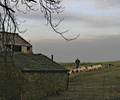
This picture, as has been commented previously, is a great representation for this challenge. Only criticisms are basically things out of your control.

Composition:
Nice off 2/3 placement of the shepherd and sheep. Excellent depiction of country life by inclusion of the house. I would've preferred less foreground distraction from the tree but in the limited time you had this is a nice capture.

Lighting & Camera Work:
The lighting in this shot is less than ideal since the subjects are all relatively dark as compared to the sky. I would've liked to see brighter subjects but again, in the limited time you had nice job. Exposure of the scene looks good. I think the focus should have been on the shepherd as opposed to the house.

Postprocessing:
I don't see any obvious signs of your cloning or dodge and burn. Sky saturation looks nice and isn't overpowered. Sharpness is a little low but noise levels due to high ISO may have prevented higher sharpening.

Suggestions:
Obviously it's hard to have suggestions for this since it was taken spur of the moment. If it were possible to retake the shot under whatever conditions you want, I would say having a better lighting (like early morning while he's taking them out) so the lighting isn't so flat, and repositioning to remove the distraction of the tree and brush in the foreground would really help this out.

I hope you find this helpful. Please don't hesitate to PM me if you have any questions.

Regards,
Zeke Smith
Photographer found comment helpful.
Pages:   ... ...
Showing 61 - 70 of ~244


Home - Challenges - Community - League - Photos - Cameras - Lenses - Learn - Help - Terms of Use - Privacy - Top ^
DPChallenge, and website content and design, Copyright © 2001-2025 Challenging Technologies, LLC.
All digital photo copyrights belong to the photographers and may not be used without permission.
Current Server Time: 08/17/2025 02:28:42 AM EDT.