| Image |
Comment |
| 03/30/2006 06:26:42 PM |
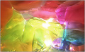
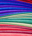
Frozen Rainbowby DeniseBernadetteComment: So creative, lovely colours - now how did you do it (colours that is), I'd like to use this idea in my own work. It's got to be popular and at least in the top 5, if my opinion counts for anything - well done! |
 Photographer found comment helpful. Photographer found comment helpful. |
| 03/30/2006 06:23:45 PM |
|
| Photographer found comment helpful. |
| 03/30/2006 06:22:00 PM |
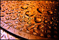
Bumpsby MisspavaComment: The colours just don't do it for me, but the idea is good - now just whatis it? You have stuck to the context of the comp. i.e. you just cant tell what it is. |
| Photographer found comment helpful. |
| 03/30/2006 06:20:00 PM |
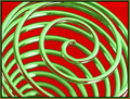
Kooshby kyeboshComment: It works for me :) nice concept and colours. However my only suggestion would be to have at least down to the bottom third more in focus. |
| Photographer found comment helpful. |
| 03/30/2006 06:15:20 PM |
Freudianaby TychoComment: Well done! However I would prefer it to be rotated 90 deg. clockwise that way the dark edge is less distracting. None the less it's got my vote. |
| Photographer found comment helpful. |
| 03/30/2006 06:12:19 PM |
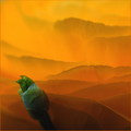
Sunsetby MajankaComment: Great idea and love the colours. However my only suggestion is that the green "bud" would look better pointing into the picture not away i.e. it leads my eye out of the photo not into it. |
| Photographer found comment helpful. |
| 03/30/2006 06:09:34 PM |
liquid heatby BeeGeeComment: I have based my voting on how the photo would look as a print on my walls (an artwork) - Love it except I would like to see most of the dark area at the top cropped, only because it distracts and gives the source away (in the context of the comp) |
| Photographer found comment helpful. |
| 03/30/2006 06:07:23 PM |
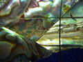
Looking Glassby ralfwComment: Great composition and colours, it reminds me of a Michelangelo sky |
| Photographer found comment helpful. |
| 03/30/2006 06:04:44 PM |
Paperby JulieGComment: I's hang that on my wall - very creative and well composed - colours well thought out. Congratulations, has to be a winner. |
| Photographer found comment helpful. |
| 03/30/2006 06:02:53 PM |
|
| Photographer found comment helpful. |
Home -
Challenges -
Community -
League -
Photos -
Cameras -
Lenses -
Learn -
Help -
Terms of Use -
Privacy -
Top ^
DPChallenge, and website content and design, Copyright © 2001-2025 Challenging Technologies, LLC.
All digital photo copyrights belong to the photographers and may not be used without permission.
Current Server Time: 08/04/2025 03:59:36 PM EDT.