| Image |
Comment |
| 03/26/2008 11:14:58 PM |
|
 Photographer found comment helpful. Photographer found comment helpful. |
| 03/26/2008 11:13:44 PM |
|
| Photographer found comment helpful. |
| 03/26/2008 08:47:20 PM |
Day 21 - Whiskersby kteachComment: I really like the compsotion and the DOF. Great use of b&w as well, nicely done! |
| Photographer found comment helpful. |
| 03/26/2008 02:17:03 PM |
Waldo's 'lil red wagonby ShutterPugComment: As per your request. This is my fav of the four you asked about in your thread. I would have voted this a 7 maybe an 8. The high key background works and the red wagon adds a nice splash of color, it's alos nicely composed. I do think it could be a bit sharper, maybe a bit of USM. I do think that some may have had an issue of having a hard time to make the eye connection. Your model has dark fur and dark eyes, which makes it hard to light them properly. People instinctively go to the eyes of a subject and want them well lit and sharp so they can make a connection. |
| Photographer found comment helpful. |
| 03/26/2008 02:09:28 PM |
Peek-a-pupby ShutterPugComment: Adding a comment from your thread. The lighting seems a bit harsh and off in this shot, which isn't easy with the dark fur friend you have. The eyes are just a bit too dark to make that connection. As Louis stated the focus seems a bit soft as well. I am not a fan of the color of cloth used and the type of material that it is, it reflects too much light taking focus away from your cute buddy. I gave this a 6 and do recall thing that I felt is was cute but that the main issue with me was the lighting and then the color. Message edited by author 2008-03-26 14:09:40. |
| Photographer found comment helpful. |
| 03/26/2008 02:04:04 PM |
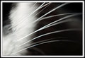
Featheredby ShutterPugComment: This was a hard challenge and almost everyone scored low. It it is nature for us to want to see things in focus and sharp and while blur and soft focus and work, more often it doesn't. This has a nice abstrat feel but I don't think the blur added anything to the shot, which is what people were looking for in this challenge. The color is nice and the compositon seems nice but as I stated the blur doesn't make your subject anymore interesting, just blurry. I would have voted this a 5. |
| Photographer found comment helpful. |
| 03/26/2008 01:59:09 PM |
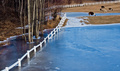
Llama Llama Frozen Llamaby ShutterPugComment: I saw that you asked for some critque so I give you my opinon. I feel that the shot seems unbalanced with it being weigthed to the left with the clutter of trees. The high, looking down perspective feels a bit odd to me as well, maybe getting closer to the fence and being more on the ground level could help. This also has an appearance of being slanted from right to left, I don't know if it's the scene or if you could crop it to make it more level but it adds to the unbalanced feel I was talking about. Hope that helps, I would have voted this a 5 if I had voted this challenge. |
| Photographer found comment helpful. |
| 03/25/2008 11:12:11 PM |
Stuntedby killjoy181Comment: Nic eshot but I don't feel that it meets the spirit of the challenge |
| Photographer found comment helpful. |
| 03/25/2008 11:10:11 PM |
|
| Photographer found comment helpful. |
| 03/25/2008 11:08:15 PM |
Soarby matrix_morpheusComment: Cool shot and I love teh contrast of the jetwash on the black sky. However, I don't feel this meets the challenge discription of a portrait. |
| Photographer found comment helpful. |
Home -
Challenges -
Community -
League -
Photos -
Cameras -
Lenses -
Learn -
Help -
Terms of Use -
Privacy -
Top ^
DPChallenge, and website content and design, Copyright © 2001-2025 Challenging Technologies, LLC.
All digital photo copyrights belong to the photographers and may not be used without permission.
Current Server Time: 06/27/2025 03:19:18 PM EDT.